After a short stopover in London for the prestigious 2024 Transform Awards, we were honoured to receive gold for our work with Debra Ireland.
The Transform Awards are one of the most celebrated accolades in branding, their focus on impact and performance over style and aesthetics setting them apart. This is incredibly important for us at RichardsDee as our primary purpose is to Design Meaningful Change for clients and their businesses.
That’s why when Debra won 3 of 3 nominations, we were delighted not only for the recognition of our partnership but for the amplification of the invaluable work they do for people affected by Epidermolysis Bullosa. This small but mighty organisation works tirelessly to transform the lives of people affected by this skin condition, raising essential funds and support for a cure. The visual shift towards positivity and empowerment now makes it an inspiring resource for families and people who live with all forms of EB.
As brand partners, we are thrilled by this acknowledgement and opportunity for the brand to continue bringing bold hope to everyone with skin as fragile as a butterfly wing.
We are delighted to win in the following categories:
🥇 Gold for Best Use of a Visual Property
🥈 Silver for Best Creative Strategy
🥈 Silver for Best Visual Identity by a Charity or NGO
What the judges had to say:
“In an increasingly alarming and alarmist world, charity communications often compete for the most emotive real estate. Debra, the charity supporting people suffering from epidermolysis bullosa, recognised that this wasn’t an effective strategy to serve all members of its community. Instead of focusing on suffering, they changed the narrative. It delivered a message documenting the fragility of the skin of those affected. The butterfly – beautiful, ephemeral – was the perfect visual representative.”
“I love, love, love this rebrand. It’s inclusive and beautifully crafted.”
We would also like to congratulate all involved and hope to be back next year.
FactoryXChange, a new European Digital Innovation Hub (EDIH) that is helping to accelerate digital transformation and make advanced technologies accessible to manufacturing startups and SMEs across Ireland. FactoryXChange is about adopting the latest technology, advancing industries, reshaping education, and propelling society forward through technology.
FactoryXChange recognised that to drive their digital transformation mission, they needed a brand strategy that would give direction and communicate the offer with clarity, and a distinctive visual identity that would stand out in a eco-system of many business support and funding organisations. To do this we were tasked with four key deliverables:
Customer first approach: Enabling a commitment to a customer centric approach that understands the needs and challenges that resonates with SME’s in the manufacturing sector.
Brand strategy: We developed a process that included a series of collaborative consortium workshops that explored the brand’s essence. and identified what set them apart. The collaborative workshops provided a chance to fully understand the needs of the target audience and how we could position FactoryXChange to connect with them.
Visual identity: Crafted with innovation, sustainability, and progress in mind, FactoryXChange’s visual identity incorporates design elements, a carefully chosen color palette, and a logo that stand out in the ecosystem of business support organizations. The design reflects their commitment to driving digital transformation.
Tone of voice: We established a tone and voice that permeates all communication channels consistently, effectively conveying the brand’s message. This ensures a unified brand experience for all stakeholders.
Driving Digital Transformation
With input from consortium workshops and stakeholder engagement we developed four key pillars to communicate how, FactoryXChange is committed to driving digital transformation across a range of sectors:
Community for Change: FactoryXChange brings together a community of businesses, innovators, and experts, all sharing a common goal – to advance digital transformation in manufacturing and beyond. This collaborative effort fosters innovation and progress.
One-Stop-Shop for Digital Needs: From artificial intelligence to robotics, cybersecurity to supply chain management, FactoryXChange offers a comprehensive range of services to meet the digital needs of the SME manufacturing sector.
Tech Translators: FactoryXChange goes beyond advocating for technology; they act as tech translators, bridging the gap between advanced technology and everyday people. This approach makes technology accessible, actionable, and impactful
Creating a Sustainable Future: Sustainability is a cornerstone of FactoryXChange’s mission. They not only adopt advanced technology but harness it to create a sustainable future for businesses, communities, and the environment. This commitment extends to every aspect of their operations..
Positioning FactoryXChange for Success
Built around the idea of ‘Manufacturing Digital Transformation,’ FactoryXChange’s brand identity places them at the forefront of digital transformation, with a specific focus on manufacturing 4.0
The new brand identity is built on the concept of their role as a connector and catalyst for change. This informed the design of a strong and confident new logo. To ensure FactoryXChange has an accessible and simple design narrative the overall system utilises and stripped back colour palette of black and white, with a yellow and green gradient that serves as a metaphor for change and forward momentum.
The challenge was to create distance from competitors and stand apart from each individual consortium member with no single member dominating.
Let’s start with a question. What do Square, Slack and Zoom have in common? Granted, there could be numerous responses to this question, but one thing is abundantly clear when you tell stories of who they are and what they can do. Each brand has ignited change within its sector and its world to transform the space it occupies in its favour. Take Zoom for example, which emerged and transformed communication and collaboration practices during the Covid-19 pandemic, while taking on sectoral Goliaths such as Google, Microsoft and Cisco. Zoom made its mark so much that it became one of the Oxford Dictionary’s most influential words and one of the most prevalent eponyms of 2020. Not bad for a brand that was relatively unknown prior to 2020.
What makes a brand a challenger?
Challenger brands can be start-ups or established brands that disrupt the market by challenging the status quo. Typically characterised by their bold and unapologetic approach, challenger brands play havoc in the market by addressing unmet needs and adopting an unwavering customer-centric mindset. In today’s competitive and borderless market environment, the competition can be fierce. It can be tough for new brands to establish a presence. Yet this is where challenger brands feel most at home, as they revel in the unexpected, breaking through the noise of their category to make an impact as they carve out unique and unfilled spaces. At their core, challenger brands focus on knowing what to challenge, rather than focusing purely on the who. Think of Oatly, who has become a recognised challenger to the dairy category – finding unique and valuable market space as a dairy alternative.
Lessons learnt from challenger brands
In our work with some leading challenger brands, we’ve learnt several lessons about how these brands set themselves apart to create a distinctive space within their categories. This list does not intend to be exhaustive, but it does intend to illustrate how these brands think and act differently from more established brands.
An ambition to push the status quo: Challenger brands look to challenge the status quo and push boundaries in their favour. With their fingers on the pulse of customer insight, they identify areas where the market is lacking to create a differentiated brand, product or service with compelling value propositions to fill unmet consumer needs. Putting creativity, focus, and determination at the centre of their practices assists them in pushing the boundaries of their categories, allowing them to optimise their chances of success and demand-led growth.
A customer-first mindset: Challenger brands put the customer experience at the forefront of everything they do, ensuring that they are always delivering high-quality products and services. When a brand is customer-centric, customers feel valued and appreciated, creating a likelihood of stronger customer advocacy, which is a crucial component for brands looking to establish themselves in a crowded market.
An innovative-driven culture: Challenger brands are always looking for new and innovative ways to do things better. They are not afraid to try new technologies, processes, or approaches, and they are always looking for ways to improve their products and services. Embracing an innovative mindset for improvements – both large and small – can help them to stay ahead of the competition and can allow them to defend their unique position in their category.
A strong, unique culture at their core: Challenger brands typically have a strong and unique culture that sets them apart from their competitors. This culture is rooted in their values, purpose and beliefs. They are not confined by industry constraints, are focused on asking questions, and are open to change – allowing them to see opportunities where others don’t.
All brands need to be distinctive, and all customers need a choice. Challenger brands provide both; challenging the norms of their category by providing choices to customers which were previously uncatered to. We can learn a lot from how challengers operate, whether that’s their ability to tap into customer-led insight, their innovation process or their strong unique culture. While more established brands in their categories may not fit their moulds, we can learn a lot from challengers and their success.
We are delighted that our friends at Switcher.ie have been acquired by Mediahuis. Our work with Switcher.ie to reposition, rename, and rebrand from U-Switch highlighted the importance of creating an accessible identity that embodied the company’s mission and unique positioning. Much like our collaborations with Openet, 4Site, Dubray, and TDS to name a few, this acquisition demonstrates the long-lasting value of a strong brand persona. Switcher director Carl Gaywood notes in the Independent “the quality of the Switcher platform and brand is truly outstanding”. Well done Switcher.ie on this achievement.
At RichardsDee, the team are working across a diverse range of branding programmes so we’ve created RD Rewinds; a way to showcase the projects we’ve been proud to lead over the month. First up, October!
SEAI Energy Awards
The SEAI Sustainable Energy Awards recognise and reward excellence in all aspects of energy efficiency and renewable energy. As proud brand partners to SEAI, we’ve worked on this critical showcase of energy innovation and sustainable energy for over five years. From event branding and stage design, to signage and presentation development, we were delighted to support on this year’s event which saw Veolia, Bus Éireann, Johnson & Johnson Vision Care Ireland and Wren Urban Nest amongst the worthy winners. A huge congratulations again to all those who were nominated, and to all of this year’s winners!
Furthr Festival
October 21st saw over 1,600 ambitious founders, investors and enterprises gather at Furthr Festival to explore global challenges and the role of tech in finding the solutions. With over 100 speakers across five stages it was a high octane day focused on big topics like opportunity drivers, scaling businesses, sustainable innovation and emerging tech. Having led the rename and rebrand of Dublin BIC to Furthr, we were delighted to develop the name, proposition, identity, architecture and experience for Furthr Festival. A destination that really celebrates where Innovation, Tech and Sustainability collide.
2021 was an incredibly busy year in our studio. From new faces to new projects and group Teams calls to get-togethers, it’s fair to say there hasn’t been a dull moment. As the final few weeks of 2021 fade into a brand-new year with fresh surprises in store, we’re looking back on just some of the projects that we designed meaningful change for this year. And, if you have a strategy or branding project in mind for 2022, contact us at hello@richardsdee.com and you could find yourself on our list this time next year!
01 — Indigo
With Indigo Telecoms Group’s acquisition of our previous client 4site, we collaborated with the teams to define, design, and implement a strategic new brand built for the future of communication. By evolving the name to simply Indigo and the positioning to ‘Engineering a Digital Future’, as well as crafting an identity reflecting the new company’s three core offerings, a colour palette reflecting and complementing their name, a digital stream representing a future of limitless possibilities, and a brand voice and messaging deeply rooted in their core values, we helped set Indigo on their path to accelerating their growth strategy.
02 — Reitigh
2021 also saw us win new clients such as Reitigh, one of Ireland’s leading software companies solving the most complex processing challenges in financial services for banking, investment, and insurance enterprises. We worked closely with their leadership team to devise a unique set of values, a brand purpose, and a compelling promise as well as a strong design system and laser-focused messaging that brought their approach of ‘Always Simplifying’ to life. Plus, in the spirit of the festive season, we were even nominated for an ICAD Bell for our work! View more work here →
03 — Kerry
This year we helped Kerry look Beyond the Horizon with their stunning new pattern. Built in four layers to reflect Kerry’s From Food, For Food heritage, their strength in people, their unrivalled capacity for innovation, and their promise to reach over 2 billion people with sustainable nutrition solutions by 2030, the new hand-illustrated pattern brings their brand to life in miniature wherever it’s used. View more work here →
04 — MII
One of our biggest projects of 2021 was our rebrand of MII. Building on the brand strategy developed by Genesis, we delivered a revitalised visual and verbal identity system across the MII brand from the mark to a suite of impactful typefaces and the website to event naming. By amplifying MII’s role as the voice of authority for marketing in Ireland and an accelerator of marketing talent, we equipped the team with a brand that evokes their limitless ambition and radiates confidence. Read our full case study here →
05 — HOHR
2021 saw us appointed as Brand Partners to the Leadership team at the €1.6bn entrepreneurial powerhouse House of HR. Our challenge was to redevelop the Purpose, Vision, Mission and Values and crystalise these into a powerful creative strategy and identity system. Our solution was a rebellious and powerful system connected deeply to the brand we had defined previously, setting House of HR up for a bold and impactful future. Read our full case study here →.
06 — St. Vincent’s
For the third year running we produced St. Vincent’s Healthcare Group’s annual report. Designed around the theme of ‘Next Steps: Towards the Future of Healthcare’, we collaborated closely with the team at St. Vincent’s to deliver artwork and final layout for 2020’s report.
07 — Fáilte Ireland
2021 also saw us refresh the brand identity of Fáilte Ireland, Ireland’s national tourism authority. Building on the strength of the iconic shamrock, we imbued the revitalised logo with a sense of authority by reaching back to the classic identity born in the 1960s, as well as modernised the identity by refreshing the typeface, harmonising the colours with Fáilte Ireland’s regional brands, and reversing the mark from a negative shape (white) to a positive shape (green). Rich in storytelling, the new logo asserts Fáilte Ireland’s role as the trusted shaper of the tourism industry in Ireland. View more work here →
08 — Energia
2021 marked another busy year with one of our closest clients, Energia. As their longstanding brand partners, this year we collaborated on a range of exciting projects that unifies their brand experience across all channels and underpinning their mission. We have a number of interesting Energia projects on the go in our studio for 2022 in what will be a challenging start of the year for the energy sector.. View more work here →
09 — Irish Water
2021 also saw a stunning new photography project take off with our friends at Irish Water. Together, we embarked on a project to update Irish Water’s image bank to capture the scale and breadth of their investment in Ireland’s water infrastructure. In 11 days, across 28 locations around Ireland, we collaborated with photographer Keith Arkins to capture aerial and ground photography that visually evoked Irish Water’s national status from coast to coast.
10 — Childline
Just over a year ago, we won one of the most meaningful rebrands of 2021 – ISPCC Childline. Selected as brand partners to Ireland’s largest children’s charity, the past year saw us enter the worlds of children and ISPCC Childline teams across Ireland through workshops to discover how we could help ISPCC and their service Childline reclaim their roles as children’s advocates and allies. By crafting a visual and verbal identity deeply rooted in the vernacular of children while clarifying the relationship between the brands, ISPCC and Childline are established as the definitive destinations for resilience and support for generations of children to come.
11 — Studio Photoshoot
Earlier this year when we had the chance to safely – if briefly! – get back into the office, we took the opportunity to refresh our RichardsDee photography with the brilliant Josh Mulholland. Check out our sweet O’Connell Street space and the wonderful faces new and familiar that make it such a meaningful place to be. All it’s missing is a Christmas tree!
We were delighted that Simon was invited as a judge for the CHARGE2020 Energy Branding Awards. The CHARGE Awards celebrate excellence in branding and aim to stimulate the discussion on brand strategy by acknowledging and showcasing outstanding branding initiatives within the energy sector. The awards cover many different aspects of branding within the global energy sector, including Best B2B Brand, Best Distribution Brand, Best Innovation Brand, etc. They also stand out from other branding awards programmes as each submission needs to be supported by evidence in segmentation, business objectives and results – often a missing piece in awards programmes as so many rely on the visual aspect.
The CHARGE Awards are also part of the CHARGE Energy Branding conference, a global symposium on how branding can transform a commodity and grow brand value. We are looking forward to attending the conference at the end of September.
We are excited to announce that we have been shortlisted for FOUR Transform Europe Awards. The global brand development awards recognise creativity and strategic thought, and place real emphasis on the impact of the work.
“The calibre of submissions has been outstanding and this year has been very competitive. It is absolutely fantastic to see RichardsDee once more reach the shortlist in not just one, but four categories.” Andrew Thomas, Transform
Our work with Dublin Bus on DoDublin has been shortlisted for Best Brand Evolution, Best Creative Strategy and Best Visual Identity in the Travel Leisure and Tourism Sector. Read the full case study here.
Our work with Bewley’s on Ireland’s Biggest Coffee Morning for hospice has been shortlisted for Best Visual Identity from a Charity, NGO or Not-For-Profit category. Read the full case study here.
“We are delighted to be shortlisted again for awards that recognise the transformative impact branding has on business, and industry. The Transform Awards are important awards for us for many reasons; a key one being the way their jury is structured by client side professionals who vote on commercial performance and disruption balanced with excellence in execution. This is our second consecutive year in the shortlist which is testament to the energy, focus and determination of both our own team and the clients who trust us with their brands” Celine Dee, Co-Founder, RichardsDee
About Transform Awards
Transform is a publishing and events brand dedicated to the global rebranding and brand development industry. The Transform Awards celebrate the best in rebranding, employer brand strategy and brand development in Europe.
“Internationally, rebranding and brand development has become a catalyst for successful business. As opportunities ripen, this year’s Transform Awards Europe 2018 shortlist catalogues the leaps and bounds that brand development work is continuing to make. The shortlists quintessentially represent not only the impact of imagination, but also how creativity can elegantly meet strategy, thriving on nostalgia, mystery and striking imagery.” Andrew Thomas, Transform
A recent article by Gillian Tett highlighted the concept of ‘normalisation of deviance’. This concept was identified by Nasa twenty years ago, and highlights that disasters cannot always be blamed on a single, catastrophic decision by a leader. Instead, they often occur because people inside institutions start to make numerous small decisions that stealthily change their concept of normality. Simply put, breaches that appeared so small, became the norm, until a significant event happened that demonstrated the complacency – in this case the Challenger disaster. While this tragic event cannot be compared with the management of a brand identity, the concept is very relevant to show how brands and brand experiences can weaken over time through actions, behaviours and communications that have not been considered through the brand lens.
Strong and meaningful brands are focused, cohesive and motivating, but when brand applications and brand experiences break the rules – however small – this becomes the new norm, and the accepted way of doing things. This is until a tipping point emerges and the brand appears fragmented and starts to lose its credibility and position, allowing competitors in, or it results in a brand that fails to inspire and motivate.
It’s very easy to focus on the exciting, big ticket marketing applications, but a badly worded or laser printed directional sign, a small shift in the reproduction of colour on a brochure, inconsistent typography in digital comms, an uncared for reception, deviation in tone of voice or a general lack of attention to detail – all amount to small changes to a brand that can contribute to the breakdown of a strong brand identity. In all cases, good intentions were at the root of the actions, but it is a consistent issue that we see with companies – not paying enough attention to the small items, all of which add up to ensure that the customer experience is seamless.
So, what can be done to minimise the impact of ‘the normalisation of deviance’ in branding?
Understanding – anyone who has the responsibility to implement a brand touchpoint – however small – needs to understand the personality, parameters and the rules of the brand. This can only be done through proactively sharing what the brand stands for, the brand assets and the expected brand standards.
Tools – To apply the brand consistently and with expedience, branding tools are required to produce communications to exacting standards. This may include digital guidelines that everyone can access easily; standards for all types of communication; or prototyping and visualisation to establish best practice and lead by example.
Management – Constant care and attention is required to manage the brand at ground level and from a strategic point of view. Attention to detail is key across all applications ensuring the customer experience is seamless. Any applications deemed “not on brand” need to be removed and made good.
Energy – Passion for the brand and continuous improvement requires energy and commitment – it requires getting people on board with the vision and instilling in them the drive to make it happen. There is no room for complacency or an ‘it will do’ attitude. Either will result in a weakness in your brand. Nor is it a 9 to 5 job. If you see an issue, and inconsistency or an application that does not make you feel proud, then fix it.
Inevitably, fresh-faced we were not, and at 5am we were up and at it again, ready to tackle the main day of the competition, the minuscule sleep adding some clarity to our thoughts from the previous night.
After raiding the local Starbucks at opening time of all of its coffee and croissants we made our way to the basement of The Palais. There we were shown to our booth and we moved into ‘production mode’.
Surprisingly, the day itself ran relatively smoothly (if we do say so ourselves!). We had devised a schedule and broken down the key targets we needed to hit to meet our 8 o’clock deadline, which proved very beneficial. Through the day we managed to stick to this, using it as a helpful guide if we felt we were spending too much time on any one element of the project.
At one point during the afternoon when the effects of the previous sleep-deprived night were setting in, a representative from Getty Images arrived at our booth with a camera person to ask us a few questions about how the project was developing and how we were feeling, ‘tired’ was our answer. But a few miniature pastries from the lunch table did the trick for a sugar-kick and we managed to push through to the finish line, with time spare to proof read and ensure our printed piece was correct.
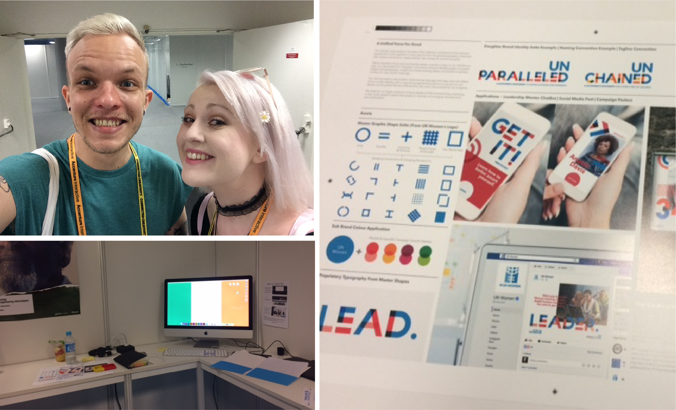
Our final design system revolved around the concept of ‘A Unified Force For Good’, speaking to the idea of the collective mobilisation of the diverse people who come together in many ways to form the global population of women, who inspire and strive to create positive, real change for women and girls.
Taking inspiration from and evolving the assets currently in place in the UN Women logo, our new system for ‘Daughter’ sub-brands utilised a flexible system of graphic shapes and typography, created from these existing assets, but transforming them to allow for the development of new forms, and varied meanings.
We did it! We were finished! We handed over the fruits of our labour, a single A3 document, and it was now out of our hands, ready to be presented to an impressive panel of judges from internationally renowned design agencies like Brand Union, Future Brand and Planeta to name but a few.
Time for an Aperol Spritz.
Another Aperol Spritz. Pizza. Sleep.
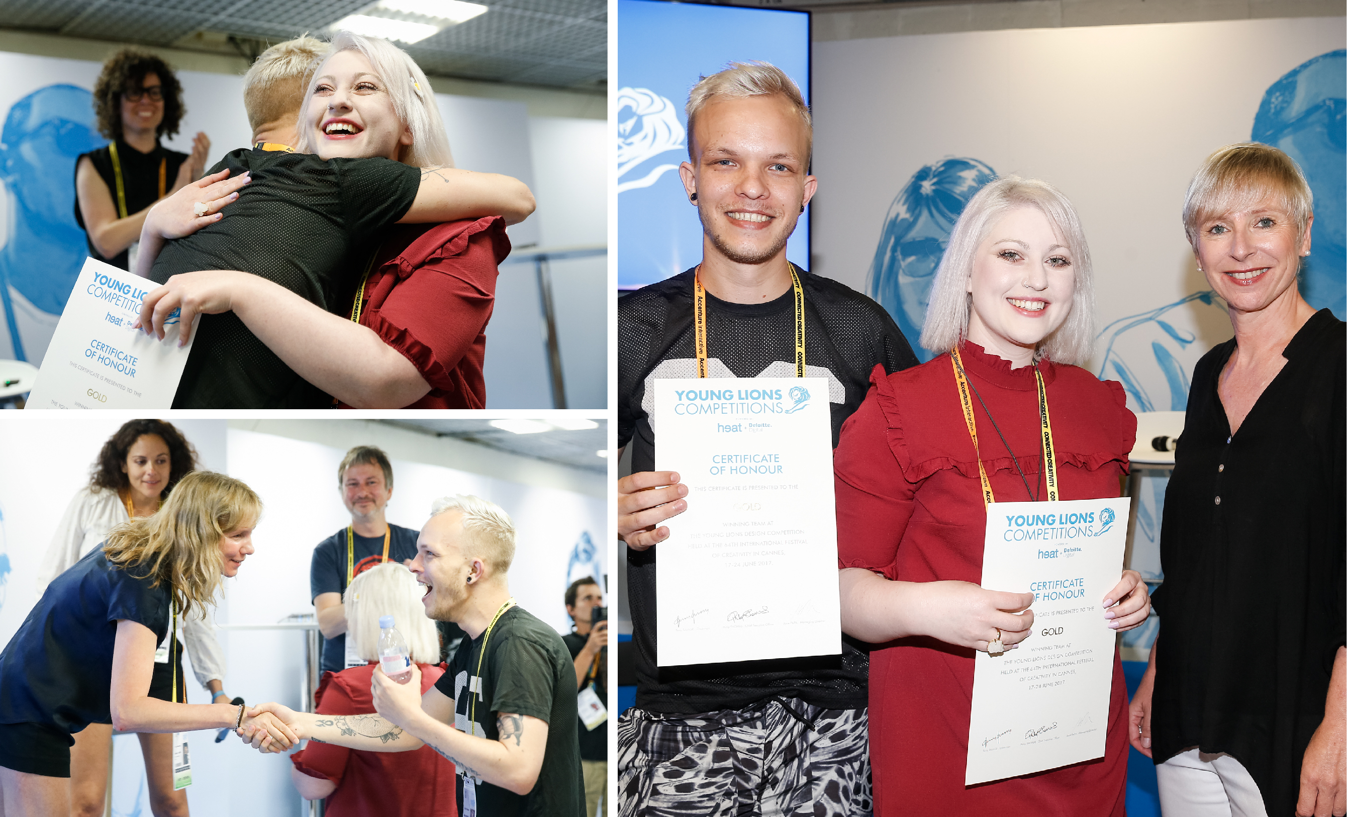
The Win
As an eternal pessimist (realist, OK?), I (Emma) had no inkling that we would be in with a chance of winning the much coveted Gold Young Lion. Kyle was more confident, hoping that we may place somewhere, possibly a bronze. As we sat in front of the panel of judges, IAPI representatives by our side, we suddenly got a wave of nausea over us as they announced the winners and we felt something we hadn’t admitted to ourselves all the way through the process…we really wanted this. Bronze was announced, not us. Silver, not us again, no chance. An then, to our utter disbelief the word ‘Ireland’ was called out as the winner of the Gold. The feeling that accompanied this disbelief was one of incredible euphoria, and immense pride that we had achieved this win while representing Ireland.
We thanked the judges, shook hands, hugged our teammates and the IAPI team, shed some tears, and most importantly…called our moms (and the RichardsDee Team)! The feeling was incredible.
We were photographed, interviewed and congratulated and then left to our own devices to get ourselves organised for the awards ceremony that evening where we would be awarded, alongside our peers and the judging panel, with two gold medals, on a stage worthy of The Oscars, in a theatre filled with over 1,500 people. No pressure, right? The awards show was fantastic, showcasing the inspiring work of the other Lion winners in the Design category.
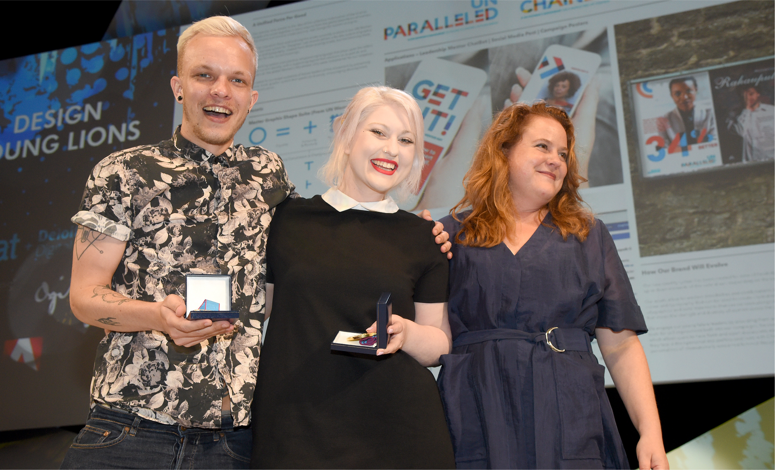
Afterglow
As the first Irish Gold winner of Cannes Young Lions in its 23 year lifespan, we were very very proud. Young Lions has been a wonderful opportunity for us to hone our skills and push ourselves to the boundaries of what we’re capable of. It’s also been an unbelievable experience, being immersed in the festival environment and being surrounded by the world’s best creative talent, and with our other teammates form Team Ireland, in the beautiful location of Cannes. We urge anyone considering entering to just go for it.
We want to thank our wider team at RichardsDee without whom, none of this would have been possible, the external mentors we had along the way- Steve Payne and James Beveridge, and the team at IAPI who were an organisational powerhouse, supporting us all in Cannes, no mean feat!
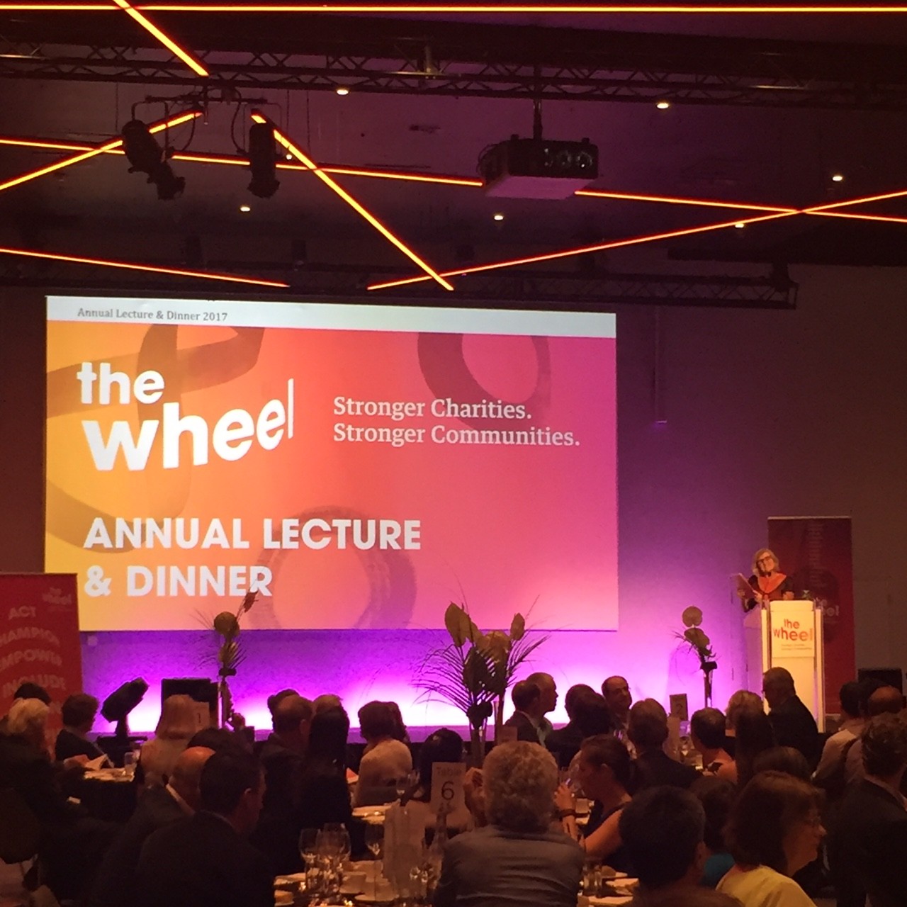
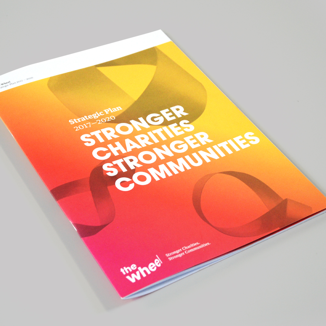
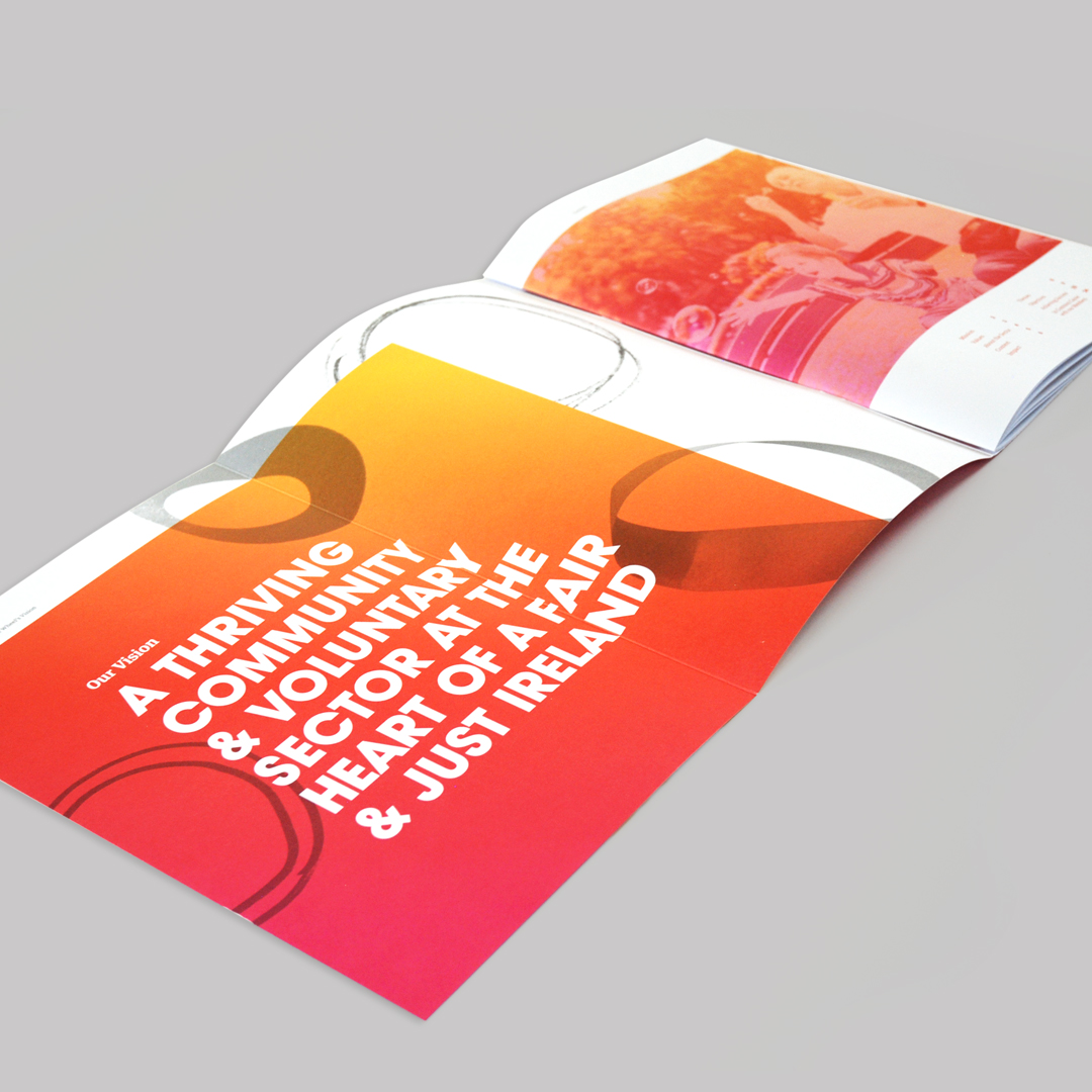
We recently had the pleasure of attending the launch of the new brand identity for The Wheel at their Annual Lecture & Dinner, at Croke Park’s Conference Centre. The new brand identity- designed by our Young Lions Emma and Kyle- coincides with The Wheel’s new strategy document, “Stronger Charities. Stronger Communities.” which outlines their plan for action towards 2020. The evening was inspiring, with lectures from the inimitable Professor Tom Collins and members of The Wheel, beautiful music from the High Hopes Choir and education around the challenges facing the sector disguised as a fun table quiz!
The new brand hinges itself on the active citizenship that The Wheel encourages and strives to create in society, with the concepts of people power, diversity, inclusivity and progression at its core.
Dublin Sightseeing has a great product portfolio and a solid reputation for providing tours and travel services in and around Dublin. However, the market has become more competitive, audiences purchasing behaviours are changing, and Dublin Sightseeing’s image had become fragmented and did not reflect either the quality of the product or the level of experience provided. While known and identified as the Green Bus, the brand, its key point of difference and its portfolio of tours and associated services were not well known.
Through a process of staff engagement, competitive benchmarking and customer research, we clearly identified and built on the strengths of the business and established the direction, which would lead to a more competitive and confident positioning and visual expression for the brand and its portfolio of products.
The challenge was to relook at the brand and how it engages with its many audiences, helping to grow market share, and regain its position as the “authentic Dublin” sightseeing company. We also needed to leverage the positive experience of the ‘Green bus city tour’ across the entire portfolio and clearly communicate the different tours and services on offer. An essential part of the process was ensuring that the brand and products were future proofed and could adapt to accommodate changes in technology, visitor expectations and possible category extensions, highlighting the need to challenge the naming and presentation of the brand.
Insight
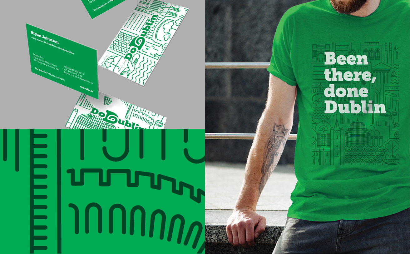
Aligning with Destination Brand Dublin, the two key audience segments for Dublin Sightseeing are the Social Energisers and Culturally Curious, who are seeking experiences that provide a real sense of place, along with an insightful and entertaining experience. It was important for us to show that Dublin Sightseeing is not a faceless multinational, but a team passionate and proud of their city and eager to share that with the world. Building on the company’s core USP – the best and most knowledgable drivers and guides in the city, and the inimitable Dublin personality, combined with our audience’s desire for fun, authentic experiences, we defined the positioning as “the Dubliners Guide to Dublin”.
The name of the brand needed to change to become more active, iconic and memorable – less about a generic sightseeing service, and more about what it can enable travellers to do. The name DoDublin emerged as a clear favourite from the naming process, and resonated well with local and international audiences when tested.
Opportunity
Our opportunity lay in creating a brand that could house a wide portfolio of distinct but related products that would be the authority on all transport and guided tours for national and international visitors alike. A confident masterbrand approach provides credibility, confidence and makes the most of all cross-selling opportunities, enabling the brand to maximise marketing efficiencies. It also establishes a brand architecture that is simple and strong, delivering impact and establishing a family style for all products.
The new identity created with Dublin, travel and sightseeing at its core – is visually represented by a ‘D’ with the symbol of an eye and a travel route combined.
Our tagline, ‘Don’t just sightsee, explore’ repositions DoDublin versus their competitors and speaks directly to visitors’ desire to get under the skin of the city they are visiting. The visual expression and messaging provides a distinct insight into the city, the culture and the people providing an experience that is real, unique and never scripted.
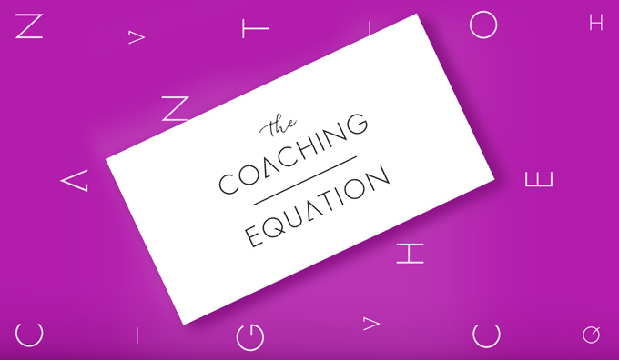
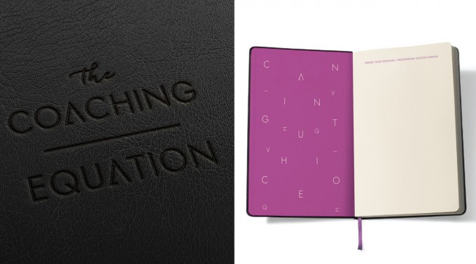
The Coaching Equation is an international professional coaching and mentoring consultancy that works with people at all levels to improve and transform their leadership and management skills. We were appointed develop an identity for The Coaching Equation that was approachable and modern, yet structured enough to support the proven methodologies employed to deliver results. It was important that the new identity reflected both the founder’s personality (positive and results driven) and style (classic with an edge), whilst positioning the company as a credible alternative to the primary competitive set who have advocated for very corporate identities.
The Coaching Equation is about discovering each individual’s happiness / success formula. As every individual is different, The Coaching Equation takes a holistic approach to uncovering the right combination and balance for that individual. To that end, the central idea around the logo is the ‘Power of Balance’. A script font is used to add a personal touch, reinforcing the approachability of the consultants. The lettering in the main word mark has been manipulated to play on symbols derived from mathematical equations and primary shapes, and elevates the results-driven nature of the advice on offer. The divider line reinforces the idea of the ultimate success formula and plays to the holistic approach taken by the company when working with the individual (professional and personal, happiness and success). The result is an identity that is precise and to the point, but with a very distinct and differentiated personality.
Saint Patrick’s Cathedral, one of Ireland’s leading visitor experiences welcomes almost half a million tourists and schoolchildren annually. We have been working with Saint Patrick’s on it’s identity and communications and were delighted to have played a role in its first real move into technology.
This week the Cathedral launched it’s new ‘Discovery Space’ in the south transept which is designed to bring a more interactive and immersive experience to the 800 year old building and its history. We worked closely with the internal team to translate core elements from the new identity system across a large touchscreen table and other digital devices which offer photography, audio and information on the cathedral’s layout, history and heritage.
We developed communications for the wonderful new Discovery Boxes that launched on the day which are specifically designed to engage young visitors. The Discovery Boxes are built using recycled wood from the cathedral’s disused pews and contain games encouraging children to Build A Cathedral and Try Brass Rubbings.
Few can claim to work with an 800 year old cathedral and we’re looking forward to sharing the new brand identity and communications in coming weeks.
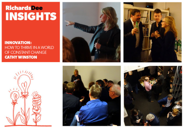
LastThursday evening, we were delighted to be joined by over fifty clients and colleagues at our studio, where Cathy Winston inspired and educated us in the process of Innovation. Black hats, yellow hats, start-up monopoly and cafe conversations, it was a night of creativity, ideas and new thinking – helping us improve our businesses and brands through embracing innovation.
This was our third Insights evenings, where we invite leaders, creatives and like minded individuals to share their passions and insights in an informal and sociable setting. The aim of the evenings are to encourage a shared learning environment where we can be inspired and empowered.
We were delighted with the amount of interest with our latest talk and would like to thank everyone for attending, we are now considering speakers for our next Insights evening which will be soon, and if you are interested in being invited to the next Insights evening then please drop us a note.