We’ve been recognised as the Irish agency leading the way in design practices
Our drive to be a company recognised for our work, team and impact has been acknowledged by the esteemed Institute of Designers in Ireland. At their annual IDI Awards in November we were elated to win Design Practice Team of the Year 2023.
The judges noted:
“(RichardsDee) demonstrates how an Irish design agency can show up with heft as a trusted design partner for organisations across the private, public and civic sectors; as an employer that understands the need to develop and retain talent; and, as a fulcrum for community mobilisation.”
This award is testament to our dedication to our purpose – Designing Meaningful Change for our people, local community and our brilliant clients.
Meaningful Change centres around our foundational belief that our work makes an impact. That strategy, creativity and design combined can bring truly meaningful, positive and game-changing transformation. We’ve built our whole ethos, client mix, employee value proposition, outreach activities and ways of working around this vital purpose – and it’s evident in every endeavour we undertake.
In 2022 we celebrated 10 years in business, won four Transform Awards and began working towards becoming Ireland’s a B-Corp brand agency. This year we’ve partnered with exceptional mission-focused brands like DEBRA Ireland and Childline and are competing (and winning) against large global agencies for projects in Ireland and USA.
And, for our own team we’re making sure everyone feels inspired and supported to do their best work – including hybrid working, health insurance, finishing early on Fridays, birthday days off and paid leave for volunteering. We’re also dedicated to ongoing learning programmes to ensure people and careers progress.
There’s so much more to the above than one blog post can cover, but this gives a sense of how we’re achieving our ambitions as an agency and why we won this amazing award. The judges on the night commented:
“RichardsDee have a strong selection of projects that demonstrate strong originality and excellence… and have articulated a clear vision, for the organisation and for its people. A clearly evidenced commitment to learning, experimentation and innovation, with particular emphasis on providing space and financial support for the team to learn, develop, experiment, and thrive at work…”
We couldn’t of put it better. This Christmas and New Year we’ll be raising a glass to every one of our ambitious team members and clients who make us the agency we are…
Power NI Perks is Power NI’s customer rewards scheme that offers discounts, savings and cashback on 100s of brands on the high street and online.
Power NI wanted to promote over the Christmas period not only the discounts they offer, but also the other benefits of Perks with Christmas guides and hints and tips. In order to create meaningful change we needed to create a Christmas themed key image that could communicate all of this throughout a range of touchpoints and use brand elements that would increase brand equity.
Perks has 100s brands and the opportunity existed to enhance and contribute to the rewards scheme, its perception and the overall character of Power NI.
We wanted to strengthen the brand by using elements from the Power NI brand identity. Our starting point was the burst of energy symbol from the logo. This immediately lent itself to being used as a Christmas wreath — from the original sketch, into concept illustration and finally as a 3D rendered wreath with felt texture.
We developed warm and friendly messaging that tied into Power NI’s positioning and the spirit of Christmas. And adapted the key visual to work across multiple formats.
FactoryXChange, a new European Digital Innovation Hub (EDIH) that is helping to accelerate digital transformation and make advanced technologies accessible to manufacturing startups and SMEs across Ireland. FactoryXChange is about adopting the latest technology, advancing industries, reshaping education, and propelling society forward through technology.
FactoryXChange recognised that to drive their digital transformation mission, they needed a brand strategy that would give direction and communicate the offer with clarity, and a distinctive visual identity that would stand out in a eco-system of many business support and funding organisations. To do this we were tasked with four key deliverables:
Customer first approach: Enabling a commitment to a customer centric approach that understands the needs and challenges that resonates with SME’s in the manufacturing sector.
Brand strategy: We developed a process that included a series of collaborative consortium workshops that explored the brand’s essence. and identified what set them apart. The collaborative workshops provided a chance to fully understand the needs of the target audience and how we could position FactoryXChange to connect with them.
Visual identity: Crafted with innovation, sustainability, and progress in mind, FactoryXChange’s visual identity incorporates design elements, a carefully chosen color palette, and a logo that stand out in the ecosystem of business support organizations. The design reflects their commitment to driving digital transformation.
Tone of voice: We established a tone and voice that permeates all communication channels consistently, effectively conveying the brand’s message. This ensures a unified brand experience for all stakeholders.
Driving Digital Transformation
With input from consortium workshops and stakeholder engagement we developed four key pillars to communicate how, FactoryXChange is committed to driving digital transformation across a range of sectors:
Community for Change: FactoryXChange brings together a community of businesses, innovators, and experts, all sharing a common goal – to advance digital transformation in manufacturing and beyond. This collaborative effort fosters innovation and progress.
One-Stop-Shop for Digital Needs: From artificial intelligence to robotics, cybersecurity to supply chain management, FactoryXChange offers a comprehensive range of services to meet the digital needs of the SME manufacturing sector.
Tech Translators: FactoryXChange goes beyond advocating for technology; they act as tech translators, bridging the gap between advanced technology and everyday people. This approach makes technology accessible, actionable, and impactful
Creating a Sustainable Future: Sustainability is a cornerstone of FactoryXChange’s mission. They not only adopt advanced technology but harness it to create a sustainable future for businesses, communities, and the environment. This commitment extends to every aspect of their operations..
Positioning FactoryXChange for Success
Built around the idea of ‘Manufacturing Digital Transformation,’ FactoryXChange’s brand identity places them at the forefront of digital transformation, with a specific focus on manufacturing 4.0
The new brand identity is built on the concept of their role as a connector and catalyst for change. This informed the design of a strong and confident new logo. To ensure FactoryXChange has an accessible and simple design narrative the overall system utilises and stripped back colour palette of black and white, with a yellow and green gradient that serves as a metaphor for change and forward momentum.
The challenge was to create distance from competitors and stand apart from each individual consortium member with no single member dominating.
Ideas Made Real is a school outreach programme designed to bridge the gap between curriculum and industry needs, championing the role of advanced manufacturing in our lives and opening young minds to the limitless potential of a career in STEM.
STEM education equips students with analytical, problem-solving, and critical thinking skills that are relevant to many careers. Furthermore, it fosters creativity and innovation, which are essential for addressing the most pressing challenges facing society and our world today
The Ideas Made Real program is a nationwide STEM and advanced manufacturing schools program from Irish Manufacturing Research (IMR) that empowers the next generation of makers with the tools for the future. We’ve been involved in helping with brand naming, brand identity, and the challenges of managing the many brands and organisations involved in this program. The objective was to inspire students of all ages to create, innovate, challenge stereotypes, pioneer new technologies and make their brilliant and bold ideas real.
Often, projects may seem straightforward at the outset, but as you unbox the complexities of branding programs and initiatives involving multiple stakeholders, branding projects can help create clarity regarding who should lead and who should endorse. In this case, we had to determine the correct branding relationship, whether the program should have its own name and brand or if it would add value and credibility by being closely associated with IMR.
Evaluating the correct branding relationships
Both options had merits, but when evaluating the outcomes, it became clear that this program needed its own name and brand assets while also maintaining a close connection to IMR. The rationale for this decision was that the delivery, content, and investment were made by IMR, so they should take credit for it. Additionally, IMR brought value and credibility, demonstrating that the program was run in association with a recognised and reputable body that could connect schools with leading manufacturers.
Brand naming and identity solution
Although the solution has a clear association with IMR in terms of colour, typefaces, and visibility of the IMR brand, the program required a shift in tone and language that could resonate with schools and students. It also needed a name that could quickly generate interest, be active, and serve as a signpost for the program. The name ‘Ideas Made Real’ was developed to work on multiple levels: it provides an understanding of the activities, emphasises creative opportunities in manufacturing, and is fun and straightforward. This naming structure allows ‘Ideas Made Real’ to lead communication with a close relationship to Irish Manufacturing Research and be used as an ingredient brand when courses are led by a third-party educational brand.
Upon launch, it became evident that the close association with IMR had two significant benefits. First, it lent the program credibility and expertise. Second, it added value to the IMR brand through the awareness, leadership and innovation-focused outreach program. While the final brand solution may appear simple in execution, the journey and process to reach this solution took time and involved input from various stakeholders. Success was evident in the adoption of the program by many schools.
The know-it-all newcomer, no-break, no-holiday people pleaser.
AI is the new co-worker that’s causing quite the stir. ChatGPT, YouWrite, WordTune and Jasper are just a few of the countless copy generators out there. With the ability to generate paragraphs of text in mere seconds, what does this mean for the future of brands and their brand voice? Should we embrace the new-age tech or run screaming from the AI-pocalypse?
Like your brand logo, colour palette, and typeface – your brand voice makes up the distinct personality, tone and style used to communicate and connect with audiences. It encompasses the words, rhythm and overall feel of your brand’s content. With the sudden influx of generated copy, what are some of the potential knock-on effects for the future of brand writing?
Speed, productivity, and brainstorming.
AI outpaces human thinking. The speed at which it generates ideas, replicates styles and completes tasks is scarily impressive. The opportunities this creates for streamlined workflows, quicker project deliveries, cost efficiencies and scale are exciting. This may have a huge effect on how we work as teams and where we spend our time. It may eliminate the need for larger teams or reduce time spent on basic tasks, leaving more space for creative and strategic thinking time. Additionally, as these tools advance, the potential for brainstorming, enhanced creativity and new pathways of thinking are ever-growing. With hundreds of ideas generated in seconds, AI lets you approach ideation with a more editorial eye.
So, clearly, AI has a place in enhancing the creative process, but could it replace it?
Empathy, creativity and originality.
With the explosion of generated content, it’s now even harder for brands to stand out. Crafting a unique voice and point of view is critical – and writing is a key component to creating meaningful connections with customers. Good brand writing is all about resonating with the consumer, tapping into their innate human needs, desires, and fears. Authentic storytelling, empathy and personalisation can be the cornerstones to long-lasting customer relationships, influencing people to feel, think and act differently. AI can get close, but it lacks the empathic, “humanness” of writing that is critical to persuasion.
Creativity is also uniquely human. Memorable writing often pulls on colloquialisms, metaphors, turn of phrases and humour, drawing insight from lived experiences. AI’s current capacity to think or link independently is limited, and the output can often feel one-dimensional. It’s a fascinating tool to sharpen up your thinking – but typically the ideas it generates are only as good as the quality and diversity of the prompts you give it.
Plus, we’re still in the early days of understanding this type of tech. AI can be “stupid in ways we can’t predict” (watch this great skit from John Oliver here). Sometimes these chatbots confidently generate falsified content or tweak the truth. These so-called “artificial hallucinations” can be convincing, so it’s essential to always fact-check and apply your own critical thinking. The existing regulations around ownership are also blurry. Of course, information trawled from the web must come from somewhere, but generative tools make it extremely easy for people to unknowingly create content already belonging to someone else (check out this dispute by Reddit). Despite some businesses tackling this problem (see Adobe Firefly case), usage rights and plagiarism are still of major concern, particularly in the copywriting field.
What does this mean for brand voice?
As AI pervades all types of content and media, it’s even more important to stand out from the generic chatter. A well-defined voice creates consistency, builds trust and fosters emotional connections with audiences. While AI has amazing capabilities, it still lacks the depth, emotion and creativity of genuine brand writing. Although it will undoubtedly enhance the creative process, it’s difficult to say whether it will replace it. Having an authentic brand voice is still a strategic advantage that helps make lasting impressions in an oversaturated market.
AI is reshaping and reinventing the copywriting landscape, heightening our creative abilities and pushing existing boundaries to reach new levels of innovation. It’s what Spotify did for music, what low-cost airlines did for air travel, and what Photoshop did for design. Creating tools to enhance our lives is how we evolve, and if we don’t embrace them, we get left behind. Ultimately, AI is a tool that will augment human creativity. A tool that has the potential to transform our industry for the better, if used with wisdom and care. But like any tool, we should learn when to use it, how to use it, and be mindful of its limitations.
The aspect ratio of a video is an official way of describing its frame shape. It defines the proportions of the frame’s sides expressed as Width to Height. They tacitly inform and affect our viewing experience. When motion pictures first took off, the shape of the frame evolved for all sorts of reasons over time, ranging from practical (the available space on a roll of celluloid) to aesthetic (certain dimensions were more visually pleasing than others).
35mm film became the standard and it provided a uniform and reliable format for the production, distribution, and exhibition of movies, facilitating the rapid spread of films. The invention of TV then brought things further, putting audio-visual entertainment in the home. Cinema responded to this competition by widening their aspect ratio as a form of differentiation, to create a more ‘epic’ experience.
In today’s digital world, the most common aspect ratio for video is 16:9. Engineers settled on this because it was the geometric mean between the original TV standard (4:3) and the average of cinemascope ratios (2.35:1). It’s the shape we see every day in the form of modern TVs, computer monitors, and phones turned sideways.
When TV was our primary device for entertainment, it made sense to produce content in a 16:9 landscape format because that was how most people were consuming media. Today, however, the primary device we engage with is our smartphone, with portrait being the dominant frame.
Since social media introduced condensed content formats, the 9:16 aspect ratio makes it easier and more convenient to focus on the action by removing the unnecessary peripheral details. In short, the videos feel personal. They resonate and connect with audiences which is why younger “digital natives” are obsessed with user-generated content (UGC). The accessibility, engagement, and storytelling all combine to offer a hugely immersive experience.
It’s not just TikTok, Snapchat, and Meta focusing on the vertical video trend; YouTube (the global hub for 16:9 landscape videos!) launched its own version of a vertical video platform in the form of ‘Shorts’. With heavy platform investment, and algorithms and user interfaces designed to serve more of it to users – it’s a crucial paradigm shift in the video industry, offering marketers new opportunities to communicate and connect with their audiences.
As more people consume content on their mobile devices and platforms continue to evolve, we can expect to see more innovation and experimentation in this space. Brands too can leverage the vertical video format for the same reason UGC is successful: it’s a budget-friendly way to create content and needs few resources, while appealing to Gen Z’s insatiable video consumption habits. They want to see content that’s thematically appropriate to the medium; something native to the space. The new challenge for brands is to create effective vertical video content that is specifically shot for that purpose. This requires forethought and planning about how the narrative is suited to the new aspect ratio, and then producing accordingly. Consider shooting both formats side by side simultaneously – one traditional camera on a tripod, one vertical phone on a tripod, maximising your coverage.
The ‘DIY’ nature of vertical videos means production values aren’t expected to be stellar. If the video content is pitched right, production values can be overlooked. It just has to be authentic. The format can be used to deliver quick messages or tell complex stories over a series of episodes. It works great for interviews as well as product reviews which can show off products in action. It’s simply a matter of getting creative with this new way of viewing the world.
As smartphones become more advanced, they will capture higher-quality video with better stabilisation, lighting, and other features. This could make it easier for brands to produce even more compelling vertical video content. We may see new formats and styles emerge as well, with the aspect ratio becoming more integrated with other technologies, such as augmented reality and virtual reality. This could lead to ever more immersive and interactive vertical video experiences. We’re only in the infancy of this new wave of video. The opportunity for brands now is to consider the potential and incorporate this new aspect ratio into their strategies creatively and tactically.
At the end of the day, good videos are all about the story, and the frame is the window through which we experience it. The frame has taken on many shapes and sizes over the years and just as ‘complex’ does not mean complicated, ‘simple’ does not mean simplistic. We want audiences to be looking through the frame, into the story being told.
We are delighted to announce the appointment of two new directors – Martin Fanning and David Dowling. Martin and David will join the founding directors Celine Dee and Simon Richards.
Martin has been with the RichardsDee team for 10 years and has led significant rebranding programmes for international brands such as Kerry, Alltech, Bewley’s and RDJ. Previously Martin worked with Radley Yelder, gaining a wealth of experience in corporate, B2B and state bodies – enabling him to lead a dynamic team and deliver compelling brand identity and expression programmes.
David has been with us since 2016 and has grown our brand experience offering across digital channels – as well as leading and designing national and international branding and comms programmes for brands such as Marketing Institute Ireland, Energia, Power NI, Indigo, Meili and more. David’s experience has led to a number of key client appointments and his forward-looking approach ensures our brands grow and flex to suit ever-evolving channels.
“The new appointments broadens our leadership team and helps us put in place a team that can help shape the future of the agency. We are incredibly lucky to see members of our team grow their careers within the business and become directors.”
Let’s start with a question. What do Square, Slack and Zoom have in common? Granted, there could be numerous responses to this question, but one thing is abundantly clear when you tell stories of who they are and what they can do. Each brand has ignited change within its sector and its world to transform the space it occupies in its favour. Take Zoom for example, which emerged and transformed communication and collaboration practices during the Covid-19 pandemic, while taking on sectoral Goliaths such as Google, Microsoft and Cisco. Zoom made its mark so much that it became one of the Oxford Dictionary’s most influential words and one of the most prevalent eponyms of 2020. Not bad for a brand that was relatively unknown prior to 2020.
What makes a brand a challenger?
Challenger brands can be start-ups or established brands that disrupt the market by challenging the status quo. Typically characterised by their bold and unapologetic approach, challenger brands play havoc in the market by addressing unmet needs and adopting an unwavering customer-centric mindset. In today’s competitive and borderless market environment, the competition can be fierce. It can be tough for new brands to establish a presence. Yet this is where challenger brands feel most at home, as they revel in the unexpected, breaking through the noise of their category to make an impact as they carve out unique and unfilled spaces. At their core, challenger brands focus on knowing what to challenge, rather than focusing purely on the who. Think of Oatly, who has become a recognised challenger to the dairy category – finding unique and valuable market space as a dairy alternative.
Lessons learnt from challenger brands
In our work with some leading challenger brands, we’ve learnt several lessons about how these brands set themselves apart to create a distinctive space within their categories. This list does not intend to be exhaustive, but it does intend to illustrate how these brands think and act differently from more established brands.
An ambition to push the status quo: Challenger brands look to challenge the status quo and push boundaries in their favour. With their fingers on the pulse of customer insight, they identify areas where the market is lacking to create a differentiated brand, product or service with compelling value propositions to fill unmet consumer needs. Putting creativity, focus, and determination at the centre of their practices assists them in pushing the boundaries of their categories, allowing them to optimise their chances of success and demand-led growth.
A customer-first mindset: Challenger brands put the customer experience at the forefront of everything they do, ensuring that they are always delivering high-quality products and services. When a brand is customer-centric, customers feel valued and appreciated, creating a likelihood of stronger customer advocacy, which is a crucial component for brands looking to establish themselves in a crowded market.
An innovative-driven culture: Challenger brands are always looking for new and innovative ways to do things better. They are not afraid to try new technologies, processes, or approaches, and they are always looking for ways to improve their products and services. Embracing an innovative mindset for improvements – both large and small – can help them to stay ahead of the competition and can allow them to defend their unique position in their category.
A strong, unique culture at their core: Challenger brands typically have a strong and unique culture that sets them apart from their competitors. This culture is rooted in their values, purpose and beliefs. They are not confined by industry constraints, are focused on asking questions, and are open to change – allowing them to see opportunities where others don’t.
All brands need to be distinctive, and all customers need a choice. Challenger brands provide both; challenging the norms of their category by providing choices to customers which were previously uncatered to. We can learn a lot from how challengers operate, whether that’s their ability to tap into customer-led insight, their innovation process or their strong unique culture. While more established brands in their categories may not fit their moulds, we can learn a lot from challengers and their success.
Steve. Calm, considerate, thoughtful. With a desire to make everything around him better and the best that it can be. A friend, mentor, sounding board, co-creator, instigator and a touchstone for setting the standard in ideas and what they can become.
Twenty years ago, Steve joined Enterprise IG which became the Brand Union. It was here that he forged many relationships in Ireland and helped to inspire, mentor and guide clients and creatives, including myself. In these early years, every introduction with a new client was that he ‘was just off the boat’, establishing a sense of humour and fun in everything he did. However, just off the boat he wasn’t. He had an enviable back catalogue of brand identity programmes, awards and experiences that stood him far apart.
Steve had worked at Saatchi Design, followed by a role as Design Director at Newell & Sorrell. At the time, Newell & Sorrell was one of the places to work in London, creating ground-breaking brand identity projects, that Steve led for the likes of Selfridges, The National Lottery, Barclays and the infamous British Airways rebrand (Steve fondly talked of Margaret Thatcher’s handkerchief being placed over the tail fin and making the headlines). Following this, in 1988, he moved to Australia and joined the Organising Committee of the Sydney Olympic Games as Design Director, and subsequently FutureBrand.
As a younger designer to Steve, I was fascinated by these larger creative branding programmes. I had seen them in the D&AD Annuals, I read about them and while at Enterprise IG in 2002, his CV landed (however, it was pretty poorly designed – in Word no less, and with shocking indents and spacing). Steve came to meet Jim, Peter and myself, and with him was a tatty, felt black bag (something that seemed to be part of his identity ever since). It contained a treasure trove of brand guidelines, projects and experience. What a gift to be able to work with the person who had created these, to learn from him and ultimately enjoy a lasting friendship over these years.
One of the first projects we worked on together was the rebrand of Bank of Ireland. Enterprise IG had just won the account in Dublin and Steve was ready to lead the project. Little did we know that Bank of Ireland had just finished working with Interbrand in London, where Steve’s identical twin brother Andy worked – and, at the very first meeting, to the surprise (or horror) of the client they thought Andy had joined us! Apparently, Steve and Andy swapped roles quite easily – but those stories are for after the watershed.
Over the coming years, Steve would be the creative lead on some of the most significant rebrands in Ireland, including the GAA and National Lottery. As his role evolved, he eventually led Brand Union in Ireland to become more strategic and client-led. We drifted from each other while our careers and priorities changed. Unfortunately for Steve the coming years were to become unkind.
It was not until 2015 that our paths crossed again. Steve and his wife Tara came to ours for a summer house party and we talked and chatted into the early evening – great fun. Steve was starting to feel strong again and was keen to work, and for the next few years he came on board as creative consultant to RichardsDee. This suited Steve, Celine and myself well – Steve could find his feet again and focus on projects without the pressure of client responsibilities, giving him space to work with the team and to think more strategically on projects. One of these was a brand strategy project for Dublin Bus, who were evolving their brand following Transport for Ireland’s decision to roll out its own brand across Ireland. This was a perfect project for Steve, bringing his international knowledge, his warmth and fresh and bold thinking to the table – however, his idea to use an Irish animal on each mode of public transport did not see the light of day.
From 2017, Steve became a full-time member of the team. It was a delight to have him join Celine and myself and for him to be a sounding board for us, central in shaping our positioning and being able to be objective and reasonable when we were having to make tough business decisions. Steve saw the opportunity in everything, in every project and every person. He was able to set creative projects for the company that everyone could take part in, whether it was creating a mask or a record cover that inspired you – Steve always went out of his way to make sure that his own solutions to these projects were above and beyond. It was this vision, creativity and energy to do good that helped inspire our Creatives Against Covid-19 project, which had a profound impact on the design community and charities we fundraised for.
While his training may have been that of a designer, his wisdom, curiosity and ability to think big enabled him to play key strategic roles. Steve could bring a unique perspective, he was analytical but had that design and creative sense to always ask what if or why not? Steve and Celine developed a strong relationship quickly. Jim, Steve and I had a trusted kinship and together we went on to collaborate on projects for Kerry, National Broadband Ireland, House of HR, Irish Water, The Talent Club, Dublin Bus and BASF AG USA.
One of Steve’s biggest impacts was on the people around him, he was adored by our team. He had time for everyone and could help tap into the thinking of designers to uncover a deeper and stronger idea. Steve was a traditional designer at heart, in search of an idea, creative metaphor or play on words to bring to life a solution that had wit, style and interest. While his tool of choice (PowerPoint) may not have been the most effective, his thinking most definitely was.
He was constantly interested in design and the ways creativity is expressed – art, photography, writing, film etc… this always inspired me. Steve stayed enthusiastic about his craft – a genuine show of loving what you do and proving that your job can be your hobby. I think this was the case for him because he loved to work and to be set a problem to solve. Over the last year, and post his unfortunate stroke, Steve came back to the studio for a few days a month. He relished reconnecting with the team, and lit up being around creative projects that needed a solution. But in truth, Celine, the team and I benefited far more than Steve. When Steve was around there was a sense of calm, another leg to the stool and another kindred soul trying to make people, the work and our environment better.
There are very few people like Steve (apart from his brother) and he made his mark – on people, on clients, on brands and on many individuals who are all the better for crossing his path.
We will miss him dearly.
To fulfil Steve’s final wishes for his children – Grace and Charlie – we have set up a fundraising page, should you wish to donate.
What a great way to sign off the year, building on our track record in the awards to have 4 nominations in 2023. The Transform Awards are one of the most celebrated accolades in branding and we think they are so important because they’re judged by clients, for how brand projects perform, and not just on style or aesthetics.
The other key point is that the results and impact of the work are central considerations when judging. That is so important for us at RichardsDee as our primary purpose is to Design Meaningful Change for our clients and their businesses.
To be nominated across four categories and judged by amazing brands like Adidas, Shelter, Decathlon, Now TV, Nestle and Channel 4 is a testament to both our clients and our team working together to deliver programmes that have made a difference.
So congrats to everyone involved.
We’re delighted to be nominated for our work with the following clients:
We are delighted that our friends at Switcher.ie have been acquired by Mediahuis. Our work with Switcher.ie to reposition, rename, and rebrand from U-Switch highlighted the importance of creating an accessible identity that embodied the company’s mission and unique positioning. Much like our collaborations with Openet, 4Site, Dubray, and TDS to name a few, this acquisition demonstrates the long-lasting value of a strong brand persona. Switcher director Carl Gaywood notes in the Independent “the quality of the Switcher platform and brand is truly outstanding”. Well done Switcher.ie on this achievement.
This month we were excited to get moving and take part in the Grant Thornton 5K for 2022. This year the registration fee was split between The Irish Red Cross and supporting up and coming Athletes in Athletics Ireland’s junior programmes.
Plus, our athletes Maria, Rachel, Paul, Martin, Sadhbh, Ciara, David and Simon smashed their times in the race!
At RichardsDee, the team are working across a diverse range of branding programmes so we’ve created RD Rewinds; a way to showcase the projects we’ve been proud to lead over the month. First up, October!
SEAI Energy Awards
The SEAI Sustainable Energy Awards recognise and reward excellence in all aspects of energy efficiency and renewable energy. As proud brand partners to SEAI, we’ve worked on this critical showcase of energy innovation and sustainable energy for over five years. From event branding and stage design, to signage and presentation development, we were delighted to support on this year’s event which saw Veolia, Bus Éireann, Johnson & Johnson Vision Care Ireland and Wren Urban Nest amongst the worthy winners. A huge congratulations again to all those who were nominated, and to all of this year’s winners!
Furthr Festival
October 21st saw over 1,600 ambitious founders, investors and enterprises gather at Furthr Festival to explore global challenges and the role of tech in finding the solutions. With over 100 speakers across five stages it was a high octane day focused on big topics like opportunity drivers, scaling businesses, sustainable innovation and emerging tech. Having led the rename and rebrand of Dublin BIC to Furthr, we were delighted to develop the name, proposition, identity, architecture and experience for Furthr Festival. A destination that really celebrates where Innovation, Tech and Sustainability collide.
Over the last year we have been working with the ambitious team at DublinBic to reposition, rename, and rebrand the organisation to become Furthr. One of its core brand expressions is the annual conference for start-ups, entrepreneurs, and investors, which features a new brand name and event branding – Furthr Festival.
Previously, this event was branded as ‘Futurescope’, with little reference to DublinBic. One of our recommendations was that this popular event should be a key expression of DublinBic and that they possess greater ownership and affinity to it. In doing this, the organisation achieves the awareness, takes command of this reputation-building event and obtains recognition for producing such a high-profile event.
In developing the brand for Furthr Festival and other events, our approach can be simplified to 5 key principles:
1: Invest in the master / parent brand Be proud of your own brand and the hard work put into making events happen. Take ownership and ensure your reputation, awareness and brand value grows rather than trying to build a new event brand that ultimately is creating its own destiny. It is ok to create standalone event brands if the parent brand wants little association with it, for reasons to do with risk, independence, or investment.
2: Know your audience Events have to reach many audiences, from academia to working professionals, specialists to a broad range of industry expertise. Ensure that you can create targeted communication to the audiences you want to reach and that these communications are interesting and motivating to them.
3: Invest key visuals Consistency of imagery is central to being remembered and getting cut-through. Develop a key visual as the foundation for the look and feel and a brand expression system can build form the key visuals to flex across many channels and communication touch points.
4: Focus on brand voice From headlines to emails, how you motivate audiences to engage and maintain a consistent communication trail without becoming monotonous is key to establishing a clear and identifiable personality for your brand. Your tone of voice is integral to your impact, so make sure you are communicating with your brand character in mind.
5: Make a plan and ensure you have the capabilities for ongoing marketing Develop a comms plan early on which deals with the many channels, and give thought to building awareness, consideration, purchasing, attending, and advocacy. Ensure you have the resources or a partner to assist in building and creating communications in an ongoing business.
In an increasingly competitive talent environment, we collaborated with Energia Group to develop a compelling employer brand built from authentic and real employee experiences. As brand partners of Energia since 2018, we explore the value of an employer brand in retaining and attracting talent.
The past two years have brought unprecedented change to businesses across every sector and every region. Almost overnight, the Covid-19 pandemic recalibrated the ways we live our lives and operate our businesses, accelerating many of the trends we were seeing before the pandemic, including those related to the future of work.
A New World for Talent The pandemic brought many changes to our work lives, accelerating the move for greater work flexibility, and for many, re-prioritising work priorities, to focus not just on how we work, but who we work for and the meaning behind the work that we do. With the tide of the Great Resignation ever-rising, it’s clear that it’s up to companies to proactively respond, with a move towards the Great Attraction and Retention.
The Importance of an Employer Brand in a Competitive Talent Environment Retaining and acquiring the best talent in a competitive market is no easy feat; however, it is crucial in generating sustainable long-term business performance, with evidence suggesting that superior talent can be up to eight more times productive (McKinsey, 2017).
Creating a strong employer brand is a critical step for both retaining and attracting the best talent, and what’s more, in the competitive talent landscape where so much is unknown, it is in organisations’ full control. Employer Brand comprises of more than just one element, perk or initiative. It encompasses three main components each of which require a dedicated approach: first, the reputation of a company in the eyes of the market and to employees; second, the employer value proposition (EVP) which articulates the employer-employee relationship; and finally, the employee experience, which comprises of the lived experience of those working in the company.[1] Creating a successful employer brand entails developing and implementing a strategy comprising all three components while ensuring an aligned approach overall.
Investing in your employer brand makes organisations more appealing to potential and existing employees, as well as the general market. Organisations with strong employer brands are three times more likely to say their brand engages and retains current employees, nearly three times more likely to say their brand reflects their organisation’s vision and mission, and considerably more likely to use employee KPIs and Net Promoter Scores to measure and evaluate their employer brand [2]. With employee turnover as high as 50% during the first 18 months of employment[3], and costing up to 1/3 of that employee’s salary[4] to replace, maximising the employees experience and investing in your employer brand makes business sense.
Our Brand Partnership with Energia As brand partners to Energia since 2018, we collaborate on brand strategy, brand identity and communications projects. In 2021, Energia Group appointed us to embark on the EVP journey with them; to develop a compelling employer brand strategy, verbal and visual identities, and key communications celebrating their people and mission ‘To provide customers with innovative, technology led solutions that help make their lives easier while contributing strongly to decarbonisation and the protection of theenvironment.”
Working with the Employer Brand dream team- Marketing and HR, we developed the platform “EnergyMoves Us” – a powerful call to arms founded on the idea that positive energy moves businesses, society and the planet forward.
There is also the duality of the word ‘moves’, it speaks to passion and what moves people. This became the catalyst to celebrate the stories of passionate employees across EV, solar, wind, hydrogen, bioenergy and smart that are so moved by the possibility of positive energy that they chose to make it their career.
A hero manifesto film was developed to showcase the passionate, ambitious people working across Energia Group, the challenges they are solving everyday and the necessary steps they are taking towards a more sustainable future.
Written by RichardsDee. Produced and directed by Double Jump
A series of short videos were developed which demonstrate the impacts of individuals across the business from Data Scientists to Off Shore Engineers, Customer Services to Business Analysts. A wide selection of social first vignettes were then produced and used to promote Energia Group’s range of exceptional job opportunities.
By empowering employees to use their voices and tell their stories, Energia Group is continuing to shape their employer brand in real-time and in a way that truly resonates with top talent.
The job market experienced a resurgence in 2021 with the introduction and offerings of new hybrid working models. This posed a challenge and opportunity to the Energia Group all at the same time. We realised we needed to bring our employer brand to life and showcase how great it is to be a part of Energia Group. RichardsDee exceeded our brief and the concept presented has given the Energia Group an exciting brand platform to really stand out in the competitive job market, across Social, Video and in Out of Home. We look forward to seeing the campaign grow in 2022.
Maria McCabe, Digital Product Manager, Energia Group
Energy Moves Us is a celebration of the stories of passionate employees across the Group from EV, solar, wind, hydrogen, bioenergy and smart – people that are so moved by the possibility of positive energy that they chose to make it their career. By building a holistic Employer Brand Strategy and content with a strong call to action, not only can existing and future talent understand the unique opportunities Energia Group provides, but from a business perspective, clear metrics are defined so the programme success can be tracked at all stages.
2021 was an incredibly busy year in our studio. From new faces to new projects and group Teams calls to get-togethers, it’s fair to say there hasn’t been a dull moment. As the final few weeks of 2021 fade into a brand-new year with fresh surprises in store, we’re looking back on just some of the projects that we designed meaningful change for this year. And, if you have a strategy or branding project in mind for 2022, contact us at hello@richardsdee.com and you could find yourself on our list this time next year!
01 — Indigo
With Indigo Telecoms Group’s acquisition of our previous client 4site, we collaborated with the teams to define, design, and implement a strategic new brand built for the future of communication. By evolving the name to simply Indigo and the positioning to ‘Engineering a Digital Future’, as well as crafting an identity reflecting the new company’s three core offerings, a colour palette reflecting and complementing their name, a digital stream representing a future of limitless possibilities, and a brand voice and messaging deeply rooted in their core values, we helped set Indigo on their path to accelerating their growth strategy.
02 — Reitigh
2021 also saw us win new clients such as Reitigh, one of Ireland’s leading software companies solving the most complex processing challenges in financial services for banking, investment, and insurance enterprises. We worked closely with their leadership team to devise a unique set of values, a brand purpose, and a compelling promise as well as a strong design system and laser-focused messaging that brought their approach of ‘Always Simplifying’ to life. Plus, in the spirit of the festive season, we were even nominated for an ICAD Bell for our work! View more work here →
03 — Kerry
This year we helped Kerry look Beyond the Horizon with their stunning new pattern. Built in four layers to reflect Kerry’s From Food, For Food heritage, their strength in people, their unrivalled capacity for innovation, and their promise to reach over 2 billion people with sustainable nutrition solutions by 2030, the new hand-illustrated pattern brings their brand to life in miniature wherever it’s used. View more work here →
04 — MII
One of our biggest projects of 2021 was our rebrand of MII. Building on the brand strategy developed by Genesis, we delivered a revitalised visual and verbal identity system across the MII brand from the mark to a suite of impactful typefaces and the website to event naming. By amplifying MII’s role as the voice of authority for marketing in Ireland and an accelerator of marketing talent, we equipped the team with a brand that evokes their limitless ambition and radiates confidence. Read our full case study here →
05 — HOHR
2021 saw us appointed as Brand Partners to the Leadership team at the €1.6bn entrepreneurial powerhouse House of HR. Our challenge was to redevelop the Purpose, Vision, Mission and Values and crystalise these into a powerful creative strategy and identity system. Our solution was a rebellious and powerful system connected deeply to the brand we had defined previously, setting House of HR up for a bold and impactful future. Read our full case study here →.
06 — St. Vincent’s
For the third year running we produced St. Vincent’s Healthcare Group’s annual report. Designed around the theme of ‘Next Steps: Towards the Future of Healthcare’, we collaborated closely with the team at St. Vincent’s to deliver artwork and final layout for 2020’s report.
07 — Fáilte Ireland
2021 also saw us refresh the brand identity of Fáilte Ireland, Ireland’s national tourism authority. Building on the strength of the iconic shamrock, we imbued the revitalised logo with a sense of authority by reaching back to the classic identity born in the 1960s, as well as modernised the identity by refreshing the typeface, harmonising the colours with Fáilte Ireland’s regional brands, and reversing the mark from a negative shape (white) to a positive shape (green). Rich in storytelling, the new logo asserts Fáilte Ireland’s role as the trusted shaper of the tourism industry in Ireland. View more work here →
08 — Energia
2021 marked another busy year with one of our closest clients, Energia. As their longstanding brand partners, this year we collaborated on a range of exciting projects that unifies their brand experience across all channels and underpinning their mission. We have a number of interesting Energia projects on the go in our studio for 2022 in what will be a challenging start of the year for the energy sector.. View more work here →
09 — Irish Water
2021 also saw a stunning new photography project take off with our friends at Irish Water. Together, we embarked on a project to update Irish Water’s image bank to capture the scale and breadth of their investment in Ireland’s water infrastructure. In 11 days, across 28 locations around Ireland, we collaborated with photographer Keith Arkins to capture aerial and ground photography that visually evoked Irish Water’s national status from coast to coast.
10 — Childline
Just over a year ago, we won one of the most meaningful rebrands of 2021 – ISPCC Childline. Selected as brand partners to Ireland’s largest children’s charity, the past year saw us enter the worlds of children and ISPCC Childline teams across Ireland through workshops to discover how we could help ISPCC and their service Childline reclaim their roles as children’s advocates and allies. By crafting a visual and verbal identity deeply rooted in the vernacular of children while clarifying the relationship between the brands, ISPCC and Childline are established as the definitive destinations for resilience and support for generations of children to come.
11 — Studio Photoshoot
Earlier this year when we had the chance to safely – if briefly! – get back into the office, we took the opportunity to refresh our RichardsDee photography with the brilliant Josh Mulholland. Check out our sweet O’Connell Street space and the wonderful faces new and familiar that make it such a meaningful place to be. All it’s missing is a Christmas tree!
Every four years each nation presents itself in a competition for attention at the World Exposition. After a delay caused by COVID-19, Dubai hosts 2020 World Expo just outside the city, united under the theme of “Connecting Minds and Creating the Future.” The investment in infrastructure and services is typical of Dubai in scale, with expected crowds of 25 million over the duration of the event.
The World Expo is a great place to witness each nation’s branding and what they stand for, as well as providing a nation’s brand with the opportunity to get a sense of its reputation through environment, behaviours, narrative, and services. Stereotypes come alive, national pride can take over, and agendas become apparent. This year’s common themes centred on sustainability, mobility, and opportunity. Yet amidst this future-focus, Ireland was one of the few pavilions taking inspiration from the past, with a story of Ireland as the island of inspiration.
As each country tries to stand out, many build on the strengths of their visual identity assets. Germany and Switzerland were both rooted in colour and shape, while America built on the iconic star, and Belgium took cues from its cartoon heritage. Others looked past their current national identity with brave new ideas, including Austria’s multi-sensorial pavilion, the UK’s striking architecture inspired by Stephen Hawking, and Bahrain’s tightly-woven design visually presenting density as opportunity.
This visuality also helps to communicate the countries’ stories succinctly, even across languages. Visually compelling performances, such as Kazakhstan’s robot hand and dancer, can bring complex technology stories such as human and AI integration to life in a tangible
Inside each pavilion, the fun begins. Large format screens and projection are de rigueur amidst 2020’s offerings, and immersiveness is key. Each country distils and displays its culture alongside their superstar companies which elevate its status. From a bright and atmospheric whirlwind ride through Thailand, to a dreamlike night under the stars inspired by the First Nations peoples of Australia, and America and China competing through the lens of opportunity, seeking to outdo each other in the space race, each country seeks to exhibit progressive attitudes, never forgetting the softer side of power. Visually, it is an unbelievable overload. As a source of inspiration, ideas, and expression, being able to experience the diversity of executions on the same concept in one place is a treat.
The World Expo is a moment in time where a country should define their place in the world by telling the story as to why their nation is worthy of investment and tourism. A number of pavilions lose sight of this. It surprising how many narratives and stories get lost in the architecture and show stoppers. This is not about just turning up with the biggest and brightest. In contrast, the countries that truly stand out are those laser-focused on their themes. Norway’s pavilion centres on the ocean as a resource, while Estonia focuses on their digital lifestyle.
So, what is the purpose of a country at Expo? In practical terms, it’s a balance between business, investment, and tourism. But on a larger scale it’s also an opportunity to connect the stories, values, and visions of each country as a brand. Nations should use the event as a centrepiece to revisit and reinvigorate their brand as a global destination, and take advantage of the event as a launch pad to connect government services, present innovations, and display what makes them truly unique. Although World Expo itself is a bubble, the exhibits and the opportunities they present need to connect deeply to each country at home – this is a missed opportunity. For example, how many people in Ireland know what the Irish pavilion is communicating, has a connection to it or how Ireland is portrayed on a global stage? In this way, each pavilion would go further towards each nations’ branding objectives by acting as a compass to their identity and values.
In short, the World Expo is drama, scale, and theatre personified; a grand showcase of where each country has been and a statement into their future. The crackling energy of aspiration is evident, threaded from pavilion to pavilion and forging impressions of national brands visitors, governments and decision makers will take across the globe with them. It is, quite simply, one of the biggest shows on earth.
As RichardsDee closes in on its first decade in business, Celine was delighted to participate in the new season of Dublin BIC Start Up Nation Podcast with two formidable ladies Sheelagh Daly Entrepreneurship manager at Enterprise Ireland and Deirdre Lyons Founder & CEO at Examfly. Celine discussed the challenges she has faced, how she has learnt to deal with them along the way and her view on why brand should be prioritised from the beginning of the start up journey. Thanks Conor Carmody for the opportunity.
Always up for a challenge, we were delighted to take part again in the virtual Grant Thornton 5K 2021, this year proudly supporting #DoItForDementia with the registration fee split between The Alzheimer’s Society of Ireland and supporting up-and-coming athletes in Athletics Ireland’s junior programmes. Plus, our athletes Sadhbh, Ciara, David and Simon finished with a respectable team position of 40!
Appointed by Fáilte Ireland to name and extend the Wild Atlantic Way brand beyond the coast to Limerick, our approach was to build on Limerick’s unique location and character to position it as an ideal base for exploring Ireland’s world-renowned west coast.
The challenge was to create a solution that did not dilute the essence of the Wild Atlantic Way, but enabled Limerick to use the Wild Atlantic Way brand to elevate destinations, grow visitor numbers, and increase the nights stayed. Key to the project was negotiating the balance between two strong brands – Limerick’s distinctive “Atlantic Edge, European Embrace” brand and the brand equity of the rugged, exciting, and independent Wild Atlantic Way.
Our process began with a review to understand both Limerick’s and the Wild Atlantic Way’s current visual and verbal communications. We then designed an approach beginning with direct engagement with stakeholders and businesses across Limerick city and county in collaborative discovery workshops, informing a brand and architecture approach based on trade and customer needs.
From here, our task was to craft an architecture that developed the optimum relationships between Limerick and the Wild Atlantic Way, designed to consider future products, services, and experiences. Working parallel to the brand architecture was our approach to naming the gateway – how could we clarify Limerick’s positioning and make it clear that Limerick is not simply a throughway, but rather a base, and a destination in itself? Through exploring a wide range of names across naming typologies, we developed a compelling shortlist.
Working closely with Fáilte Ireland, we developed research stimulus to test our naming solutions with visitors across four European markets. In the end, the research revealed that the name “Wild Atlantic Way Gateway City” brought clarity to visitors both home and abroad.
To bridge the brands and establish an ownable and differentiated identity for the Gateway City, we also needed to create a design system and guidelines with proprietary visual assets, including colour palette, typefaces, image style, brand graphics, and messaging. We based the identity in the affinities between Limerick and the Wild Atlantic Way. Both have a deep connection to the water. Both are independent, fresh, and exciting. And, both have unspoiled connections to their unique heritage and histories. This informed the construction of the logotype capturing the relationship between the two and the definition of a natural and authentic photographic style. Core to the communications strategy was a narrative and structure for businesses to interweave their unique stories with the Gateway City narrative and build a compelling reason for visitors to come, stay, and enjoy all that Limerick can offer.
Invigorating rush
The source of surprise
Shows shaped by the sounds of the Shannon
Liberating swim, surf, or sail
A revitalising Wild Atlantic Way Gateway City
By invoking dualities between the ancient Wild Atlantic Way and the modernity of Limerick – the tranquil villages and bustling cityscape, and the traditional and edgy arts scenes – through creative connections in photography and balance between evocative and straightforward language, the two brands are united, rather than made uniform.
Limerick’s vibrant nightlife and edgy music scene
Centuries of language, literature, music, and dance
The down-to-earth determination of our city’s people
The famous warmth and wit of our Wild Atlantic folk
The sub brand was launched to trade across Limerick city and county and was revealed with enthusiasm and excitement for the future. The brand workshop ensured the Wild Atlantic Way Gateway City brand would be implemented consistently and create opportunities for businesses in the years to come.
The result is a unified, harmonious sub-brand adaptable to any business in Limerick with space for individuality and structure for consistency.
We are looking for a senior brand designer who has the creativity and hunger to Design Meaningful Change for our exciting and well known clients.
We are looking for a confident, creative senior brand designer who has the know-how and hunger to translate brand strategies, create original identities and deliver compelling ideas.
This is a key role with RichardsDee, working with a design team where your thinking and creativity will impact the direction of the design projects and allow you to challenge and hone your creative and strategic abilities.
The role requires someone who has proven themselves on challenging branding programmes with leading agencies, has a digital first approach and is looking to play a central role in the future of branding. Needless to say the role requires excellent typography, design and craft skills, together with the energy to discover new thinking, influences and references.
Requirements:
Curious, thoughtful and brave in creating concepts, solutions and ideas that are underpinned by the project challenges, yet is based on fresh thinking that sparks a clients interest.
Attention to detail in craft and execution through design development, testing and implementing.
Clearly communicate and articulate creative and strategic led thinking.
Design across many brand touchpoints with a customer first and brand led approach.
Passionate about language, with the ability to structure, write and create narratives for communications and to be able to build on tone of voice guides.
Interested in how brand and creativity can be a strategic business tool and how our work matters to help drive meaningful change.
Creatively curious and inspiring, uncovering the new references that help to create distinctive creative outputs.
Play an integral role to help grow our creative and strategic reputation building a culture to be proud of.
Digital first, in how brand identities need to live in a moving and digital world.
Have a minimum of 5 year experience.
This role does not need to be based in Ireland, but there will be requirement to attend meetings and workshops when required.
Looking for a meaningful change and to be part of a growing and ambitious company, then drop us a line at jobs@richardsdee.com
A strong iconography system is essential to the customer experience and recognisability of a brand. By helping users navigate content and by increasing readability and engagement, customers’ experience with a brand is streamlined.
As longtime strategic creative partners to Ireland’s greenest energy supplier Energia we recently developed a new proprietary icon system.
The principle of positive energy was at the heart of the new icon system. Rounded terminals and shapes anchor into the Energia logo mark, while the simple, modern, and friendly design captures Energia’s enthusiastic personality.
To create a consistent customer brand experience, criteria have been defined for specific shapes, strokes, corners, and spaces. Diligence in the applications of these criteria allowed us to produce a unified, functional, and visually enticing design system.
We are looking for a strategic, creative and business centric thinker who can solve complex client challenges and turn business strategy into brand strategy to help clients grow, transform and make an impact.
This is a consultative role, focused on increasing client’s brand value through various branding strategies including brand positioning, brand architecture, brand valuation/analytics, internal brand engagement and digital brand strategy.
This is a key role in RichardsDee where interaction, insight and building trusted client relationships is key to success. You must demonstrate innovative brand thinking, curiosity and razor-sharp acumen working with our clients to build reputation, so they become leading brands in their markets today into the future.
Requirements
Lead market and client discovery activities including interviews, workshops, research and customer journeys.
See the bigger picture, exploring possibilities with clients in a collaborative way always grounding opportunities in the positive impact they will have on the business
Understand clients’ challenges and respond with recommendations that puts brand at the centre of growth and transformation.
Think strategically, creatively and be adaptable to shift thinking across sectors and industries.
Be an analytical, critical thinker with an expert-level understanding of branding, research, business and strategic planning
Build long term relationships with clients and be a trusted advisor on brand strategy.
Inspire our team and our clients’ confidence and ongoing commitment.
Have minimum 6 years proven experience leading large complex projects that have returned strong results
Be passionate about how brands can make an impact and help businesses progress for the better
Have your finger on the pulse of new thinking and innovative tools and how they can be applied for success
Develop and measure impacts for success
Play an integral role in the agency to expand our thinking, assume a leadership role with our teams and continue to build our reputation in building brand value.
Looking for a meaningful change and to be part of a growing and ambitious company, then drop us a line at jobs@richardsdee.com
Hospice Coffee Morning Together with Bewley’s is one of Ireland’s biggest, longest and most-loved fundraisers, having raised over €39 million in total for hospice care over the past 27 years.
Appointed as brand partners in 2016, we worked with the regional hospice groups and Bewley’s to revitalise the campaign strategy, positioning and the creative execution. The campaign subsequently went on to have its best years increasing registrations and donations by double digits, raising over €2m in a single year and winning an All Ireland Marketing Award for Corporate Social Responsibility along the way.
In order to provide essential care that is free for everyone, hospices needs to raise a staggering €26million every single year. This year the campaign faces restrictions and challenges to physically coming together so Hospice Coffee Morning are asking families and friends to connect virtually or hold a socially distanced coffee morning to raise vital funds ensuring that hospices can continue this critical work.
Tomorrow, September 24th will mark a very different kind of Hospice Coffee Morning but the team at RichardsDee will be celebrating the day with a cuppa and donating to https://hospicecoffeemorning.ie/donate/ and we ask that you do too.
Discover Ireland is the consumer-facing brand of Fáilte Ireland, Ireland’s Tourism Development Authority. This familiar household name and brand identity had been in existence for many years, but it was time for Discover Ireland to be brought up to date and better represent Ireland’s tourism today.
Our task was to deliver meaningful change by re-establishing Discover Ireland as the only online destination for visitors seeking authentic experiences. For this well-known brand, we needed to ensure it was relevant to a domestic audience, impactful and distinct in a world of travel and tourism logos, and carried Discover Ireland’s personality and warmth into the digital domain. This was the definitive digital offering for holidaymakers looking to plan every aspect of a break, and the new brand needed to represent this in a contemporary, confident, and trustworthy manner in order to grow numbers and awareness. The brand also had to work as a B2B brand, working with established trade partners as a recognised brand that they respected.
Through our process of discovery, definition, and design we established creative territories exploring how a logotype can retain its sense of place through symbolism – in contrast to modern online brands which amplify simplicity over personality. Our solution was to draw inspiration from traditional Celtic letterforms and combine their authenticity and charm with a contemporary sans font to deliver on the objective of a forward-looking personality. This was partnered with a colour palette building on the familiar language of green for Ireland, with a brightness that encapsulates the fresh final identity of discoverireland.ie, perfectly adapting across the digital world.
“Just want to say thanks to you and the team for your work on Discover Ireland. I love the simplicity and craft in the final version”
Niall Tracey Director of Marketing, Fáilte Ireland
We were delighted that Simon was invited as a judge for the CHARGE2020 Energy Branding Awards. The CHARGE Awards celebrate excellence in branding and aim to stimulate the discussion on brand strategy by acknowledging and showcasing outstanding branding initiatives within the energy sector. The awards cover many different aspects of branding within the global energy sector, including Best B2B Brand, Best Distribution Brand, Best Innovation Brand, etc. They also stand out from other branding awards programmes as each submission needs to be supported by evidence in segmentation, business objectives and results – often a missing piece in awards programmes as so many rely on the visual aspect.
The CHARGE Awards are also part of the CHARGE Energy Branding conference, a global symposium on how branding can transform a commodity and grow brand value. We are looking forward to attending the conference at the end of September.
We’re delighted to be partnering with Ireland’s number one paying visitor attraction, the Guinness Storehouse, to showcase the diversity of work from the Creatives Against Covid-19 campaign. For the first time, the breadth of global and local talent can be experienced together under one iconic roof.
SOON IS NOW is an exhibition of creativity, hope and love during lockdown which runs from 11th July to 31st August 2020. At the height of the pandemic, when the whole world was put on pause, Creatives Against Covid-19 called on the creative industry to design inspiring art prints of optimism and resilience.
Building the collection from a place of positivity, patience and hope, we chose the theme “Soon”. Soon, all the things we enjoyed most would resume. Soon, the pieces of our lives would fall back into place. In just 7 days, over 1,200 art prints from over 30 countries were designed and submitted to the campaign.
The art quickly became an antidote to bad news, an explosion of colour and creativity, filling hearts and Instagram feeds across the globe with moments of hope, joy and love. Bringing us together when we had to stay apart.
This exhibition marks the passing of time of the pandemic. We are one step closer to doing all the simple things we missed the most. As the Lockdown draws to a close, SOON IS NOW.
To show our heartfelt thanks to all of you who have purchased a Creatives Against Covid-19 print online, we are offering free entry to the Home of Guinness and a complimentary beverage. We’ll be sending print purchasers an email with a code to book your complimentary visit soon.
For those who haven’t yet purchased, and don’t want to miss this special exhibition, purchase your print today at www.creativesagainstcovid19.com
Guinness Storehouse MD Catherine Toolan said, “It was fascinating to see the outpouring of creativity inspired by this campaign – not just the variety of talent in the artwork, but also the strong message of unity during what continues to be an trying time. I was also intrigued to see the long-awaited pint of Guinness feature in many guises throughout the artwork, and it is a perfectly fitting venue to not only showcase the work, but also invite people to enjoy a pint poured at the Home of Guinness itself. We look forward to welcoming everyone in to see the exhibition!”
Catherine Toolan, MD Guinness Storehouse
“The Guinness Storehouse has always been a hub of creativity, from storytelling and advertising to hosting and supporting artists, musicians and visual creatives. It’s the perfect venue to showcase this global creativity. While celebrated across the globe, Guinness is intrinsically Dublin– just like Creatives Against Covid-19 which was born in Dublin and raised in the world.”
From 28th May to 8th July, the Creatives Against Covid19 “Have HeART” campaign will be showcased on 101 buses throughout the streets of Dublin thanks to the very generous support of Dublin Bus.
The goal of the campaign is to inspire Irish people to “Have HeART” by purchasing an original art print from the Creatives Against Covid19 online store. The proceeds from every purchase will be donated equally between ISPCC Childline and Women’s Aid, helping vulnerable women and children affected by the current pandemic.
Supporters of the campaign are now able to spot some of their favourite artwork on the 50 sightline and 50 t-side bus ads as well as on the beautiful full wrap on Route 46a which travels right through Dublin city from the Phoenix Park in the north to Dun Laoghaire in the south.
Throughout the current crisis, Dublin Bus has been working bravely and tirelessly to keep Dublin city moving for essential workers. And now, thanks to their support, we hope that our campaign of optimism and resilience will brighten up the commute of those who work on the frontline every day.
“It has always been important to us in Dublin Bus to play an active part in communities across the city. Throughout this pandemic, we have played our part by providing a safe and reliable service for frontline employees and essential journeys. Our partnership with Creatives Against Covid19 has provided us with another opportunity to help our communities. This initiative is a great example of how people have pulled together during this challenging time to not only create inspiring messages of hope, but also to support some of the most vulnerable people in our society who have been made more vulnerable by this pandemic.”
Ray Coyne, CEO Dublin Bus
“We are so honoured to be one of the beneficiaries of this wonderful artistic fundraising campaign that has generated such an incredible outpouring of extraordinary, inspiring and beautiful works. The support of Dublin Bus means increased visibility across the capital, helping to drive sales. To all involved – thank you.”
Sarah Benson, CEO of Women’s Aid
Photo by Darren Hall
“ISPCC Childline is very grateful to have the generous support of Dublin Bus, creating a strong visual presence across the city and beyond for the wonderful Creatives Against COVID-19 campaign. The generosity of all those supporting the Creatives Against COVID-19 campaign is helping to safeguard Childline’s future and making a vital difference for children and young people.
John Church, CEO ISPCC Childline
“On behalf of the whole Creatives Against Covid19 team, I want to give a huge thanks to Dublin Bus for their incredible support of our “Have HeART campaign”. Their generosity has literally filled the streets of the capital with our message of hope and optimism. It’s particularly special for us to see our campaign come to life throughout the city where it first began.”
From Monday 18th May, many contributors to Creatives Against COVID-19 will have seen their art prints showcased across Ireland as part of a newly launched campaign facilitated by the marketing service group, Dentsu Aegis Network Ireland.
On behalf of the whole Creatives Against COVID-19 team, we’re delighted to announce that our media campaign ‘Have HeART’ is now live. Over the coming weeks, followers of the initiative will continue to see the campaign in major national newspapers including the Irish Independent, Irish Daily Mail and Sunday World Magazine. The campaign’s out-of-home ads are also visible nationwide in key locations including Dublin’s Heuston station, Dundrum Town Centre, Galway’s Corrib Shopping Centre and Kerry’s Manor West Shopping Centre.
The goal of the campaign is to inspire Irish people to ‘Have HeART’ by purchasing an original art print from the Creatives Against COVID-19 online store. The proceeds from every purchase will be donated equally between ISPCC Childline and Women’s Aid, helping vulnerable women and children affected by the current pandemic.
While the campaign hopes to inspire kindness, goodwill and generosity While the campaign hopes to inspire kindness, goodwill and generosity towards the two charities, the reach of the campaign was greatly amplified with the assistance of our marketing partner, Dentsu Aegis Network Ireland.
“ISPCC Childline is hugely grateful for all of the wonderful support we have received through the Creatives Against COVID-19 campaign. That PML Group are ensuring a captivating out-of-home presence to showcase these uplifting pieces and raise awareness of ISPCC Childline is significant. The generosity of Dentsu Aegis Network Ireland supporting this campaign is really helping to safeguard Childline’s future and making a vital difference for children and young people.”
John Church, CEO ISPCC Childline
“We are so honoured to be one of the beneficiaries of this wonderful artistic fundraising campaign that has generated such an incredible outpouring of extraordinary, inspiring and beautiful works. The prints allow us to display something in our homes that will remind us in years to come of a time where we were all severely challenged but never lost hope. The support of Dentsu Aegis Network Ireland and PML means increased visibility and sales across the many platforms they are providing free of charge. To all involved- thank you.”
Sarah Benson, CEO of Women’s Aid
Dentsu Aegis Network are the first global marketing services group built for Dentsu Aegis Network are the first global marketing services group built for the digital economy. Designed to meet their customers’ needs, they are fueled by an ambition to drive sustainable business growth for clients brands and businesses. They strongly believe that the closer brands get to people, the more likely they are to thrive.
“We are grateful to Dentsu Aegis for their pro bono work on our campaign, securing the media coverage that has brought it to life across the country helping to spread our message of hope and driving sales to our online shop, helping us raise more funds for vulnerable women and children during the current crisis.”
Celine Dee, RichardsDee
“The team at Dentsu Aegis Network are delighted to assist Creatives Against Covid 19 to fine tune its online presence & digital campaign and courtesy of our media partners, to provide additional fund raising momentum across the radio, print and out of home (poster) mediums. The global and long lasting nature of these wonderful prints will serve as a reminder of this pandemic and the power of creativity to brighten people’s lives while raising much needed funds for Women’s Aid and the ISPCC.”
Liam McDonnell, CEO, Dentsu Aegis Network
“PML Group alongside Clear Channel Ireland and Exterion Media are delighted to be part of this excellent initiative helping the ISPCC and Women’s Aid by showcasing stunning creative across broadcast digital out of home. The response has been really strong to date given the strategic placement in high footfall locations.”
Creatives Against Covid-19 called on the creative industry to design and donate inspiring posters of optimism, resilience and hope. The result? Over 1,200 submissions, from over 30 countries, in just 7 days. The prints will be made available to buy, with all funds donated equally across Women’s Aid and ISPCC Childline.
To reframe this crisis into something more hopeful and optimistic, the Creatives Against Covid19 council chose the campaign theme ‘Soon’. This moment in our lives will not last forever. Soon we will be reunited with our families and friends. Soon all the things we enjoy the most will resume. And when they do, we will appreciate them so much more. Under the positive theme of ‘Soon’ we asked creatives to share messages of Hope & Optimism, Strength & Solidarity, Togetherness, Kindness, Resilience. We wanted the campaign to spread messages of hope for now and the future. And we wanted the prints to be beautiful pieces of original work that people would be proud to hang in their homes.
The campaign is a creative collaboration between Shauna Buckley, Emma Conway, Sarah Doyle, Ryan Kavanagh, Fuchsia MacAree, Rory Simms, The Project Twins and was originated by RichardsDee.
Creatives Against Covid-19 is a campaign calling on the creative industry to design and donate inspiring posters of optimism, resilience, and hope. The posters will be made available to download or buy in print, with all funds donated equally across Women’s Aid and ISPCC Childline.
This is the worst global crisis the world has faced since WWII threatening everyone indiscriminately, but especially vulnerable women and children. Social isolation is more dangerous for women and children living in the reality of abusive relationships. Trapped inside without the sanctuary of work or school, these people need our help now. ISPCC Childline are already reporting a 30% increase in vulnerable children seeking help and advice on online. Equally, Women’s Aid are deeply concerned about the safety of women and children affected by domestic abuse during this pandemic.
Creatives Against Covid-19 aims to mobilise the creative community to help raise much needed funds for women and children who are suffering and in need. We want to come together as a creative force and use our collective imagination and skills to design posters of hope, optimism and resilience. The posters will be created and donated by all creatives including; illustrators, designers, artists, photographers, typographers and writers. All posters will be available for purchase as digital downloads or as beautiful prints on www.creativesagainstcovid19.com.
To reframe this crisis into something more hopeful and optimistic, we have chosen the campaign theme ‘Soon’. This moment in our lives will not last forever. Soon we will be reunited with our families and friends. Soon all the things we enjoy the most will resume. And when they do, we will appreciate them so much more. We will emerge stronger from this crisis, showing more respect and kindness towards each other and our world. Under the positive theme of ‘Soon’ we can share messages of: Hope & Optimism, Strength & Solidarity, Togetherness, Kindness, Resilience. The posters will spread messages of hope for now and the future. The brief is available for download here https://tinyurl.com/wcj285g
The poster submission date is Thursday April 16th. Soon after the posters will go on sale on www.creativesagainstcovid19.com. All proceeds will be equally donated to ISPCC Childline and Women’s Aid.
The campaign is a creative collaboration between Shauna Buckley, Emma Conway, Sarah Doyle, Ryan Kavanagh, Fuchsia MacAree, Rory Simms, The Project Twins and was originated by RichardsDee.
Seachtain na Gaeilge le Energia is the biggest Irish language festival in the world. Taking place each year from 1st – 17th March, the global festival promotes the Irish language at home and abroad, reaching over 1 million people on 5 continents.
We worked with Energia and Conradh na Gaeilge to redesign the campaign identity, creating a fun and dynamic system that was rolled out across key touchpoints.
“In 2020, after three successful years of Seachtain na Gaeilge le Energia, we announced a three year extension of the sponsorship. We wanted to evolve the identity of the festival and the team at RichardsDee played a central role in this process. They guided us through a collaborative development of the brand idea, bringing a fresh approach and contemporary design system to create a new and exciting identity with lots of great suggestions for execution and extension.
Thug foireann RichardsDee fuinneamh iontach don tionscadal agus bhíomar thar a bheith sásta leis an toradh.”
Amy O’Shaughnessy, Marketing Acquisition & Sponsorship Manager, Energia
The new identity is inspired by the phrase cúpla focal. It’s designed to show how every little bit of Irish you use builds up to create meaningful conversations that keep our language alive. We wanted the new identity to convey how the festival is an opportunity for everyone, fluent speakers and beginners alike, to practice and have fun with their native language.
So, this month go ahead and úsáid do theanga agus bain triail aisti — use your language and surprise yourself!
“The RichardsDee team helped us evolve the Seachtain na Gaeilge le Energia brand – including brand idea, logo and contemporary design system. Chuidigh foireann Richards Dee linn brandáil nua Sheachtain na Gaeilge le Energia a fhorbairt le lógó nua agus dearadh comhaimseartha.”
Arsa Orlaith Nic Ghearailt, Bainisteoir Sheachtain na Gaeilge le Energia
RichardsDee are delighted to announce the appointment
of Stephen Ledwidge as Design Director and Emma Conway as Senior Designer. The
appointments reflect the company’s commitment to design excellence and
creativity.
Stephen brings to the agency over 15 years industry experience. He has been based in both Dublin and London and most recently worked as Design Director at Zero-G where clients included DesignMap, Special Olympics International, and EPIC The Irish Emigration Museum. Stephen has also developed campaigns for the Abbey Theatre, Galway International Arts Festival and St. Patrick’s Festival.
Stephen is currently sitting as a member of the 100 Archive steering panel and has worked as an illustrator for clients including the Harvard Business Review, Business Week, Der Spiegel, Esquire and the 2012 London Olympics.
Emma has over 7 years experience in the design industry and has worked
in both Dublin and Rotterdam agencies where clients included Temple Bar
Gallery, The Yes Campaign and Trinity College Dublin. Most recently she worked
on the An Post rebrand while at Image Now.
Emma’s areas of speciality lie within branding, typography and digital applications. She has also been recognised for her independent projects and is regularly featured in Totally Dublin and District Magazine.
“Stephen’s strength in design leadership for many well-known organisations will help us move the dial on how we evolve and future-proof brand identity. Emma’s relentless creativity will help us develop braver and more ambitious territories for our client’s work”, says co-founder and Creative Director Simon Richards.
Ireland’s claim to the origin of Halloween is relatively
unknown amongst an international audience. Fáilte Ireland recognised this as an
opportunity to celebrate the festival at its source and grow tourism at a typically
quiet time of year.
Obviously, Halloween is a well-recognised event in the western world and one with its own very distinct, name, rituals and iconography – but how do you create a name for the festival that won’t get lost in the Halloween noise, a name that stands out as an authentic and captivating event.
The first task with naming is to establish the opportunities, challenges and criteria for the name. This criteria is built on by the stakeholders who have a view on what the name is and what the name needs to do. Criteria for naming can include looking at some of the following questions:
Is it distinctive from the many festivals at the time of year?
Is it ownable? Halloween has become popularised and generic, a festival name needs to encompass the characteristics that establishes its own narrative.
Is it defendable – can it be stood over as genuine and meaningful ?
Is it easy to pronounce? Is it a name that works for international audiences? How it is pronounced cannot be barrier, it can’t have alternative meanings.
Is it easily understood – does it embody the spirit of Halloween?
Is it authentic – does it build on the truths of the festival?
Is it protectable – will the name become an owned asset that has intrinsic value?
Does it bring to life the spirit and positioning of the festival that’s relevant to the target audience?
Early on in a naming project, it is useful to workshop potential positioning with the client to establish territories of interest and to rule out positions that are not in line with the experience. Once clear criteria and positioning is agreed, ideas that are relevant form a rich catalogue of inspiration for a name.
Once a shortlist of names is established, these are evaluated against the naming criteria developed. Each name is tested and screened with our international partners for any conflicts or negative meanings.
Our shortlist stretched from very creative names like “Unearth” to more descriptive, authentic names like “Samhain”. However, a name needs to work simply, be easy to pronounce for international visitors and ultimately, be ownable.
The final name agreed was “Púca”. Púca is authentic and rich in storytelling – it has its origins in the original Samhain traditions. Púca was described as a shape-shifting Celtic creature that received harvest offerings from the field and was considered to be a bringer of both of good and bad fortune – they could either help or hinder rural communities. As such, many people traditionally would stay indoors on Halloween night to avoid receiving any misfortune it may have brought their way. The name is short, ownable, and easy to say. It also tested well with international markets.
With consumers seeking more and more authentic experiences, this was the perfect opportunity for Ireland to take to the stage internationally with its genuine Halloween heritage. The name we developed seeks to reclaim the truths, stories and rituals of Halloween’s origins as an event and festival. It is one we believe will help to establish Ireland as the definitive place to celebrate Halloween.
We are delighted to have been shortlisted for the Cannes Grey Lions competition. Putting some of the grey hairs and years of experience to good use, Steve and Simon developed a campaign for Alone that caught the judges attention.
An IAPI initiative, the Cannes Grey Lions competition is a pilot for seasoned veterans of the creative industries. Aligned to the concept established for Cannes Young Lions, the competition celebrates those in the industry over the age of 50 and seeks to combat stereotypes about age within our industry.
The competition brief was to create a campaign for Alone to motivate thousands of people to volunteer their friendship and support older people at home in their communities.
Team
RichardsDee joined over 4000 runners to take on the Grant Thornton Corporate 5K
Team Challenge around Dublin’s iconic docklands. Undeterred by the September
chill, the ambitious athletes pounded the streets from City Quay across Talbot
Memorial Bridge, passing Custom House Quay, over Sean Casey bridge and back
again.
Always remembering our all for one spirit, the team all crossed the finish line within the same 30 seconds, celebrating with a well-deserved post race pint in our local the Confession Box. With a team average of 27 minutes Simon, David, Ryan and Adam of the newly founded RichardsDee running club are off to a flying start – now to find the next challenge!
We were delighted to host The Design Kids last night, where there were plenty of laughs, drinks and some of our designers spoke passionately about the great projects we have the opportunity to work on here at RichardsDee. The event was over–subscribed, people from a variety of different backgrounds came, and lots of new friends were made.
For the RD team, it was a great chance to showcase our new studio space smack bang in the middle of O’Connell Street, the heart of the city and right in the thick of things – keeping us fresh on all things Dublin.
We started at 6.30pm where our Creative Director and Co-Founder Simon Richards, brought the audience through RichardsDee history and how far we have come. From starting as a team of two in a small studio in Temple Bar right up to the present day with a team of 20 people over 4 floors on O’Connell Street.
Our designers Emily, Susannah, Mariana, Ryan, and Kyle then took to the floor to take us through some of their projects. They highlighted the research and strategy, design thinking and behind the scenes process that goes into each and every project to create meaningful change for all RD clients. Emily then went on to discuss our internship programme and Dylan and Susannah shared their own personal experiences and path from a graduate intern, through to a permanent member of staff on the design team.
We then opened the floor to Q&A where the attendees had the opportunity to ask some of their burning questions… by the end, we even had some people wanting to switch career paths and others ready to make that leap!
After a brief studio tour finishing with sunset up on the rooftop terace, we moved on to Wigwam where the networking continued and conversations were flowing after a few more drinks.
We’d like to say a big thank you to all involved, our guests that came, and a special thanks to Zie Kirk and Jessie DeBoe – until next time Design Kids!
Taste the Island is a new annual celebration of everything that is unique and special about food and drink across the island. Ireland is known for its vibrant culture, green fields, pristine waters, a windswept coastline and high-quality food produce, and this event aims to celebrate this and create greater opportunities for Irish businesses to attract higher number of visitors outside of the already busy months of summer.
“We are creating some of the most exciting food and drink stories ever experienced on this island and our ambition is to bring Ireland’s food story to the world”
Fáilte Ireland
Collaborative workshops with Fáilte Ireland, Tourism Ireland and Tourism Northern Ireland enabled us to draw out and articulate compelling stories about the breadth and depth of food experiences across the island. We developed the positioning to reflect the whole food story – from the farms and fisheries, to the characters, makers and creators through to authentic and locally inspired dishes and everything in between.
The Taste the Island brand identity had a very important role to play; it would serve as the primary signpost to visitors that they should expect a world class food experience. It needed to be simple and designed to co brand with hundreds of food brands. As an all Ireland celebration, and a bridge between food and the tourism industry, it needed to build off the equity and awareness of the Failte Ireland, Tourism Ireland and Tourism Northern Ireland brand assets.
Building on the proposition of “A celebration of Ireland’s Food and Drink” the design system communicates a warm and friendly attitude. It is influenced by food characteristics and subtly references the typographic design of Ireland. It speaks to the land and the sea, while the iconic Shamrock and Hexagon communicate an all island initiative.
The brand voice exudes warmth and conviviality, it places an emphasis on writing beyond the end experience and brings the land, sea and everything in between into the narrative. The photography style was developed to reflect all food experiences including visits to food producers, distillers and brewers; food trails, food festivals, foraging, fishing or just sitting back to enjoy the best modern Irish cuisine in traditional pubs.
One of the first critical deliverables was the Toolkit; a full and comprehensive guide which was sent to businesses so they could understand the opportunity, the initiative and the expectations of them. The brand toolkit was then deployed to participating businesses to ensure the Taste the Island identity and system would work hard for them to attract new customers.
We have no doubt Taste the Island will inspire greater creativity leading to exciting new food and drink experiences and events into the future.
As part of their commitment to being the power behind rugby in Ireland, Energia have announced a new 5 year official partnership with the IRFU which includes title sponsorship of the AIL.
We’ve been working with Energia on a wide range of projects recently and were thrilled to work with them to deliver a new identity for the league that encapsulates the energy, passion and excitement of the sport.
Comprising 50 mens, 7 womens and 16 junior teams from across the island of Ireland, the All-Ireland League is the second highest level of rugby in Ireland. The partnership will also include title sponsorships of the Club International Competition, Bateman Cup and All-Ireland Junior Cup.
Sene Naoupu Mandatory and Devin Toner were on hand to announce the new partnership. Speaking at the launch, Devin Toner said:
I am delighted to see Energia partner with Irish Rugby to help support rugby clubs across the country. Playing for your country begins with playing for your club. For so many players up and down the country the journey begins in their local club. The All-Ireland League gave me the opportunity to be where I am today, doing something I enjoy and representing my country at the same time.
On the new partnership Garry Ryan, Managing Director of Energia had this to say:
“We are thrilled to announce our partnership with the IRFU as official energy partner of Irish Rugby and title sponsor of the All-Ireland League.
It is a very exciting time to be involved with Irish Rugby as they prepare to take on the world in Japan this autumn and we’re delighted to sponsor Irish Rugby from grassroots to the national team. We have an exciting journey ahead of us and we look forward to working closely with Irish Rugby to deliver future success.”
We’re
back to reality, or at least trying to come to terms with reality, given the
truly exceptional experience we had over a period of 5 days at the Cannes Lion
International Festival of Creativity. It’s been both an honor and a dream to
represent our country in what we love to do; design, and are proud to be able
to share the experience.
Our main reason for attending the festival was to compete as Young Lions in the Design category for Team Ireland, but of course, we wanted to fuel our hungry brains with words of wisdom from the best-of-the-best in the industry. We heard from Kate Rand, head of HR at design company Beyond, orchestral composer Max Richter, Japanese organising consultant and author Marie Kondo, and Nick Law, to name but just a few.
The
selection of speakers at the Cannes Festival offers insights into a wide
variety of disciplines, but what we found consistent from them all, is to keep
things simple. Trust the process. There will be days when we will hit blocks.
Creative blocks. It’s okay to have these days. It’s the brain striving to
achieve more. Trying to be better. And if you want to be better, you will
naturally become so.
We were inspired, that’s for sure and we had an opportunity to put the good vibes to use over the week. Below is a brief account on what we did each day.
Monday: We woke pretty early Monday morning, excited by the sunshine that crept into the room through the parting of the curtains, and the pastries that awaited us downstairs for breakfast. From there we went to the Palais where we registered for our pass and were gifted the 2019 tote bag with a sustainable water bottle. What we found interesting about the first feel of the festival, is the push and promotion of sustainability. Over the course of the festival, we learned that a good number of the briefs were from WWF, tackling the issue of climate change.
While we had a few hours on the Monday, we dedicated our time to absorb the inspiration from the speakers we mentioned above. The talks were spread across The Palais, some in The Auditorium, some in the intimate breakout space of The Basement, and others were outside on The Terrace – which happened to be our favourite space.
Being
able to tune into the discussion of the panel, but soak up the glorious
sunshine made us feel guilt free. It was tough being indoors on occasion we
must admit.
Later in the day we found time to take a swim in the sea, refreshing to say the very least. Afterwards it was back to having dinner, a glass of wine, and then networking at the official festival opening party.
Tuesday: “…And so it begins”, muttered Dylan, as he woke with a sense of uncertainty of his surroundings for the second day in a row. It was the morning of day one of the competition. We were ready. We had to be. Off we went to our briefing, which lasted the best part of an hour. In–depth. Thorough. You could even say it was motivating. The client, WWF, certainly got us in the competitive spirit. As soon as we were left to begin our research, we went for lunch to debrief and gather our initial thoughts. It was after this, back at the hotel, where the real work began and the creative juices were flowing.
Wednesday: We were up bright eyed and bushy
tailed from 5.30am discussing our idea once more, and confirming we were happy
with everything. Needless to say, there would be changes.
We
arrived at our designated Team Ireland design booth, successful only on second
attempt. We actually plonked our bags at the Digital Design booth first. It was
when the login didn’t work that we quickly scattered.
With only the one computer to work with between the two of us, it was only natural we were at each others throats throughout the day, laughing it off two minutes later. We were semi-used to this process, having completed the competition in Ireland for IAPI. However, the rules were strict. We couldn’t use a second device under any circumstance. Everything was being monitored. It made it quite a challenge, but a fun experience all the same.
There were some tense moments, moments where one of us would walk away to give the other space. This worked wonders. We returned with a clear state of mind, being able to produce constructive feedback on the progression.
The lunch buffet was a welcomed sight. We had been so engrossed on the computer, it was time to take a break. We discussed our progress, reflected on our plan of action, and arranged next steps. The minds were clear and sharp once again, for the 7pm deadline that was only around the corner.
After
we submitted that evening a rush of relief swept over us. It felt surreal. On
screen read “Entry submitted for Ireland, Design!”. What had been an eagerly
awaited few months in the build up to this, felt like it concluded at the click
of a submission button. “Pint?” asked Ryan. It was a rhetorical question. Dylan
was already on his way to the Cannes Croisette.
The
evening was shared with the other teams from Ireland, who had completed their
entry. We discussed each other’s experiences over a few drinks at the private
beach parties. It really added to the whole surrealness of the day.
Thursday: We took it nice and chill that morning
after the hectic Wednesday. By chill we mean, we had a nice little lie in, we then
got ready and headed down to the Palais. “To the Boulangerie!” demanded Ryan,
while pointing in the direction of the bakery and marching off to lead the way.
We
met with Katherine at the winners showcase where we would find out if we were
to be crowned King and King of Cannes. We grabbed a nice little seat mid row
awaiting the announcements. We didn’t know we were nervous about it until the
spokesman started talking. At this point I could hear Ryan’s stomach rumble in
uneasiness. “And Bronze goes to… BRAZIL! The crowd went wild. “Hmmm” we
thought, “if Brazil are third we still have a chance”. “Silver goes to…
UKRAINE! “Hmm, interesting” Ryan murmured. With Bronze and Silver announced we
thought perhaps, “Could Gold be Ireland!?” “And the winner of Cannes Young
Lions Design 2019 goes to… RUSSIA!!!
We
were slightly disappointed to have come so far and so close, but we were
delighted to see a worthy winner take gold. Later that day we attended the
winner debrief, where we learned why these teams placed where they did. This
was great to learn, as we knew immediately where our entry fell short. There
was also the opportunity to discuss our entry with the judges, and understand
what we could have done better.
Friday: We’re not ones to tell tales, at least
not usually, so we will be very honest. Friday was a day of relaxation,
shopping, food and wine. We had our usual morning feed of pastries. We grabbed
a coffee in the Armani Cafe, because if we can’t have notions at least once in
our lives, when can we? We browsed a few shops on the way to the Palais. We got
our Team Ireland photo, and then, only then did we find ourselves flat out on
our beach towels beneath the near 32 degree heat of the sun. “This is mint”,
gasped Ryan, as his pasty Cork skin began to toast ever so slightly.
Our Cannes experience has been amazing and memorable, made possible first day through the perfect collaborative opportunity. It was a challenge, one we have never been involved with before. It challenged us to think left of centre. It challenged us to perform as a team. We’d like to thank IAPI, Fairtrade Ireland, JCDecaux and the team at RichardsDee for this opportunity, and for the support both at home, and over the course of the festival.
Regardless
of winning or losing, we had this wonderful experience of representing our
country through design. We’ll put what we’ve learned into action, and return to
Cannes in 2020 looking to learn even more. We’ve returned inspired and are
excited to take on the next brief. A brief that will challenge us to design
meaningful change. Until then, we’re thinking more, learning more and most
importantly, growing more.
We are delighted to announce that Steve Payne has joined RichardsDee as Director of Brand Strategy bringing with him over 25 years experience in leading global brand programmes across Australia, Europe, the UK and Ireland.
Steve has consulted the leadership of the world’s most iconic brands and addressed business challenges across diverse sectors. Previous experience includes brand strategy, brand architecture and engagement programmes for British Airways, Kerry, GAA, ESB, An Post, Norwegian Airlines, 3 Mobile, National Lottery, GSK Global Innovation and Selfridges.
Steve has previously worked at Saatchi & Saatchi, Siegel & Gale, Futurebrand, Interbrand, Brand Union and most recently Genesis. He will oversee the quality and development of RichardsDee’s strategy projects globally.
“I am delighted to work with the great talent at RichardsDee. Their ambition is one which sits well with me and one I can get behind and help steer; To Design Meaningful Change enabling organisations to evolve and grow, ultimately improving our experiences in work and life.”
Steve Payne, Director of Brand Strategy
“We are delighted to welcome someone of Steve’s calibre to the agency. His extensive experience and holistic perspective enables him to offer clients unparalleled brand guidance. The appointment reflects our ambition and continued international growth.”
You may or may not know that RichardsDee has moved address. After many happy years in Portobello we eventually ran out of room for our ever-expanding team. We’ve ventured across the Liffey and into a beautiful space on O’Connell Street directly across from the GPO and right next door to Clery’s. A new chapter, and inspiration in a new part of Dublin.
Moving to a new studio means discovering a new part of the city. Here are a few things we’ve noticed about our new stomping ground that help to keep our minds fresh with new ideas. We thought we’d take a minute to share them.
First things first, the morning sun on the quays is a sight to behold. It’s hard to not feel energised and ready to create meaningful change when the walk to work is this charming.
We’re also lucky to have history living right on our doorstep, there’s the GPO, James Joyce’s statue on Earl Street or the statue of Big Jim Larkin, the founder of the Workers Union. He’s usually exclaiming something or other to us when we walk past! With all this history right on our doorstep, it helps us shape brands with authenticity.
It’s a privilege to see the DoDublin buses drive past every day, a project that we worked on in 2017 and one we’re very proud of. It’s fantastic to see the buses in action, packed full of tourists learning more about our beautiful city.
Walking around our new hood, we’ve noticed that there’s lots of old signage on the buildings above our heads, you just have to look up to see it. Our necks are craned looking upwards, whether it’s signage for pubs, Clery’s clock or ghost signage from places past. It makes for an interesting walk around the block.
One thing you won’t find everywhere, but you will on Marlborough Street is a place to get a pint and your confession heard all at once. Well, not anymore, but legend has it that during the War of Independence, this is where rebels that were going to be excommunicated would get communion and receive confession beforehand. Apparently, Michael Collins was one of them. Our favourite local spots include The Big Romance, Pipers Corner, Tang, Bowls, and Kimchi Hophouse.
If that’s not enough to keep us inspired, there’s also constant entertainment on O’Connell Street. Whether it’s parades, protests or the sound of music being played by Dublin’s buskers, there’s certainly never a dull moment.
O’Connell street is an exciting change from the sedate Portobello, and with every day that passes there is a new discovery to be made. The area is changing daily, new shops appearing, scaffolding being erected and an exciting new wave of independent bars and international food styles to enjoy. Through the work we do on a daily basis designing for our clients, we hope to leave our own mark on O’Connell Street.
We can now announce that our two designers Dylan Panetta and Ryan Kavanagh have been selected to represent Ireland in the Design category at the Cannes Young Lion Competition in France this coming June.
We made hay while the sun shone (literally), and celebrated last Thursday with a pizza party on our O’Connell Street rooftop.
Ryan and Dylan are the second team from RichardsDee to represent Ireland in the Design category.
We’re wishing them all the luck in the next stage of the competition.
The Geneva International Motor Show is the most important event in the automotive calendar. This year I headed over to check out the latest design and technology from self-driving and in-car experience to electric and hypercars.
As car manufacturers continue the move towards becoming full on tech brands, it was interesting to see how they still struggled to present the in-car UX in a way that felt meaningful and personal — the emphasis is still very much on the exterior design and not on the experience.
When it comes to design, typically the German, Asian and American brands tend to err more on the safer side whereas the French brands usually take up the mantle of the weird and wonderful. This year was no different, so here’s my favourite crazy French car designs from this year’s show.
1. Bugatti La Voiture Noire
The world’s most expensive new car. At a cool €19m, it buys you the ultimate bragging rights, but as Henry Ford famously said, “You can have any color as long as it’s black.”
2. Citroën Ami One
The all-electric two-seater is intended as an alternative to public transport, two-wheelers and scooters, and is designed to meet the challenges of future urban needs.
3. The Peugeot E-Legend
Like an electrified ’70s Camaro, the e-Legend shows that you don’t have to go dull — looking at you Tesla Model 3 — to go electric.
4. Renault EZ-Ultimo
The EZ-Ultimo is the ultimate, luxury, self-driving living room. Like a mix between a luxury yacht and an executive lounge, it shows how the super wealthy of the future could travel.
Category is… Design. Congrats to our two superstar designers Dylan Panetta and Ryan Kavanagh who have been shortlisted in the Cannes Young Lions competition this year.
Wishing them luck in their presentation to the jury tomorrow. #CannesYoungLions2019
Looking for a new studio is a big ask; will it enhance the creative process? Is it easy for everyone to get to? Will clients get a sense of our ambitions? Will the area inspire and invigorate thinking? Does it reflect our culture and does it represent value? Looking for a new studio in a Dublin dominated by shared offices is a task, and after a year of looking, we found our new home.
Located on one of Europe’s great streets and in the very centre of Dublin, our new home is 32 O’Connell Street Lower. Reconstructed in 1919, and designed by Donnelly, Moore, Keefe & Robinson, the landmark building was the home of the Savoy Cocoa company – later bought by Rowntree. It seems very fitting that a confectionary company once renowned for launching great brands has its legacy living on in what we do.
Spread over 4 floors we now have a building dedicated to design teams, client areas and a reference library. But the real benefit of the new space is the following:
A dedicated 600 sq. ft workshop room where we can host or hire out the space for creative workshops, brainstorming sessions, presentations and meetings. A unique creative thinking space in the heart of the city.
An enviable rooftop terrace overlooking the GPO and O’Connell Street with unparalleled views, the perfect spot to host summer meetings or our Friday team show and tell.
On Saint Patrick’s Day the rooftop served as one of the best vantage points from which to view the parade. Agency friends and family enjoyed the views from the balcony which is almost within reaching distance of the spire on O’Connell Street.
The location means that we can promote the use of public transport, be near to retail influences and ensure that access is easy from all sides of town. While you might not be able to park outside the door (this was not the goal), we wanted a space where we can be inspired and energised, a space (forgive the cliche) that we are proud to call our home.
Today marks International Women’s Day, and this year’s theme is Balance for Better.
In order for the day to have real value, we need to move away from the bandwagoning, pink fluff, box-ticking content and get down to the facts. What does Balance for Better really mean?
The first step to tackling any issue is admitting there is one and we think the tide is beginning to turn on this one. Working in creative agencies, where the gender balance has been skewed and not always a priority, years of campaigning for better might finally be bearing fruit. People are more engaged in social justice than ever before and gender balance is being put on the agenda. Recently Diageo CMO Syl Saller penned a personal letter to all its creative and media agencies requesting the numbers on gender diversity and pay gaps within their teams.
No doubt people will be hash-tagging Balance for Better to their hearts content today, but the power is lost if it’s not grounded in what this really means. If balance is indeed better then how so?
Let’s look at the business case for gender balance. There have been countless studies that outline the benefits of better balanced teams. For those who might dismiss the day, this isn’t a Hallmark event and the concept for better balance across the workforce is rooted in cold hard facts. McKinsey recently published an article on the matter and outlined some of the following benefits of having a balanced team:
Teams are more productive
Teams are more measured when it comes to risk-taking
Teams are better at problem-solving
It has a Halo effect on the employer brand
Decision making is more reflective of all the members
Increased operational profit
Employees are more engaged
Increased client retention & satisfaction
Having a balanced team drives results at ALL levels of the organisation, and that’s not just a “women’s issue”, that’s everyone’s business.
At RichardsDee gender balance is hugely important to us. Here are our team stats:
Gender equality (47:53 / 47% Women: 53% Men)
Founders (50:50)
Senior members of staff (50:50)
This blog post was brought to you by a gender-balanced team.
The Aer Lingus brand identity was in need of an update. Now twenty years later, Aer Lingus has embarked on a significant programme to overhaul its brand identity with a more “modern and fresh” image. In the past decade, the brand identity had transitioned from a dot.com sales logo to a well presented commercial brand. But it never recaptured the uniqueness, warmth and personality established in the rebrand completed 20 years ago – which was a benchmark in how an airline uses all experiences to reinforce a brands reputation.
Now the brand refresh has been launched how do we assess whether it is good or bad? At RichardsDee our viewpoint is that branding has to create meaningful change, helping brands adapt, motivate, grow and be the best that they can be. Great branding programmes start with real problems, real insights and a strong brand platform of vision, mission, purpose and personality, executed meaningfully across people, products, services and communications – a brand is what a brand does.
One problem that may have existed is getting to understand what Aer Lingus’s positioning was, the brand had been stuck between a value operator and a flagship carrier, trying to compete with Ryanair or position itself as a great flagship carrier like Swiss or Lufthansa. While the launch video explains the rationale, position and process, little has been written in the press about how the brand refresh will support the business case or assist in repositioning the airline, or how the brand experience will change in offering new products or services that will differentiate and motivate customer to chose them, rather than price. We do know that the new brand refresh is to reflect an international airline that connects, bring to life its value positioning and an airline that is in touch with modern Ireland.
In regard to the new brand refresh, there has been a lot of emphasis on the execution rather than how the brand is defining the future of how customers will experience Aer Lingus and how its reputation will be maintained. The shamrock takes centre stage, it retains its warmth and emphasises the hearts which is a good idea. The style elevates a consumer-centric carrier rather than a premium leader. The symbol features a 3D effect, but the shadow and depth of colour already looks dated, and when is a tilted shamrock not a shamrock falling over? Unfortunately, the brand refresh is lacking a bigger idea, the shamrock seems to be the idea and is placed everywhere and has become a shorthand to “an Irish welcome” even on the front of the door that is usually hidden? The font for the logotype brings a contemporary twist to the logotype, but the restyle ‘g’ does look awkward and unbalanced with the rest of the characters.
The new brand removes one of the brand most distinctive assets which is the heavy use of green on the livery. The new livery is lighter, modern, conventional and falls in line with fellow IAG stablemates Iberia, and maybe a potential design direction for Finnair and BA. Futurebrand’s rebrand of American Airlines created an ownable and dynamic retake on American symbolism without being overtly patriotic.
Overall it is and credible and consistent brand identity, it is true to its past but the refresh does little to communicate their values of strength and confidence, the refresh goes little further than addressing the cosmetic elements of the brand and helping the brand to look less like a national flag carrier and more accessible to a wider range of travellers. This was an opportunity to use the brand refresh as a principle to communicate clearly a focussed positioning, establish a leadership stance in introducing new innovative products and services and create a sense of purpose in the brand for the employees.
In contrast to this Alaskan Airlines went through a similar refresh by Hornall Anderson, but the launch established why, how and what the new brand will do for the business and customers. Alaskan Airlines grounded the refresh with research and in-depth conversations with flyers, they were clear in the goal the brand needed to make them look bigger, the brand became a lens to curate each travel touchpoint, they led with clarity in how the travel experience will become better including locally inspired food and craft beers. And, they went back to their roots, to the native artists in how their symbol of the Eskimo become modern, yet was respectful. The refresh wasn’t about revamping the identity is was making it relevant for “Today” – all supported by research to ensure that the refresh changed perceptions of the brand.
Maybe, the real brand story is not about the shamrock, nor the brand refresh, but that Aer Lingus is moving away from a national flagship brand to positioning itself as a value operator with great connecting choice. Aer Lingus should be more than a brand that uses the shamrock as a shorthand, it is a brand where the warm, friendly welcome of Ireland runs through its people, and that the airline is an international player with Ireland at the centre – helping to connect and bring people together. If this is the case, then the discussion around the new brand ident should focus less on a stylised tilted shamrock and more on the positioning, the personality of the people in the brand and the progressiveness in how the brand will define the future experiences.
2018 proved to be another busy year. We just had enough time to pull together a selection of our favourite projects from the last year.
01 — TDS
TDS is a Super Enterprise B2B Brand making the world’s largest companies and their employees safer through the delivery of access control, visitor management and life safety solutions.
Through a process of audits, interviews, trends research and brand workshops we worked with TDS to unearth their positioning – ‘Providing armour for the Super Enterprise’.
We designed a motion-based brand system to bring their positioning to life in a meaningful way that resonates with their Super Enterprise clients.
Kildare Crossings is an ambitious mixed-use development in Kildare adjacent to Kildare Village and Kildare Town.
We named and designed the identity for this exciting new development.
03 – Equiendo
Equiendo are consultants and product developers specialising in providing solutions for large-scale telecoms companies around the world.
By using predictive analytics to provide actionable insights to their clients they enable them to future-proof their networks.
We partnered with Equiendo to create their positioning ‘Predictive analytics. Powering action. Future networks.’ providing them with a clear communications strategy.
The Irish Tourism Industry Confederation (ITIC) represents the leading tourism interests and businesses throughout Ireland.
Having worked with ITIC on a number of projects over the past couple of years, we were tasked with designing their strategy report to 2025 which lays recommendations the government can invest in, maintain and implement to further the industry’s potential.
05 — Goshawk
Specialists in aircraft leasing, Goshawk is a young company led by a highly experienced team of aviation experts. In the five years since launch, Goshawk has become a top 10 lessor by acquiring a young portfolio of 222 aircraft, valued at over US $11.3bn.
Over the last year we have worked closely with them across print, digital and environmental communications to externalise what differentiated them from their international peers.
06 — Water Conservation
With the winter weather firmly in place it’s hard to imagine it was so hot during the summer that the country started running out of water!
To encourage people to conserve water at home and at work we launched a mini campaign with small changes that could make a big impact.
07 — Bewley’s
In 2018 Bewley’s became the first Irish company to launch 100% compostable coffee capsules.
We worked with Bewley’s on the packaging of these innovative pods that compost in only 12 weeks rather than the 500 years it takes other pods to breakdown!
08 — Bord na Móna
Positioning Bord na Móna Horticulture Professional for international success. ‘Enriching Life’s Essentials’ illustrates the benefits of using their raw material to improve yield… naturally.
Their premium products will improve the possibilities open to growing communities of the future, improving access to life essentials for everyone.
09 — IDI Mind Over Matter
The IDI national day of creativity in aid of mental health awareness took place on October 10th. Designers from the best agencies in Ireland donated their time to help raise money for Aware.
This year we were one of the gold sponsors for IDI Mind Over Matter 2018, where we supported the rebrand of the event, enabling it to have a strong and concise brand presence.
10 — 20×20
20×20 is a movement to champion girls and women in sport. To make them a greater part of who we are and what we follow in Irish culture.
By bringing together the media, Ireland’s sporting organisations and the Irish public they aim to achieve a genuine sea-change for women’s sport in Ireland.
We teamed with the 20×20 initiative to create a bold brand to reflect this ethos.
11 — Marianella
Marianella is a distinctive new development located in Rathgar, where we had the pleasure to create a signage system providing wayfinding information to help people navigate around the site.
12 – Energia & Ireland’s Most Christmassy Home
Lights, Christmas, Action! Ireland’s Most Christmassy Home saw the most passionate Christmas decoration aficionados from across the country battle it out to win the trophy, charity donation and accolades that go along with being named the Energia Ireland’s Most Christmassy Home!
We were delighted to help spread some Christmas cheer yesterday with the amazing #fillaluas campaign. The event was organised by the charity Inner City Helping the Homeless (ICCH) with the partnership with Transdev transportation. The campaign is supported by our client Energia, who donated €5 to ICCH for every shoebox photo they received.
The whole studio got involved with spreading a little bit of Christmas magic with making their boxes, whether it was adding lots of sweets or thermal gloves, socks and hats to help make someone’s Christmas a cosier one.
Finishing touches on our Christmas shoeboxes.
We hand delivered our Christmas shoeboxes at Connolly Station where the #fillaluas event was happening. There were thousands of boxes and it felt truly great seeing lots of packed luas carriages filled to the brim with Christmas shoeboxes.
Yesterday marked the official launch of Ireland’s Biggest Coffee Morning for Hospice, together with Bewley’s. Ireland’s Biggest Coffee Morning, the country’s longest running one-day charity event has raised over €35 million for vital hospice and homecare services across the country.
Campaign ambassadors Brendan Gleeson and Clelia Murphy were on hand to help launch the event at St. Francis Hospice in Blanchardstown. We’ve been working with Bewley’s and the hospice and homecare groups on the campaign since we rebranded it in 2016 and are delighted to once again be involved in such a great cause.
We hope you’ll join us on Thursday September 20th to help make 2018 Ireland’s Biggest Coffee Morning ever.
We are delighted to have won four awards out of four categories entered in the ninth annual Transform Awards Europe. Established in 2009, the Transform Awards has evolved into a celebration of the indispensable talent that exists in international branding.
The 2018 Awards celebrated outstanding branding and rebranding projects from the UK and Europe. The awards consistently set a stronger benchmark for work in brand development while reflecting the growing significance of brand in strategic corporate communications.
Our work was recognised in the following categories:
Best Brand Evolution
Best Creative Strategy
Best Visual Identity in the Travel Leisure and Tourism Sector
Best Visual Identity from a Charity, NGO or Not-For-Profit
“We are delighted to have won four awards out of the four categories we entered at this year’s Transforms. The Transform Awards are important awards for us for many reasons; a key one being the way their jury is structured by client side professionals who vote on commercial performance and disruption balanced with excellence in execution. This is our second consecutive year of wins which speaks volumes about the energy, focus and determination of both our own teams and those of DoDublin, Dublin Bus, Bewley’s and Hospice with whom we celebrate this great achievement.” Celine Dee, Co-Founder, RichardsDee
Our work with Dublin Bus on DoDublin has been won awards for Best Brand Evolution, Best Creative Strategy and Best Visual Identity in the Travel Leisure and Tourism Sector.
Our work with Bewley’s and Hospice on Ireland’s Biggest Coffee Morning for hospice won a bronze for Best Visual Identity from a Charity, NGO or Not-For-Profit category.
Transform is a publishing and events brand dedicated to the global rebranding and brand development industry. The Transform Awards celebrate the best in rebranding, employer brand strategy and brand development in Europe.
“Internationally, rebranding and brand development has become a catalyst for successful business. As opportunities ripen, this year’s Transform Awards Europe 2018 celebrates the leaps and bounds that brand development work is continuing to make. The winners represent not only the impact of imagination, but also how creativity can elegantly meet strategy, thriving on nostalgia, mystery and striking imagery.” Andrew Thomas, Transform
On this global celebration of the political, cultural, social and economic achievements of women, we make our pledges as individuals and as a studio, to each other and to society, to accelerate gender parity. The World Economic Forum’s 2017 Global Gender Gap Report has told us that gender parity is over 200 years away. This morning the Irish Times published another report on the serious under representation of female CEO’s in businesses across our country, yet we know that an organisation with 30 percent female leaders could add up to 6 percentage points to its net margin1 and companies with more women at the top consistently outperform those that don’t.2
It is evident in our own industry, with female leaders unrepresented in creative agencies in Ireland which is why we call for Gender Balanced Leadership and are strongly supporting #WhyDesign, the IDI’s gender balance initiative for the Irish Design Sector.
Shared responsibility and collective action for driving gender parity is what makes International Women’s Day successful and there has never been a more important time to stay focused, motivated and #PressforProgress.
2017 was our busiest ever so we thought it would be a good idea to step back and take a look over 12 of our favourite projects from the last year.
01 — Wrapsies
We couldn’t think of a more appropriate project to start our 2017 wrap-up. Not only did we create a new identity but we went one step further and designed a range of signature wrapsies hitting their online store in Spring 2018.
We designed the identity, each of the seven collections and developed a new website for Soho Forest, a global wood company ready to floor the competition.
03 – DoDublin
We rebranded Dublin’s original sightseeing tour buses, helping to launch DoDublin onto the streets of Dublin and into the hearts of tourists from around the world. We’d say look out for them but you can’t miss them!
Following on from our 2016 rebrand of Ireland’s Biggest Coffee Morning, we designed the 2017 campaign to celebrate 25 years of Ireland’s longest running single day charity event and helped raise over €1.8m for vital hospice services.
With 14 companies, over 500 offices across Europe and a turnover of €1.2bn House of HR needed a revitalised positioning, a simplified brand architecture, a new identity and comms to help them sail into the future.
06 — Bewley’s Grafton Street
We collaborated with Bewley’s in the reopening of one of Dublin’s most iconic landmarks helping them reclaim their position at the heart and hearth of Dublin.
07 — Otis Spunkmeyer
We dropped the Spunkmeyer moniker and gave the new consumer facing Otis brand a fresh new look. Not bad for America’s second biggest cookie company.
08 — The Wheel
We created The Wheel’s new positioning and designed a dynamic new identity. Straight off the back of this, Emma and Kyle headed to the south of France and picked up a gold Cannes Young Lions award.
We designed and helped organise Ireland’s first ever conference aimed specifically at leaders in the creative fields bringing together speakers and delegates from all over the world.
10 — Bewley’s Project Harmony
Inspired by the taste notes in the coffee and Bewley’s unique visual system, the new foodservice coffee packaging will enable Bewley’s to reach new audiences.
11 — Ervia
Ervia deliver Ireland’s national gas and water infrastructure and services. We delivered a refreshed visual identity system, a new brand architecture and many great creative projects throughout the year.
12 – Bord na Móna BioEnergy
With the creation of a new industry came the creation of a new brand that will enable Bord na Móna to lead the change to a more sustainable future.
Phew! ?
We’re off now for a few days of mulled wine and mince pies and we’ll be back open for business on Tuesday 2nd January.
We are are on the hunt for curious, thoughtful and talented designers, as well an organised, insightful and imaginative account director. At RichardsDee we believe design has the power to inspire positive change in businesses, brands and the world in which we live. Design that is purposeful and driven by insight inspires employees, changes perceptions and motivates customers. We call this Designing Meaningful Change. And we do it daily for local and global brands through designing brand strategy, brand identity and brand experiences.
Account Director
We are looking for an energetic Account Director who is experienced in brand positioning and generating insights and propositions that shape and influence the direction of our clients brands. You will have experience developing existing client relationships and growing new ones. Ideally you have worked for a number of years at leading national or international agencies and have a track record of leading, managing and inspiring clients to move their brand forward. We are looking for someone whose love of brands and strategy is evident, someone who wants to make an impact on businesses and be part of an energetic team to design meaningful change.
Senior Designer
We are looking for curious, thoughtful, experienced and passionate Senior Designers who can deliver understanding, ideas and creativity to the exciting projects and clients we are working with. Ideally you have worked for a number of years at leading national or international agencies and have a track record of award worthy, idea driven and strategically sound creative projects. We are looking for someone who loves working on branding projects and who is not afraid to challenge how brands can be expressed or should be experienced. You will get to make your mark on significant (and small) branding projects, be part of an energetic team and work closely with clients to design meaningful change.
Designer
We are on the hunt for designers who can bring creativity, energy and problem solving skills to the exciting branding and design projects we are working on. If you have had a couple of years experience at known agencies and are looking to work with a team on significant projects that will help you develop your career then we would love to hear from you. We are looking for someone who wants to do the best work possible, be part of a team and can bring a creative edge – attention to detail and excellent technology skills are a priority. You will get to grow your career, work with a passionate team and work on projects that will define your portfolio.
Looking for a meaningful change and to be part of a growing and ambitious company, then drop us a line at jobs@richardsdee.com
We are delighted to have our branding project for the Institute of Designers included in the 6 best design industry logos and recognised against global peers such as Adobe, SXSW and D&AD.
To be recognised with these brands and to give the IDI the profile it deserves is a great testament to the work the team at the studio are delivering.
Creative Bloq is an art and design site which provides daily news, inspiration and reviews for creatives of all kinds. In partnership with international media group and leading digital publisher, Future plc, Creative Bloq is the go-to source for creative professionals to keep up with the latest trends in art and design from across the globe.
Special thanks to Tom May for including our design in the article.
Did you know that creatives are 25% more likely to suffer from a mental health issue in their lifetime, or that now, 1 in 10 people in Ireland are affected by depression?
Creating a stronger design community means facing these issues, putting a spotlight on mental health and how we deal with it as colleagues and agency principals.
It is our responsibility as a community to support each other which is why we are proud to give our time for Mind Over Matter on November 2nd, a national day of design in aid of mental health. The day is dependent on the design community giving their time, and businesses engaging and paying a fee that is donated directly to Aware.
How it works For a fee of €60 anyone from an established business to a start-up or an entrepreneur can book a consultation hour with a designer. The fee goes straight to Aware, while during the hour you will find innovative solutions and discover new opportunities, while raising money for a great cause in your region.
We are delighted that three of our team are volunteering their services on the day
Why talk to a designer?
Designers are natural problem solvers who make it their business to be on the pulse of international design practices and thinking. It’s their dedication to innovation and creativity that translates into added value for your business, whether that’s through branding, production, user experience or manufacturing.
By embracing design it has been proven time and time again to add value to your business in ways that can end up creating competitive advantage and improving your bottom line.
Where Two locations in Dublin and locations in Belfast, Cork, Limerick, Galway, Waterford, Tullamore, Dundalk and Kilkenny. Check out the Mind Over Matter website to find a venue close to you
The annual report has, over the last number of years, become more involved, with greater expectations placed on it to be a valuable source of information for stakeholders. It has also become an integral vehicle for companies to set out their vision and strategy for the future. With the ever changing landscape of global challenges, this has never been more important.
Through our experience and industry research we have identified four key themes in reporting that are helping to inform the structure and design of annual reports for our clients, enabling them to differentiate and reaffirming their leadership positions in the markets in which they operate.
1: Individuality is key
Many reports lack individuality or an ownable voice. They can struggle to communicate what makes their story compelling or their business model unique. Individuality reflects a company’s confidence, helping to build relevance which sets them apart from their peers and highlights the energy of forward thinking.
2: Substantiate your strategy
While it is important for reports to look back on previous achievements, it is more important to present how the company will move forward. Consideration to the upfront narrative and insights to the coming strategy period should be elaborated, articulating the strategic direction the company intends to take. An annual report must be a statement of a company’s strategy, however many companies are inconsistent in communicating this often with a disconnect between strategy and viability. A recent report by PWC confirms that 98% of FTSE 350 companies have a viability period of 3 to 5 years but only 11% discuss strategy beyond the next 12 months in their reporting.1
3: Be relevant
Reporting becomes really relevant when the business model and its impacts are illustrated in a wider context. With multiple stakeholders, it is important that they are placed to the fore when structuring content. Understanding how your business aligns with various stakeholder groups and what impacts the organisation is having in the sector is crucial. Relevance is less about the products and services an organisation offers, but how the organisation is affecting the world around us.
4. Bring Clarity
Over the past fifteen years, much additional reporting burdens have been placed on businesses, and many of the existing requirements have also changed in that period. As brand and design agencies we have a responsibility not to overcomplicate the commentary. A great report should bring clarity, be precise, explain complex accounting and reporting issues and avoid jargon at all points. The report should be easily read and understood by all members of the organisation, not just the authors of it.
In practice these four themes are brought to life in our recently designed annual report for Bord na Móna.
With a powerful title of ‘Leading the Change’ we were able to position the company as leaders, at the forefront of an evolving industry. This individuality was further illustrated by giving the people that work in Bord na Móna a voice. These took the form of employee insights with an individual from each area of the business given the opportunity to speak to how their role supports the broader company strategy.
A key challenge was to detail how Bord na Móna are responding to a changing world. By elevating their three strategic imperatives and the key initiatives within each one, we could show how they will achieve their vision to lead the change to more sustainable resources and to be recognised as a leader in each of the markets in which they operate. We highlighted the key external challenges that will impact their long-term strategy, and the internal actions the company is taking now to secure their 2030 vision. By doing this we are demonstrating Bord na Móna’s proactive strategy, and how they are well placed to respond to the key challenges facing it, all of which answers the questions and concerns of key stakeholders.
We visualised their business model to ensure its relevance to the different stakeholders, illustrating the unique inputs that enables them to operate and identifying the key stakeholder benefits resulting from their operations.
Sustainability and corporate responsibility reporting has become increasingly relevant to companies and their stakeholders. At Bord na Móna corporate responsibility is a priority in all that they do. We brought the 4 key objectives of their corporate responsibility strategy to life in a visually engaging way that mapped out their key objectives in each area and highlighted the actions that Bord na Móna are taking to achieve them.
The final report is an engaging overview of their year that not only tells Bord na Móna’s story but also brings to life their 2030 strategy through the use of a compelling narrative and a bold visual style that aligns with the reports theme of ‘Leading the Change’.
Footnotes and sources
1 Create value from your reporting, PWC 2016
Annual review of corporate reporting 2015/2016, Financial Reporting Council
A recent article by Gillian Tett highlighted the concept of ‘normalisation of deviance’. This concept was identified by Nasa twenty years ago, and highlights that disasters cannot always be blamed on a single, catastrophic decision by a leader. Instead, they often occur because people inside institutions start to make numerous small decisions that stealthily change their concept of normality. Simply put, breaches that appeared so small, became the norm, until a significant event happened that demonstrated the complacency – in this case the Challenger disaster. While this tragic event cannot be compared with the management of a brand identity, the concept is very relevant to show how brands and brand experiences can weaken over time through actions, behaviours and communications that have not been considered through the brand lens.
Strong and meaningful brands are focused, cohesive and motivating, but when brand applications and brand experiences break the rules – however small – this becomes the new norm, and the accepted way of doing things. This is until a tipping point emerges and the brand appears fragmented and starts to lose its credibility and position, allowing competitors in, or it results in a brand that fails to inspire and motivate.
It’s very easy to focus on the exciting, big ticket marketing applications, but a badly worded or laser printed directional sign, a small shift in the reproduction of colour on a brochure, inconsistent typography in digital comms, an uncared for reception, deviation in tone of voice or a general lack of attention to detail – all amount to small changes to a brand that can contribute to the breakdown of a strong brand identity. In all cases, good intentions were at the root of the actions, but it is a consistent issue that we see with companies – not paying enough attention to the small items, all of which add up to ensure that the customer experience is seamless.
So, what can be done to minimise the impact of ‘the normalisation of deviance’ in branding?
Understanding – anyone who has the responsibility to implement a brand touchpoint – however small – needs to understand the personality, parameters and the rules of the brand. This can only be done through proactively sharing what the brand stands for, the brand assets and the expected brand standards.
Tools – To apply the brand consistently and with expedience, branding tools are required to produce communications to exacting standards. This may include digital guidelines that everyone can access easily; standards for all types of communication; or prototyping and visualisation to establish best practice and lead by example.
Management – Constant care and attention is required to manage the brand at ground level and from a strategic point of view. Attention to detail is key across all applications ensuring the customer experience is seamless. Any applications deemed “not on brand” need to be removed and made good.
Energy – Passion for the brand and continuous improvement requires energy and commitment – it requires getting people on board with the vision and instilling in them the drive to make it happen. There is no room for complacency or an ‘it will do’ attitude. Either will result in a weakness in your brand. Nor is it a 9 to 5 job. If you see an issue, and inconsistency or an application that does not make you feel proud, then fix it.
Ireland’s Biggest Coffee Morning for Hospice together with Bewley’s, is 25 years old this year. In over two decades, Ireland’s longest running one day charity event has raised over €32 million for hospice care nationwide and served over 16 million cups of coffee.
We were appointed to refresh the campaign strategy and creative in 2016 which led to the campaign achieving the best results ever and winning an AIM Award for CSR. The bar was set high for our 2017 campaign which took place yesterday in homes, businesses and hospices all over the country. We planned our RD coffee morning months ago which included a highly competitive studio bake off, and we were delighted to host our agency neighbours in Portobello who supported us to raise funds for our local hospice, Our Lady’s Hospice in Harold’s Cross.
With more passionate brand ambassadors coming on board, strong commitment from hospices all over the country and of course Bewley’s commitment to drive this campaign forward every year, we are excited to see the results of 2017 in coming weeks.
If you haven’t already donated, there is still time simply text COFFEE to donate 50300.
Inevitably, fresh-faced we were not, and at 5am we were up and at it again, ready to tackle the main day of the competition, the minuscule sleep adding some clarity to our thoughts from the previous night.
After raiding the local Starbucks at opening time of all of its coffee and croissants we made our way to the basement of The Palais. There we were shown to our booth and we moved into ‘production mode’.
Surprisingly, the day itself ran relatively smoothly (if we do say so ourselves!). We had devised a schedule and broken down the key targets we needed to hit to meet our 8 o’clock deadline, which proved very beneficial. Through the day we managed to stick to this, using it as a helpful guide if we felt we were spending too much time on any one element of the project.
At one point during the afternoon when the effects of the previous sleep-deprived night were setting in, a representative from Getty Images arrived at our booth with a camera person to ask us a few questions about how the project was developing and how we were feeling, ‘tired’ was our answer. But a few miniature pastries from the lunch table did the trick for a sugar-kick and we managed to push through to the finish line, with time spare to proof read and ensure our printed piece was correct.
Our final design system revolved around the concept of ‘A Unified Force For Good’, speaking to the idea of the collective mobilisation of the diverse people who come together in many ways to form the global population of women, who inspire and strive to create positive, real change for women and girls.
Taking inspiration from and evolving the assets currently in place in the UN Women logo, our new system for ‘Daughter’ sub-brands utilised a flexible system of graphic shapes and typography, created from these existing assets, but transforming them to allow for the development of new forms, and varied meanings.
We did it! We were finished! We handed over the fruits of our labour, a single A3 document, and it was now out of our hands, ready to be presented to an impressive panel of judges from internationally renowned design agencies like Brand Union, Future Brand and Planeta to name but a few.
Time for an Aperol Spritz.
Another Aperol Spritz. Pizza. Sleep.
The Win
As an eternal pessimist (realist, OK?), I (Emma) had no inkling that we would be in with a chance of winning the much coveted Gold Young Lion. Kyle was more confident, hoping that we may place somewhere, possibly a bronze. As we sat in front of the panel of judges, IAPI representatives by our side, we suddenly got a wave of nausea over us as they announced the winners and we felt something we hadn’t admitted to ourselves all the way through the process…we really wanted this. Bronze was announced, not us. Silver, not us again, no chance. An then, to our utter disbelief the word ‘Ireland’ was called out as the winner of the Gold. The feeling that accompanied this disbelief was one of incredible euphoria, and immense pride that we had achieved this win while representing Ireland.
We thanked the judges, shook hands, hugged our teammates and the IAPI team, shed some tears, and most importantly…called our moms (and the RichardsDee Team)! The feeling was incredible.
We were photographed, interviewed and congratulated and then left to our own devices to get ourselves organised for the awards ceremony that evening where we would be awarded, alongside our peers and the judging panel, with two gold medals, on a stage worthy of The Oscars, in a theatre filled with over 1,500 people. No pressure, right? The awards show was fantastic, showcasing the inspiring work of the other Lion winners in the Design category.
Afterglow
As the first Irish Gold winner of Cannes Young Lions in its 23 year lifespan, we were very very proud. Young Lions has been a wonderful opportunity for us to hone our skills and push ourselves to the boundaries of what we’re capable of. It’s also been an unbelievable experience, being immersed in the festival environment and being surrounded by the world’s best creative talent, and with our other teammates form Team Ireland, in the beautiful location of Cannes. We urge anyone considering entering to just go for it.
We want to thank our wider team at RichardsDee without whom, none of this would have been possible, the external mentors we had along the way- Steve Payne and James Beveridge, and the team at IAPI who were an organisational powerhouse, supporting us all in Cannes, no mean feat!
After winning the Irish leg of Cannes Young Lions in the Design category in March 2017 with our brand identity for not-for-profit representative organsisation The Wheel, we began preparations for the international competition in June, where we would go head-to-head with 22 Design teams, ranging from a variety of countries worldwide.
The team at RichardsDee had strongly encouraged us to enter the Irish sub-section of the competition and had mentored and supported us through the process. They were now delighted for us to be representing our country, and our agency, as part of Team Ireland in Cannes. Over the coming months we went into intense ‘design training’, testing our time management skills and honing our process with a series of internally devised 24-hour briefs for brands in the not for profit sector, with mentoring and review sessions from external, internationally renowned industry figures. This process was immensely beneficial for us in the lead up to the competition and we would urge anyone thinking of entering to ensure that their studio/agency is on-board and on-hand to support. This prepared us (as much as was possible!) for the whirlwind that was to be Cannes Young Lions.
Arrival in Cannes— Taking it all in
Once we were settled in to our hotel, we instantly immersed ourselves in the festivities at The Palais. An impressive schedule of talks from industry superstars, celebrities, and homegrown talent (g’wan Rothco and AIB!), stretched out in front of us and we began to plan our daily dose of inspiration. Bravery was at the core of the festival theme this year, as were topics of creativity for change, gender equality and our responsibility as advertisers and designers to represent a diverse viewpoint and challenge stereotypes.
Along the seafront were various elaborate brand hubs from all the usual players in the tech world (Youtube, Facebook, Spotify etc…). The brand hubs were where we relaxed in the sun after the talks and got to know our fellow team mates from Team Ireland, and let’s not forget happy hour (4 hours). We can confirm that tech companies make a mean rosé slushie. Another ‘social’ point of note includes the infamous Gutter Bar, where it seemed every single delegate from Cannes Lions would congregate at the end of the day (€17 G&T’s, avoid!).
Briefing—Dream Client
Before we knew it, the day of the briefing was upon us. Excitedly, we opened our blue folders to reveal the client, UN Women. Needless to say, we were delighted, we couldn’t have dreamed of a more fantastic organisation to work with. As a team with a long-held interest in women’s issues and as active participants in the Irish, and global feminist movement, we had a wealth of insights and learnings to draw from that would prove beneficial to us throughout the project process.
Background on UN Women from their briefing document:
“UN Women is the global champion for women and girls. Created in 2011 by UN Member States and backed by the global women’s movement, UN Women acts on the fundamental premise that all women and girls have the right to live free of discrimination, violence and poverty, and that gender equality is central to achieving development.”
Since its inception, UN Women has developed multiple campaigns and sub-brands attached to the mothership brand. Lacking a visual identity system to unify these and create a link between the sub-brands and the over arching UN Women brand, the association was being lost and their brand was becoming increasingly fragmented and confusing for their respective audiences. Our challenge was to solve this problem and create a flexible system for future UN Women sub-brands and campaigns that would create a strong, recognisable link to the mothership brand, and also be sufficiently fluid so as to retain interest and relevance across a range of different (and currently unknown) topics, initiatives, and subject matter.
With only 24 hours to execute this challenging, complex task, we set out to work.
The Work— Minimal Sleep, Post-its, and Face Masks
Over a quick refuel, we discussed our initial thoughts and began to dissect the brief. With food out of the way we headed for home to work in the (much adored) cool breeze of the air conditioning with a stack of post-its, markers, and a manic energy that only comes with a tighter than average deadline and a client and judging panel we desperately wanted to impress.
Over the course of the evening and into the small hours of the morning we brainstormed, researched, formulated our core concepts and devised our plan for execution for the following day, where we would have access to a computer and our own booth space (complete with Irish flag) from 8:30am to 8:00pm.
We utilised what we could, in a ‘cosy’ hotel room with (tastefully…) stippled walls, we found that the bathroom door was our only option for pinning up our thoughts and project structure. Here we broke down the brief and analysed the assets at our disposal in the existing UN Women brand identity. We outlined the core themes we needed to address, the appropriate tone of voice, the insights we had relating to the topic of women’s issues, and we chose a focused approach of tackling one key audience group out of the five provided (an insight that had arisen from our previous practice brief sessions at RichardsDee) of the future of the feminist movement, young future femisist leaders.
From this point we sketched, rationalised, conferred, and ultimately devised the route in which we would go down the following day (with a few back up ideas in the pot, were we to run into difficulty with our core idea).
Somewhere in between ‘post-it-a-geddon’ we took a (very important) break for R&R and skincare with some facemasks obtained from the local Monoprix. When working on two hours sleep how else is one to appear glamorous, together, and fresh-faced in Cannes? (Our Cosmo think-piece will be out next week…)
We recently had the pleasure of attending the launch of the new brand identity for The Wheel at their Annual Lecture & Dinner, at Croke Park’s Conference Centre. The new brand identity- designed by our Young Lions Emma and Kyle- coincides with The Wheel’s new strategy document, “Stronger Charities. Stronger Communities.” which outlines their plan for action towards 2020. The evening was inspiring, with lectures from the inimitable Professor Tom Collins and members of The Wheel, beautiful music from the High Hopes Choir and education around the challenges facing the sector disguised as a fun table quiz!
The new brand hinges itself on the active citizenship that The Wheel encourages and strives to create in society, with the concepts of people power, diversity, inclusivity and progression at its core.
We are very excited to announce that our designers, Emma and Kyle, have won the top prize, representing Ireland in the Design category at the Cannes Young Lions Festival.
Their brief was to create a visual branding system which would “evolve and build on the UN Women Campaign” with the ability to grow and develop over time on a national and international level.
Following the 24-hour brief set by the United Nations, they took home the Gold Award, fending off competition from over 22 other countries. This is the first time a Gold Award has been won by an Irish team at the internationally renowned creative event.
In March, Bewley’s won gold at the AIM’s for Corporate Social Responsibility for Ireland’s Biggest Coffee Morning for Hospice.
Ireland’s Biggest Coffee Morning for Hospice is Ireland’s longest running one day charity event and has raised over €32 million for hospice over the past 20 years.
As Bewley’s brand partners, we developed the campaign strategy, refreshed positioning and the creative execution and worked tirelessly with a working group comprised of of St. Francis Hospice, Our Lady’s Hospice, regional hospices, Bewley’s and MKC to ensure the campaign achieved the success and recognition it deserved.
Socialise hosted their Studio Edition at the Sugar Club on Wednesday night and we were delighted to be one of the agencies invited to present. The line-up was all about nine – 9 of Dublin’s top branding and design studios with 9 minutes each to present.
With an audience of almost 200 people, we presented the work we have completed on the re-brand of Bewley’s, telling the story from initial brand strategy through to the development of the brands assets and applications – such as packaging. Seeing a full house of designers, brand agencies, creatives, etc. was, in itself, inspiring and exciting. Being able to share our work with Bewley’s was a great way to reflect on a project that started over three years ago and is still a work in progress.
The first London Coffee Festival took place 6 years ago, on realising that London was rapidly becoming the most relevant and exciting city on the world coffee map. In its first year, the festival attracted 7,000 visitors and 100 exhibitors and was a huge success, so much so that it has grown every year and in 2017 over 30,000 coffee (culture) lovers packed out the Truman Brewery in Shoreditch over its 4 day stint to get in on the action.
Being the coffee fanatics that we are here at RichardsDee, we didn’t want to miss an opportunity to experience all things coffee and more, from both a retail and industry perspective. The festival was super busy this year as coffee culture grows, hosting sensory and immersive experiences, barista competitions, along with countless tastings and tutorials from the extensive world of coffee roasters and experts.
The stands and brands were brimming with enthusiasm from well known veterans in the coffee industry to new players popping up with new product developments and offering some interesting alternatives to coffee such as Turmeric Lattes (our drink of the moment), Matcha Teas and Coffee spread – Have your espresso and eat it too!
Milk alternatives were in abundance; Oatley, Rude Health, Alpro and Almond Breeze to name but a few as more and more consumers shy away from dairy.
Chocoholics were also catered for over the weekend, with Hotel Chocolat taking a large space and creating a huge amount of by-products from cocoa beans include herbal teas, hot chocolate and cocoa bean infused water!
We were pretty charged up on caffeine and sugar by the end of the day, and looking forward to putting our learnings and insights to good use back in the studio. Stay tuned…
It’s the first year that IAPI’s Young Lions Ireland has run a new-fangled category solely for design, so naturally, we thought; “we’ll give that a go!”. After much (read: little) persuasion from the team, we young-gun, under 30s of the RichardsDee clan were on our way to the briefing session where we were introduced to our client and a unique challenge, a full-scale rebrand of not-for-profit representative body, The Wheel.
What was presented to us was the issue of an incredibly important and much-needed organisation that was struggling to express its authority, values, wealth of expertise and experience in the space through its dated and fragmented identity, that had been in use since the late 1990s. The Wheel supports over 1,300 of Ireland’s not-for-profit and voluntary groups through representation, training and advocacy. They play a vital role in ensuring a thriving Irish charity sector, and they wish to grow in the coming years. Their identity, as it stood, didn’t reflect the organisation, or its goals, as it had done when first created. The Wheel had changed and its identity was becoming a hindrance to pushing forward and continuing to strive for positive social change in Ireland.
What a fantastic opportunity for us to create a brand identity system that truly reflects the work that The Wheel does, and the values they stand for. An identity that works to transform how their audience perceives their organisation, and one that can challenge perceptions of the not-for-profit sector as a whole.
With merely a fortnight until our deadline, we set out to work!
We started our adventure with a trip down the rabbit hole. We got intimate with our knowledge of The Wheel, and really got to the core of what makes the organisation tick, what drives it at the heart. We concluded that it is people who drive The Wheel. People, striving towards a more fair and just Ireland, through action.
We conducted a deep dig into the sector, an exploration of our competitors, and identified key benchmarks in and out of category. We thought, why can’t we be more of a progressive thought leader, like MIT Media Lab? Or how could we represent activity and transformation, like Channel 4? Why can’t we benchmark The Wheel against some of the world’s most dynamic and progressive brands, and champion the idea that organisations like The Wheel are central to achieving real change in Irish society through the empowerment of people, collaboration, and action.
Based on our research, we began to develop possible territories for exploration. After a brainstorming session and some scribbling in our notebooks we were equipped with multiple concepts that we could tease out and subsequently decide as to which we felt was strong enough to take forward to creative stage.
After whittling the bunch down to seven core ideas, we progressed with a route each, choosing to explore the spaces of:
‘Change/Support’
Ever-moving the wheel turns, leading the way. A supportive structure that not only moves forward but also supports a larger structure than itself. It’s through this free movement that The Wheel is able to shape change, transforming the industry and supporting its members.
And, because I couldn’t choose just one, what became a combined route of:
‘People Power’
The Wheel as a collective of doers, working together towards a common goal of a more fair and just Ireland. We are stronger together because, to create positive change, we must use all the resources at our disposal, and our people are the strongest resource we have. We utilise their knowledge, passion, and drive for good by lifting each other up and strengthening each organisation through collaboration and community.
‘Impact/Origins’
We can’t imagine a world before the invention of the wheel. The wheel impacted civilisation powerfully and set the world in motion, sparking the development of society as we know it. The Wheel is a catalyst for progression, evolution, and transformation. The Wheel inspires change, it evolves and enriches the organisations it represents and supports.
‘Revolution’
The revolution is active, constantly moving forward, it’s a cycle, a knock-on effect, a chain reaction, an idea sparked and transformed. It is active and it doesn’t stop. The Wheel tirelessly empowers the organisations it represents, inspiring and enabling an industry to create powerful change and challenge the status quo. The Wheel is always progressing towards its goal of a fairer and more just Ireland, enabling others to do the same.
Once we had our concepts clearly outlined, we progressed to creative exploration.
With these core concepts at hand, we started to build outwards and develop our suite of key visual assets in alignment with these ideas, always referring back to the brief and sense checking to ensure that we were on the right path to creating something powerful, and useful, for The Wheel. After various potential executions and visual expressions of concepts we settled on a route that had ‘Revolution’ at its core, though it encompassed the ‘People Power’, ‘Impact/Origins’ and ‘Revolution’ routes, all in one.
Every element of the identity needed to suggest these core themes at its heart. Dynamism was key. This identity could not appear to be static, and it had to speak with authority and conviction.
We wanted to evoke the duality of the term ‘Revolution’; the physical act of revolving, being active; and a societal revolution that is sparked by the actions of people empowered to create change. The final execution we settled on used dynamic typography that would appear to rotate around a curve, interchangeable wheels that would suggest different factions of the organisation (whether it be common goals or people power etc.), and cyclical language devices to express the revolutionary action that The Wheel wished to inspire in Ireland through working with and supporting its clients. We employed an impactful black and white colour palette to suggest The Wheel’s transparency and straight-talking attitude. As an organisation in a landscape of groups that have been marred by scandal in recent years, it is imperative that they communicate their position in a clear, matter-of-fact way.
We were beyond thrilled to hear that we had been shortlisted in the top 3 in our category by the Young Lions judging panel, and then even more overjoyed to hear that we had actually won! To be recognised by the Young Lions team and to be competing on behalf of our country in Cannes in June at such an internationally renowned and prestigious event is a huge honour.
We look forward to keeping you all posted on the rollercoaster that will be the following few months as we get into training for a whirlwind 24 hour brief against 40 other international teams, and prepare ourselves for a fantastic experience attending one of the most renowned festivals of creativity worldwide.
RichardsDee’s work on the rebrand of Bord na Móna was awarded Bronze at the eighth annual Transform Awards Europe. RichardsDee’s excellence in rebranding and brand development was recognised in a room of global branding agencies. With fierce competition, the calibre of entries broke all previous awards records, with a 35% increase in both the companies entering and the actual number of entries.
Established in 2009, the Transform Awards has evolved into a celebration of the indispensable talent that exists in international branding. Covering Asia-Pacific, the Middle East, North America and Europe, the Transform brand itself is truly global, with no other outlet as committed to providing such comprehensive coverage of the brand environment. The awards recognise the creativity and strategic thought exercised and provide the opportunity to celebrate with clients and colleagues at the most prestigious awards event for brand communications.
‘The Transform Awards evaluate exemplary work in brand development, and acknowledge the growing significance of brand in strategic corporate communications. Developing and sustaining a strong brand is imperative for success and we are honoured that our work with the brand team at Bord na Móna has been recognised on an international stage’
-Celine Dee, RichardsDee
The awards ceremony, hosted by comedian and actor Russell Kane, was held at the Brewery, in Moorgate, London.
“Each brand that has been involved in this year’s awards, global or local, has demonstrated outstanding creative ability and strategic thought while working closely and collaborating with their agencies.”
IAPI announced today the winning teams who will represent Team Ireland at the annual international Cannes Lions Festival in June. We are delighted to confirm that our rising stars Emma Wilson and Kyle Schow have been selected to represent the country in the design category.
Emma and Kyle were briefed to rebrand The Wheel, a really exciting representative body connecting community and voluntary organisations and charities across Ireland. We are incredibly proud of their fantastic achievement, even more so knowing that over 200 creatives vied for a place on the team by entering the IAPI Young Irish Lions competition held throughout February & March.
This summer will see the largest number of Irish Young Lions since the festival’s inception 60 years ago and we wish our super stars the very best on their exciting journey.
“The standard of entries for the national heats was incredible. This is our 4th year taking a team from Ireland over to Cannes, it is a real opportunity to learn about the best marketing communications worldwide, future trends, to perform on a world stage and propel their career to the next level. ”
– Tania Banotti, CEO of IAPI.
For more information, contact: Simon Richards, Creative Director, RichardsDee.
Dublin Sightseeing has a great product portfolio and a solid reputation for providing tours and travel services in and around Dublin. However, the market has become more competitive, audiences purchasing behaviours are changing, and Dublin Sightseeing’s image had become fragmented and did not reflect either the quality of the product or the level of experience provided. While known and identified as the Green Bus, the brand, its key point of difference and its portfolio of tours and associated services were not well known.
Through a process of staff engagement, competitive benchmarking and customer research, we clearly identified and built on the strengths of the business and established the direction, which would lead to a more competitive and confident positioning and visual expression for the brand and its portfolio of products.
The challenge was to relook at the brand and how it engages with its many audiences, helping to grow market share, and regain its position as the “authentic Dublin” sightseeing company. We also needed to leverage the positive experience of the ‘Green bus city tour’ across the entire portfolio and clearly communicate the different tours and services on offer. An essential part of the process was ensuring that the brand and products were future proofed and could adapt to accommodate changes in technology, visitor expectations and possible category extensions, highlighting the need to challenge the naming and presentation of the brand.
Insight
Aligning with Destination Brand Dublin, the two key audience segments for Dublin Sightseeing are the Social Energisers and Culturally Curious, who are seeking experiences that provide a real sense of place, along with an insightful and entertaining experience. It was important for us to show that Dublin Sightseeing is not a faceless multinational, but a team passionate and proud of their city and eager to share that with the world. Building on the company’s core USP – the best and most knowledgable drivers and guides in the city, and the inimitable Dublin personality, combined with our audience’s desire for fun, authentic experiences, we defined the positioning as “the Dubliners Guide to Dublin”.
The name of the brand needed to change to become more active, iconic and memorable – less about a generic sightseeing service, and more about what it can enable travellers to do. The name DoDublin emerged as a clear favourite from the naming process, and resonated well with local and international audiences when tested.
Opportunity
Our opportunity lay in creating a brand that could house a wide portfolio of distinct but related products that would be the authority on all transport and guided tours for national and international visitors alike. A confident masterbrand approach provides credibility, confidence and makes the most of all cross-selling opportunities, enabling the brand to maximise marketing efficiencies. It also establishes a brand architecture that is simple and strong, delivering impact and establishing a family style for all products.
The new identity created with Dublin, travel and sightseeing at its core – is visually represented by a ‘D’ with the symbol of an eye and a travel route combined.
Our tagline, ‘Don’t just sightsee, explore’ repositions DoDublin versus their competitors and speaks directly to visitors’ desire to get under the skin of the city they are visiting. The visual expression and messaging provides a distinct insight into the city, the culture and the people providing an experience that is real, unique and never scripted.
Last November, BWG Foods amalgamated their two Value Centre branches in Dundalk and Carrickmacross and relocated to Ecco Road, a 60,000 sq ft warehouse which underwent a €5 million renovation to become a new flagship store for them. The new Dundalk branch showcases upgraded IT and supply chain systems, and maximises the use of instore digital display to deliver real time offers to customers. The branch is further equipped with an expanded chilled and frozen product range and relaxing coffee spot for customers to enjoy a well earned break.
As agency partners to BWG Foods, we devised a branding system that would reflect the investment in this state of the art facility. Using floor plans, we mapped out the customer journey and defined the key customer touch points in the 60,000 sq foot store. We worked with the Value Centre team to define the optimum store experience, we developed signage hierarchies and applied the new system through all customer touchpoints from carpark to aisles.
We were inspired by the vast physical space and used this as our starting point when approaching the store design. Rather than hiding elements such as brick walls, concrete floors and container like panels, we celebrated these as cornerstones of new visual system. We devised a system that was Big, Bold, Statement. An approach that was simple in approach, strong in impact. The brand messaging was guided by what Value Centre offer which is exceptional value, support and a local service to their loyal customer base.
This new branch design has been very well received and will inform future branch refurbishments for the group through 2017 and beyond.
We are delighted to announce that we have been shortlisted for a very prestigious Transform Europe Award. The global brand development awards recognise creativity and strategic thought, and place real emphasis on the impact of the work.
The rebrand of Bord na Mona has been shortlisted in the ‘Best brand development project to reflect changed mission/values/positioning’ category with four other global brands and the awards ceremony is being hosted in London on March 30th.
‘We are delighted to be shortlisted for awards that recognise the transformative impact branding has on business, and industry. The positive results reflect the energy, focus and determination of the combined Bord na Móna and RichardsDee team throughout the process’
The 2017 Airline Economics Conference is taking place in Dublin’s Shelbourne Hotel this week and is attended by airlines from across the globe with specific interest in finance and leasing. The theme of the conference is Growth Frontiers, a name perfectly suited to our client Goshawk who themselves have undergone significant growth since their inception only 18 months ago.
We were appointed as brand partners to Goshawk, an aircraft leasing company, with the focus of rebranding this young, but highly experienced team of aviation experts. In a short amount of time the company a committed portfolio of 89 aircraft with an attributable value of approximately US$4.4bn. Achieving these numbers in this short amount of time is reflective of the high level of ambition within the company.
Our creative solution for them had to be equally ambitious. Having reviewed their international peers, we identified a very conservative approach to brand and communications existed. Many employed the old trusted blue colour of financial institutions, however we wanted to reflect the passion and ambition within the company, therefore choosing a vibrant red to orange gradient as the primary colour palette.
This bold gradient brings energy and dynamism to communications when used in combination with the new photographic style. Black and white images of open skies and horizons reflect the Goshawk approach of looking at things differently than their competitors while the use of a handwritten font reflects the personality of the company.
As part of a strategy to engage Dublin County Council to improve the experience and increase footfall and dwell time around Henry Street and the surrounding area, Dublin Town together with retailers and business owners, wanted to embark on a journey to create destination value for the area. The first part of the journey was to create an identity, which would resonate with local, national and international audiences alike, and enable the area to come together under the same banner providing a holistic experience that together was greater than the sum of its parts.
The area in question spans the streets of O’Connell Street to Capel Street and Parnell Street to the end of Liffey Street and the vision is to transform what is today one of the busiest shopping hubs in the country, and create a diverse area where people can live, work, shop, eat, stay, relax and be entertained.
We started by developing the brand positioning – “heart and soul”, which celebrates not only the area’s physical location at the heart of the city, but also the individual characters that make up the area. Heart and soul speaks to the blend of old and new, of heritage and living culture and the authentic and diverse experience on offer, not found elsewhere in Dublin or in the sterile out of town shopping centres.
A naming exploratory followed, in which over 100 names spanning the 8 different naming typologies were created. Dublin One proved to be a clear winner with the project team and research validated the name choice in supporting the positive vision and future potential for the area. The name Dublin One is both descriptive, anchoring it in a sense of place but it also has scope to be imbued with deeper meaning and capture the imagination of current and future visitors alike.
The Dublin One visual identity has been designed to represent the contrasting neighbourhoods and experiences that make this area such a unique space in Dublin city. The brandmark combines typography that represents both tradition and modernity, with the Dublin blues providing inspiration for the primary colour palette.
A pattern created from the shapes of Dublin One’s streets acts as the main brand graphic, which highlights the vibrant and dynamic neighbourhoods this brand covers and is used to call out the different experiences on offer, from food to retail, when extended into iconography. Another key aspect of this identity is the tone of voice. A distinct local tone is adopted in headlines to reinforce the authenticity of the area.
To celebrate the launch, Dublin One has teamed up with photographer Peter Varga of Humans of Dublin to create an exhibition showcasing individuals from Dublin One, living, working and enjoying all that the area has to offer. The photography exhibition ‘Humans of Dublin One’ is free to the public and will be housed in the Jervis Shopping Centre from now until Christmas.
We are always keen to support the design community and recently we set a brief and design workshop for ICAD’s Upstarts programme. The Upstarts programme is a great initiative for designers to pair with mentors and grow as creative and strategic thinkers.
The brief we set was based on whiskey gift packaging and the designers were given only one week to develop their ideas and present back to us. The energy and enthusiasm always impresses us and given the short period of time for the project, each designer developed and produced great thinking and creativity. We are looking forward to participating again next year and hoping to keep up with what these creatives do in the years to come.
Ireland’s Biggest Coffee Morning for Hospice together with Bewley’s, is 24 years old. In over two decades, Ireland’s longest running one day charity event has raised over €32 million for hospice care nationwide and served over 16 million cups of coffee.
However, the non profit landscape is changing. There are more charitable organisations in Ireland, with more fundraising initiatives to compete with, than ever before. Donations are down, consumers are skeptical and contributions to ensure the vital services of hospice groups to our communities, are being challenged. Hospice services remain in desperate need of funding and in many areas around Ireland, there is a real lack of available services.
We all know people who have been supported, comforted and cared for by hospice services. Staff work tirelessly to help patients to live life as fully as possible with dignity and comfort whilst making the most of precious time with their family and friends. Realising first hand the critical nature of these services, we were delighted to come on board to transform Ireland’s Biggest Coffee Morning for Hospice supported by Bewley’s.
We began with stakeholder workshops to get under the skin of what the event was all about. We conducted international benchmark reviews and positioning studies on all Irish same day charity events. As a team, we rewrote the campaign ambition, aligning everyone behind a huge, audacious goal.
e created a campaign identity that brims with personality, its loose typographic style feels personal and everyday, rather than institutional, reflecting the deep personal nature of the services delivered. Our key visual is a coffee cup with the sun rising in the background and our optimistic orange colour palette reflects the comfort and care provided by the staff.
We set about developing a messaging system elevating why this campaign is so important. A core message being that all money raised locally, stays locally. So by supporting the campaign, you are supporting a vital resource for your local community.
Our next requirement was passionate brand ambassadors, ambassadors that had experience with hospice, and that could speak fluently about the importance of supporting the campaign and the impact the monies raised made at local level. To date, Domhnall Gleeson, Brendan Gleeson, Imelda May, Gabriel Byrne, Mario Rosenstock and a host of other high profile advocates have readily come on board to support and promote the day.
The campaign launches this week and Ireland’s Biggest Coffee Morning for Hospice is on Thursday 15th September 2016. We’re hosting a big coffee morning in the studio and are asking all our agency friends and clients to register on hospicecoffeemorning.ie to host a coffee morning at your workplaces. If you can’t host one, please donate online at hospicecoffeemorning.ie where you can select the hospice you want to donate to. Remember, all money raised locally, stays locally and in this campaign, every cup counts.
Having won some great new accounts this year, we set about recruiting the best of the best to add to our ever growing team, and we are delighted to welcome our three latest superstar designers – David, Kyle and Fiona to RichardsDee.
David joins us as a Digital Producer, having spent the last 8 years crafting digital brand engagement projects at various branding and design agencies in London. He has delivered internal engagement campaigns for Reckitt Benckiser, digital advertising campaigns for KLM Air France, as well as building responsive websites, creating identities and apps, and designing wayfinding systems for clients ranging from multinationals and professional services to not for profits and start-ups.
Fiona, our latest Senior Designer has a masters degree in graphic design from St. Joost, in the Netherlands where she immersed herself in the internationally renowned design culture there, which has had a huge impact on her design sensibilities. Fiona has over 6 years experience working on publishing, branding and and digital design projects, working with clients from the food, wine, fashion, cultural and hospitality industries . Some of her previous clients include Brown Thomas, Arnotts, M&S, Food&Wine Magazine, Irish Tatler & Irish Tatler Man and Dundrum Town Centre.
Kyle joins the team as a Brand and Digital Designer. From South Africa, he has over 5 years experience working on a diverse range of projects for FMCG clients and international fashion brands. With a strong focus on brand identity development, digital campaigns and brand activations, he brings passion and great energy to the team.
It’s been over a year in the making, but our role in the creation of the new executive lounge at Dublin Airport is complete. Not only is this lounge the only US Preclearance lounge in Europe, it is the first lounge on “US soil,” outside of America. Working across concept, creative direction, naming, brand identity and passenger experience, this week marks the launch of the lounge, where all of these elements can be experienced together for the first time.
From an initial brief to delivery, the challenge was to convey and position a new lounge experience that captured the crossing of time zones and countries. With a clear understanding of the audience, we considered spaces for play, work, relaxation and to explore the fusion of Irish and American produce. A key focal point was the idea of a barista, to reinforce the quality of experience and to create a talking point for the lounge. MCA Architects led the delivery of the built environment, bringing to life the concept through references to time and the brand colour palette.
Menu covers and delph.
The name 51st&Green was inspired by the idea of an intersection; the fusion of the best of Ireland with the best of America. The 51st represents the creation of a new time zone – the 51st state of America and the Green is a proud reference towards Ireland and the new Dublin Airport brand. In addition, the construction of the name reflects a traditional American address, and this street sign concept is brought through in the style of the brand mark. This theme is continued across all key touch points to build the 51st&Green story.
This new lounge represents a place where Ireland and America connect; a place where people, time and cultures blend to create a truly unique lounge experience, and we are delighted to have played a leading role in bringing the vision to life.
A small team of us attended the Brand Neiuwe Conference in Amsterdam – a symposium on the latest thinking and direction of brand and brand identity. The two day event gathered together over 300 global leaders of branding to hear from the creators of case studies that have generated interest such as The Premier League, Spotify, Mozilla and Helsinki Philharmonic Orchestra.
From seasoned professionals, who presented with confidence and gusto, to smaller agencies sharing projects for the first time. The subjects covered were varied and included topics such as, new processes for large and small-scale branding programmes and insights into managing the fallout when a brand is launched and subsequently blasted on social media.
Particular attention was given to the branding process. The importance of digging deeper to discover distinctive brand pillars and focusing on who you are doing this for – the audience. Consideration was also given to leading clients through creative work. Every case study was exemplary in standard, and the passion and insight from seasoned practitioners confirmed the reasons why we got into the industry in the first place – to be creative, to challenge, to have a point of view and to have fun.
Highlights included:
– “The Simplification of the Process” by Michael Johnson and his insight into connecting strategy with creativity
– Sagi Haviv and his sharing of a number of case studies and the pitfalls of these projects in a humorous and down to earth manner
– Brian Collins and his passion for design, his team and their projects
– DixonBaxi on being restless and always pushing forward
– Essen International for being the nicest guy presenting
– DesignStudio for the insight of the process and the championing of what we do
Thanks must be given to Armit and Bryony, of UnderConsideration, for putting the energy and time into the event and for creating a compelling conference that focuses on the process, projects and people.
The idea of a company’s brand being a key motivator for customers and employees is much talked about in the B2C space, but this has often been overlooked or even dismissed in B2B circles in the past. However, the landscape is changing, with more and more CEOs from B2B businesses of all sizes seeing the value in investing in their company’s brand and reaping the rewards as a result.
A recent study by Google revealed that most business buyers do not perceive enough meaningful difference between competing brands to be willing to pay a premium for one over the other1. How then, can B2B brands stand out among a sea of similar offerings, and what prompts today’s buyer to make a choice of one partner or provider over another? Your brand is the answer.
Your brand is your company’s face, reputation and identity. It is how you are recognised by your current customers and what creates that all important first impression for new and potential customers too. Crucially in the B2B channel, the way your audience perceives your brand plays a central role in purchasing decisions, so managing consistency across all outlets and channels is essential if you want to stand out and accelerate brand growth. After all, decision makers think long-term, with purchases acting more as partnerships. They want to make decisions that will still hold true as the right choice 10 years from now. To that end, your logo, corporate website, social campaigns, sales communications, media coverage, and even the office culture all contribute to creating your brand. The story you tell is just as important as the way you tell it.
For Print & Display, Ireland’s largest and longest established printers, their brand expression was at odds with the visually impactful world they create for their clients on a daily basis. Some of the world’s most iconic brands rely on Print & Display to ensure that their customers sit up and take notice of them, yet their own identity had been neglected and didn’t represent either the company they had become or the vision they had for themselves. So, we were tasked with repositioning the business and creating an identity that reflects the colourful and vibrant business today and would enable them to capitalise on growth opportunities in the future. To read the full case study click here
Your brand also sets up customer expectations: so it is of paramount importance that you set the right expectations from the outset. For rising e-commerce player Luzern, their identity made them blend in rather than stand out and didn’t communicate either their point of difference or their advanced technical abilities. Our brief was to provide clarity of purpose so they could clearly communciate their USP and compete with the larger, more established players. Our propositon ‘accelerating eCommerce for ambitious brands’ was a statement of intent and mirrored their ambition as a company and the clients they wanted to acquire. This provided the lens through which their refreshed identity was crafted. Aligning their identity and critically, their online experience to the new positioning enabled them to present the company as both an authority and the ones to watch in this space. To see how we helped them bring their propostion to life click here
Having set those expectations, you then need to deliver on them consistently across every channel at every opportunity. In the absence of significant advertising budgets, your employees are often the face of your brand, so as a company, you need to ensure that they understand what is expected of them and have the tools at their disposal to deliver the optimal brand experience at all times. When we refreshed the 4site brand, employee engagement was a key part of the process from the outset and we used the rebrand as an opportunity to celebrate their world class team; the innovative thinking they brought to their clients’ challenges and the trust and dependability to deliver effective and timely solutions. 4site’s new identity and creative expression has allowed them to broaden the conversations they can have with their target audience and is providing the perfect platform for growth at home and abroad. To find out more click here
But don’t just take our word for it, research from McKinsey & Company confirms that companies with strong and consistent branding are 20 percent more successful than those that are weak or inconsistent2. So, how does your B2B brand stack up?
At RichardsDee, we have successfully executed brand refresh programmes for many B2B businesses across diverse sectors from IT and Professional Services to Semi-State organisations and we can do the same for you. Get in touch today and see how we can help maximise your brand’s potential.
Bord Na Móna has ambitious plans to become number one in each of their chosen segments, employ 3,000 people, turnover in excess of €1billion by 2030 and reposition the business as global leaders of the future.
We were invigorated by Bord Na Mona’s ambition. But we knew their current brand experience was not up to their new vision. We worked with the team over the past year in a three step process to realise their vision.
We created a programme of work that included a comprehensive brand audit, benchmark and competitive studies, consultative interviews, cross functional team workshops, consumer research and designed a creative process that would successfully reposition the business and bring all stakeholders along the journey.
Through the discovery and insight stages, we unearthed a “brand truth’’, that Bord na Móna is Naturally Driven. Naturally Driven not only speaks to the expertise and the innate ability of Bord na Móna employees to take something ordinary and make it useful, but to their drive to make the most of our natural resources to provide sustainable solutions to the diverse challenges being faced.
With the new brand truth established and a robust master brand strategy in place, we set about developing the brand identity system.
We identified much of the brand fragmentation had arisen from acquisitions that were diluting the master brand and encouraging the divisions to operate autonomously. Our initial objective was to design a fluid system where all existing and future companies would align behind one brand, and embrace one culture to deliver one vision.
By working in an agile and collaborative way, the outcome is a confident and energetic brand system that both reflects and galvanises the ongoing evolution of the business and their ambitious commitment to making a difference to people’s lives, the economy and the planet we live on.
To ensure the successful integration of the visual identity system, we have developed brand guidelines, toolkits, and continue to host workshops both for internal stakeholders and partner agencies.
RichardsDee is Ireland’s leading brand and design agency and we are looking for senior and mid-weight creative and conceptual brand designers to join our growing team. The ideal candidates will be self-starters, ambitious, articulate, upbeat and have a strong understanding of brand and corporate identity. The candidates will work in teams that are fun, hardworking and love what they do. You will work alongside the Creative Director and Client teams in developing and building brands that are changing categories and evolving industries.
Senior Designer- Brand Identity Experience- 6 years +
Responsibilities:
•Create impactful and memorable visual experiences for a range of ambitious clients
•Generate and produce great ideas and design executions that are underpinned by brand and business strategy
•Execute and produce design communications for diverse media
•Collaborate and coordinate with all internal agency disciplines from strategy, creative, project management and implementation
•Work passionately with our external partners, from photographers to illustrators and typographers, ensuring we deliver world class responses to briefs
•Continuously develop and participate in external activities on an ongoing basis for personal development and as a source of inspiration
Skills and Experience:
•Exceptional creative talent
•Strong written and verbal communication skills
•Strong organisational and time management skills
•Strong presentation skills and leadership qualities
•Experienced in all current design software
•BA degree in graphic design plus 6+ years of related experience
•Experience with motion graphics and a working knowledge of digital design
Mid-weight Designer- Brand & Packaging Experience- 3 years +
Responsibilities:
•Be confident in brand and packaging and in presenting your work, both internally and to clients
•Be able to excite and inspire people around you – both colleagues and clients – while earning their respect and confidence
•Be able to make bold, clever design decisions and bring others with you
•Be great at organising and prioritising your workload
•Bring a strong creative point of view to the agency
Skills and Experience:
•A brilliant creative thinker, with the ability to challenge and push comfort
•Obsessed with both craft and detail
•Comfortable engaging with the strategic dimension of our work, able to get under the skin of clients’ issues
•Articulate, confident and assertive in presenting work
•Highly collaborative, able to build strong relationships within design and across the business
•Excellent typography and brief taking skills
•A good awareness and keen interest of packaging in the market today.
•Print and new media exposure and good knowledge of print and various print processes.
•Experienced in all current design software
Please submit CV and a low-res PDF of work to simon@richardsdee.com before March 10th.
Following a pitch process, we were delighted to be appointed to work on the naming, brand strategy and creative development of Intuity, a newly formed entity in Galway.
Intuity is home to tec support, an IT support and maintenance business and ice cube, a company that has been providing software solutions to Credit Unions and marts for decades. It was important to develop an overarching creative strategy that aligned the brands and built on the new group positioning – Straight Talking Experts.
With plans for a 100-strong expansion to its workforce, Intuity is ambitious and we are delighted to have played a part in their inception.
As we continue to grow our services and the scale of projects, we have opportunities for the following roles:
Account Manager We are looking for a motivated account executive looking to take a step up, with first class skills in project management, communication, organisation and a passion for creativity and branding. Working alongside the Account Directors you will either manage or assist with a range of projects from brand strategy, brand identity and brand experiences. You will be involved from concept to completion including involvement with creative thinking, copywriting, budgets, proposals, delivery schedules and support documentation. You’ll be confident, personable and enthusiastic with initiative, you must have a keen eye for detail and real motivation to succeed and develop your career. You must demonstrate the potential of being an account manager of the future and want to work with a creative branding agency who wants to make a name for itself.
Design Internships We have opportunities for design graduates looking for design internships – with the possibility of the internship developing into a full time role. You must demonstrate an excellent portfolio, thought process and desire to work across brand identity and brand experiences. Also you must demonstrate excellent software skills across that standard Creative Cloud apps. If interested drop us an email at martin@richardsdee.com
So the festive season is almost upon us and while the sensation that is the Coca Cola Santa is evident nightly on our big screen, #MontyThePenguin is playing a blinder in dividing the masses on our small screens. It is the season for brands to be jolly and is also the one time of year where we seek out and want to engage with things that get us into the festive mood.
So whilst some great and some questionable Christmas packaging floods our supermarket shelves, we thought we’d shine a spotlight on one of our favourite Limited Edition packs, which we had a wonderful time creating back in August.
The old adage goes ‘Seeing Is Believing’ however with Bewley’s Christmas Chai Tea, the proof is most definitely in the taste. The unique festive blend of Chai encompasses cinnamon, nutmeg, rich vanilla and hints of sweet fruit…..It is a must for the basket this season.
We used a number of festive treats as the basis for our illustration which we then fused with colour, typography, gold foils, beautiful descriptors and ended up with a Limited Edition pack that is destined to get you in the festive mood.
Devenish Nutrition are a market leading agri-technology company, that specialise in developing and providing nutritional solutions to challenges faced by livestock producers across the globe.
As part of a larger branding project, we were asked to specifically look at their packaging and provide a design solution which would elevate their market leading status and bring the range together with a consistent look and feel.
A key part of the new packaging design is the introduction of a graphic agricultural landscape, which provides a dynamic element to the pack whilst grounding it in a familiar environment.
Colour-coding through the landscape and colour blocking on the sides of the bags allows for the different products to be easily recognised in a warehouse whilst giving each product brand a degree of personality in its own right. The design is completed with a visual of the animal range in question to allow for quick reference in product store.
Finally a quality seal device was developed to represent the IP that is present across certain products under the ‘DeviCare’ offer.
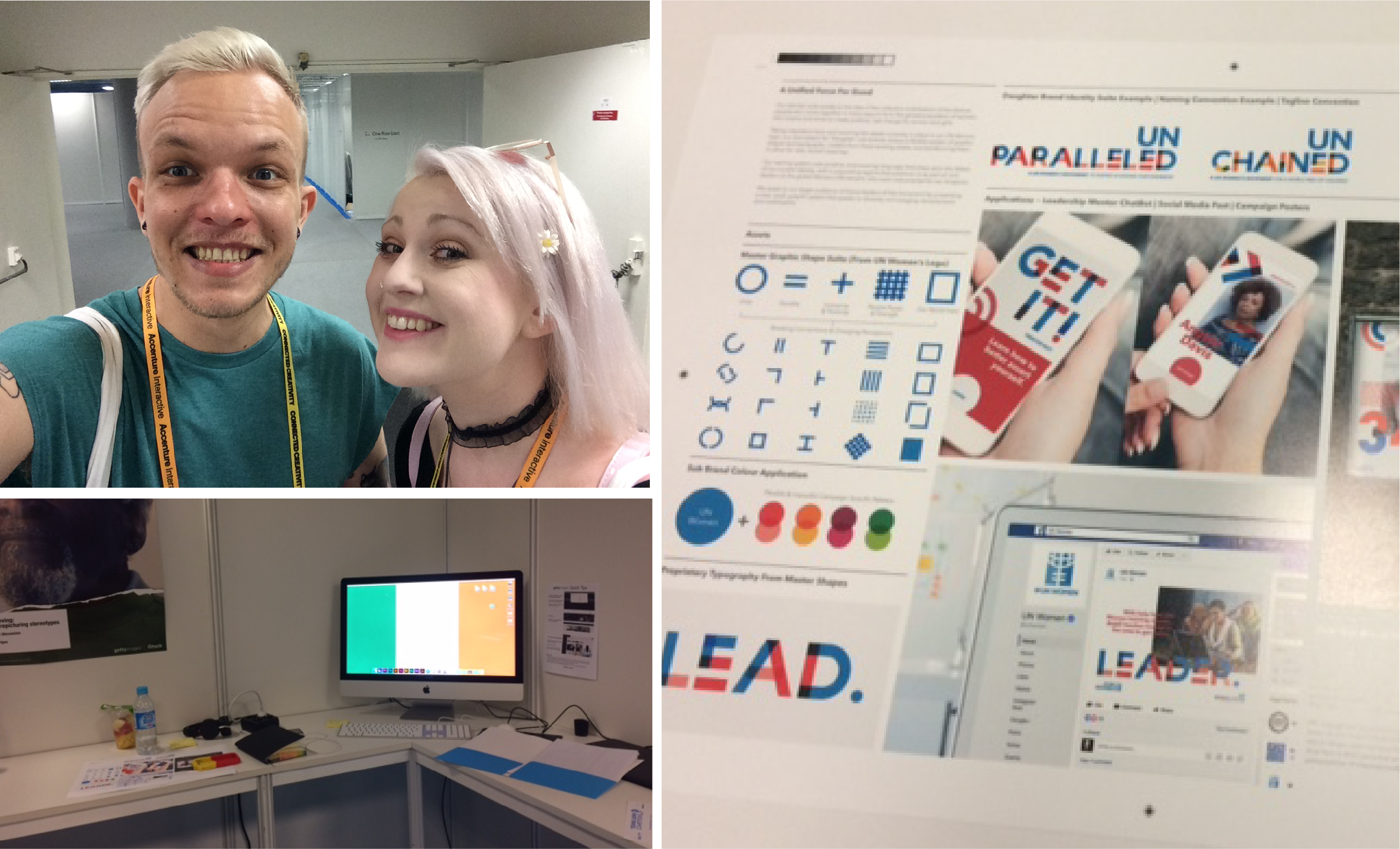
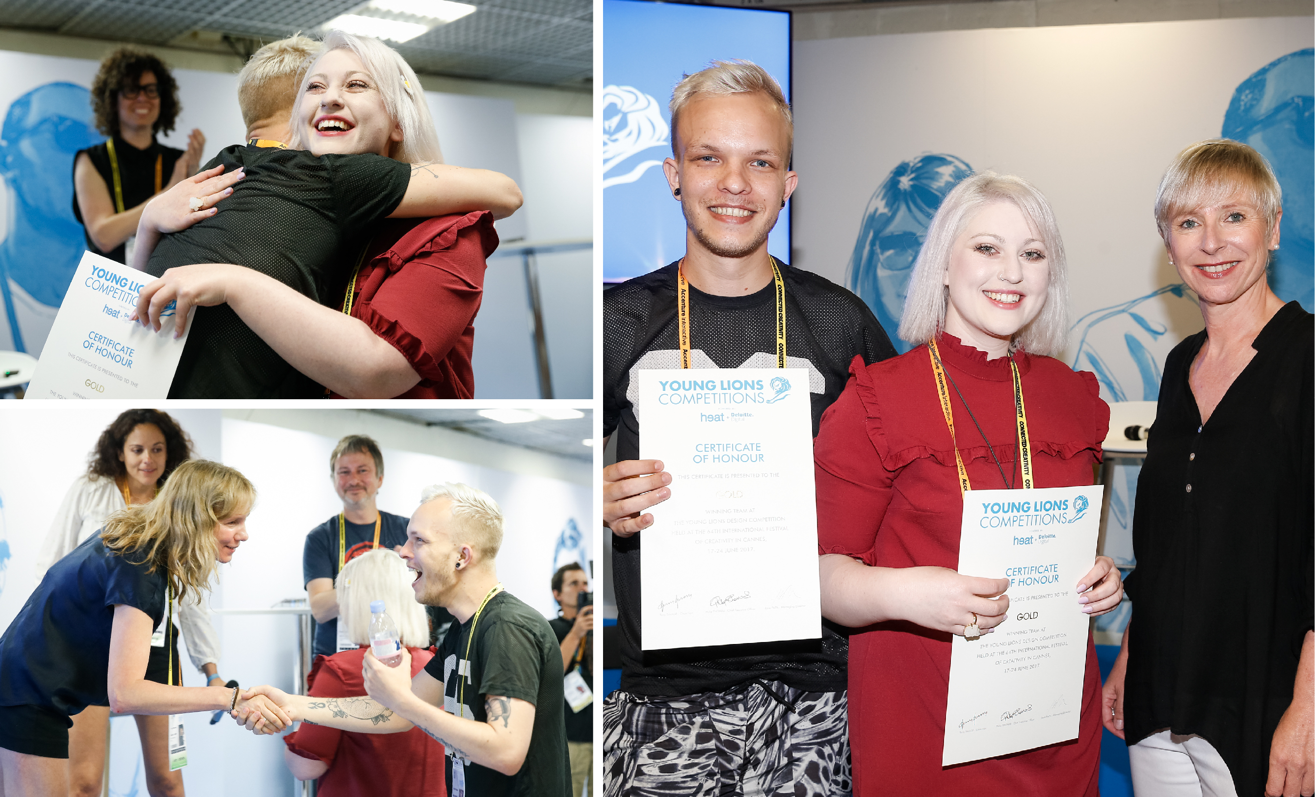
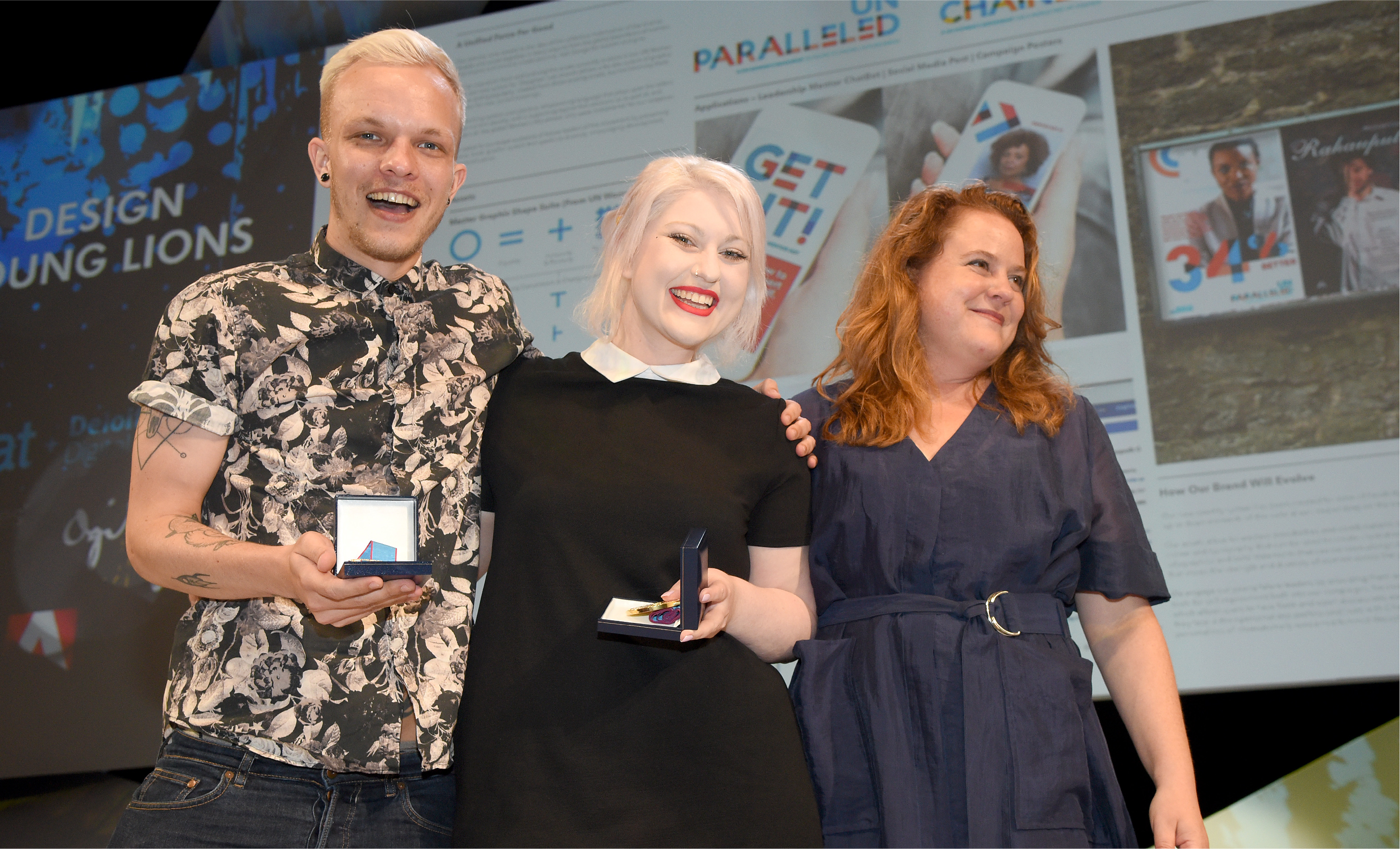

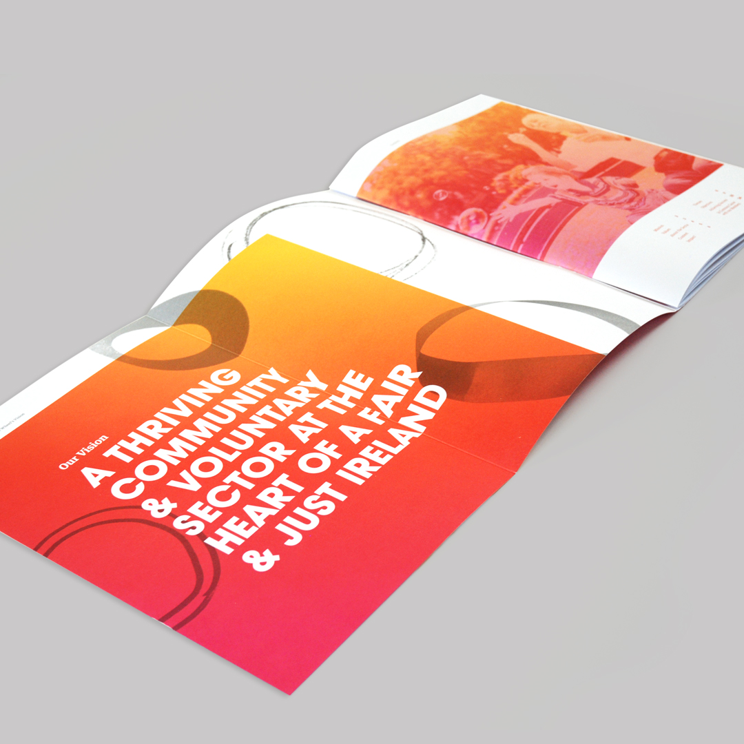
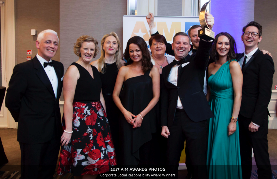
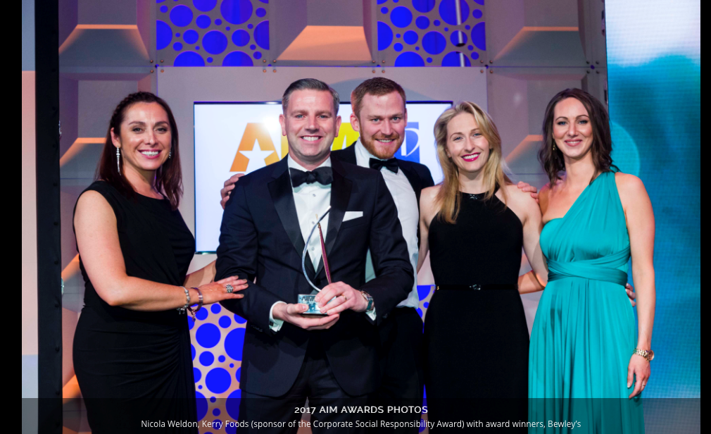
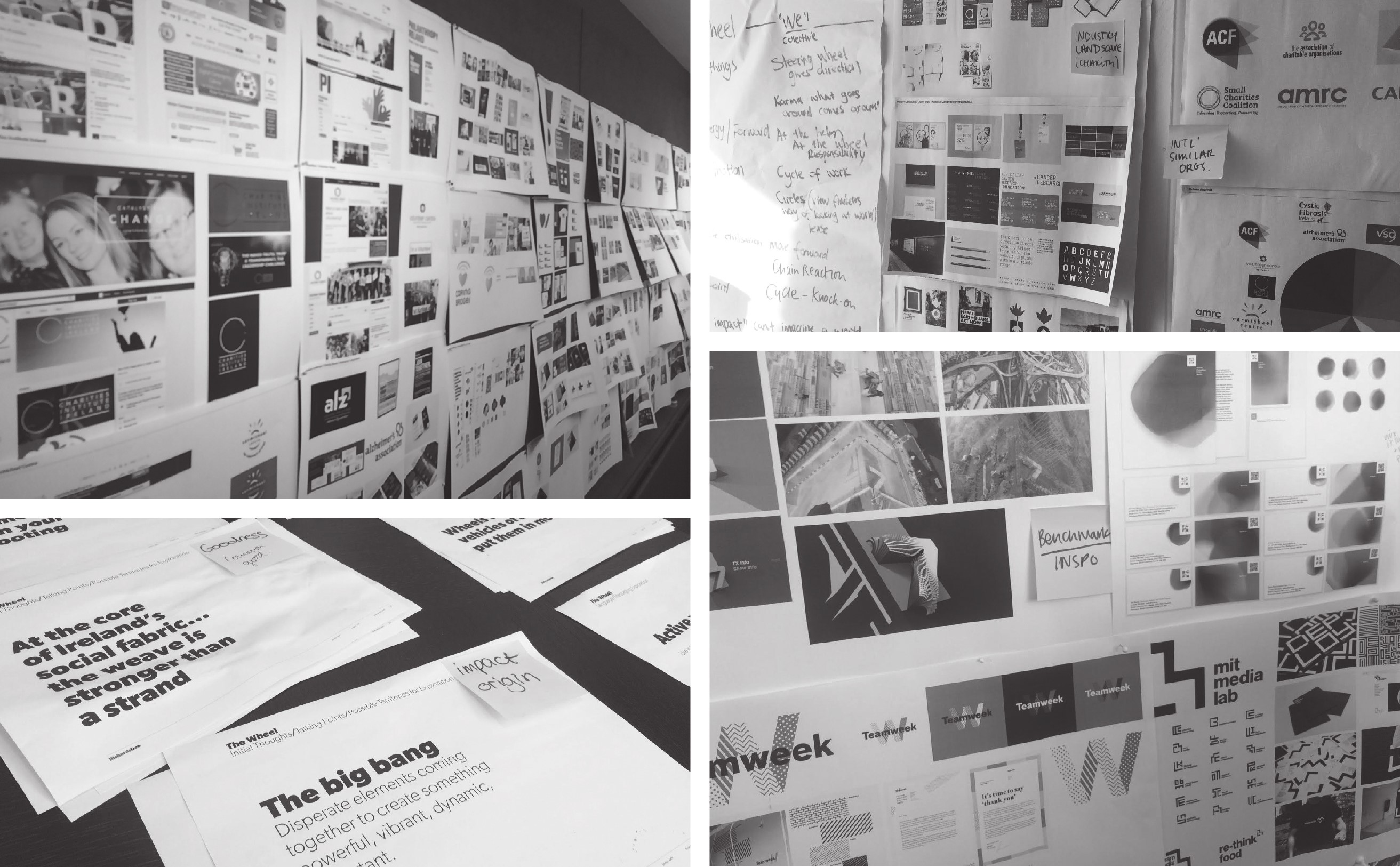
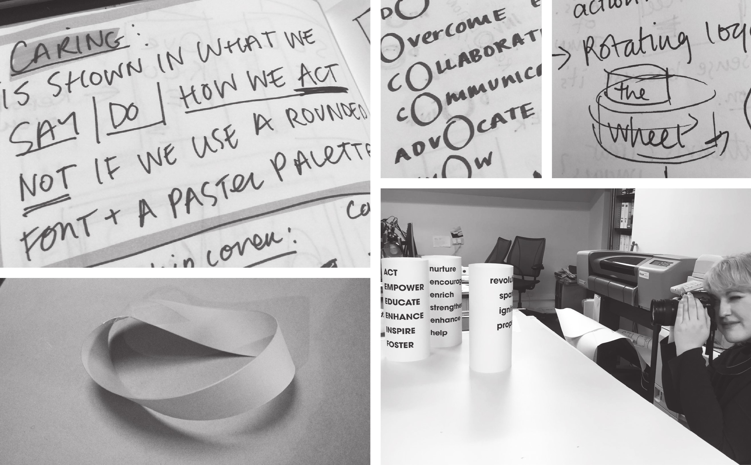
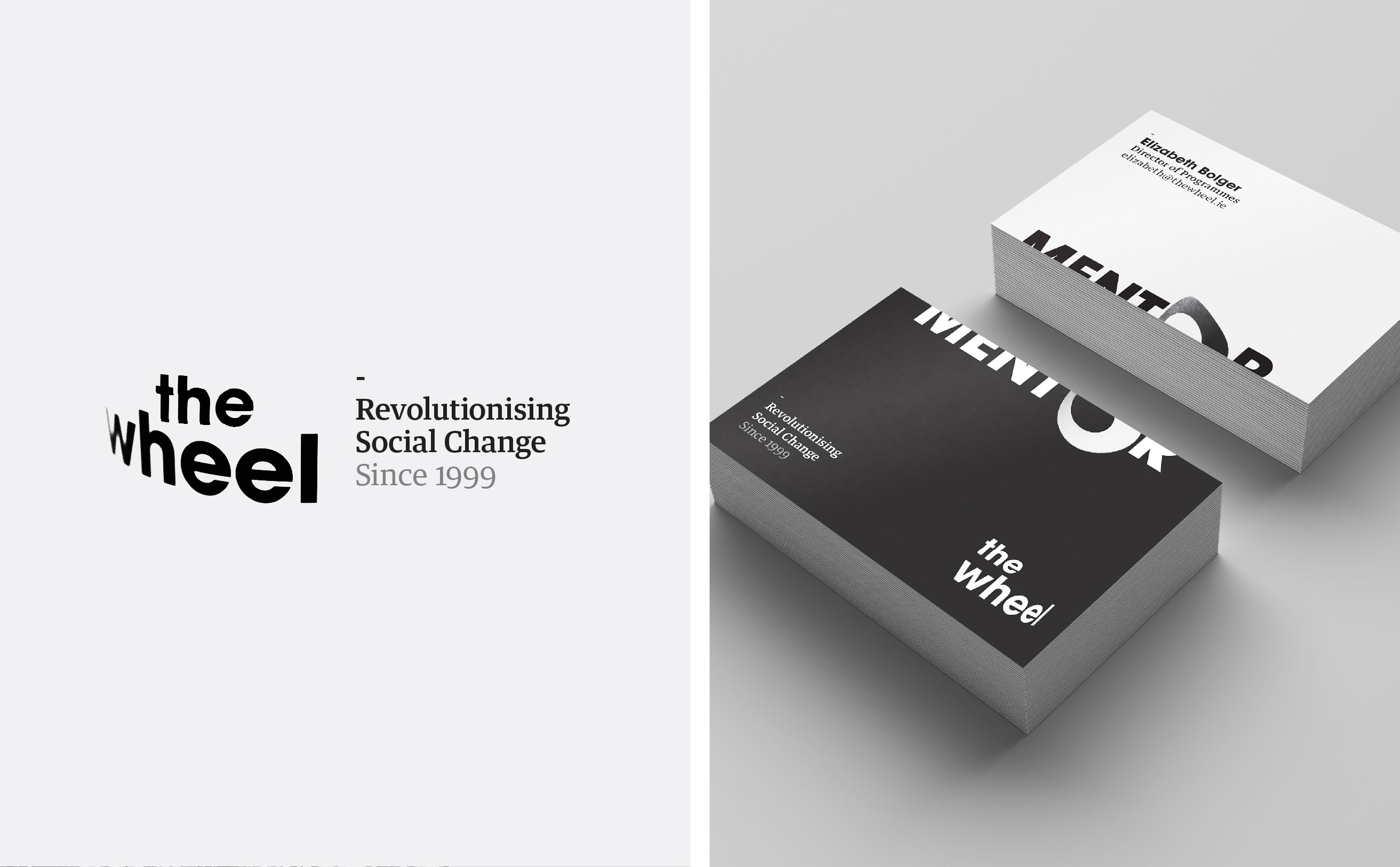


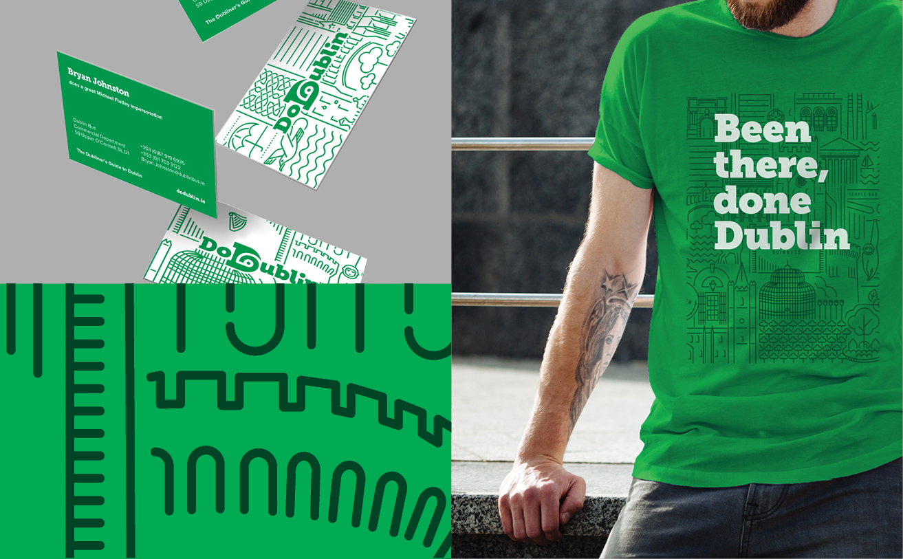


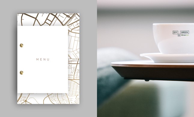
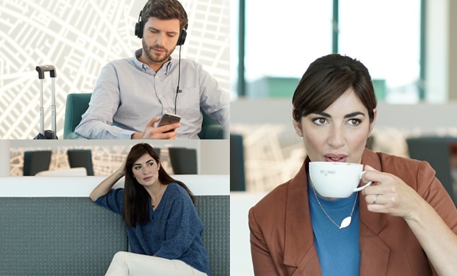
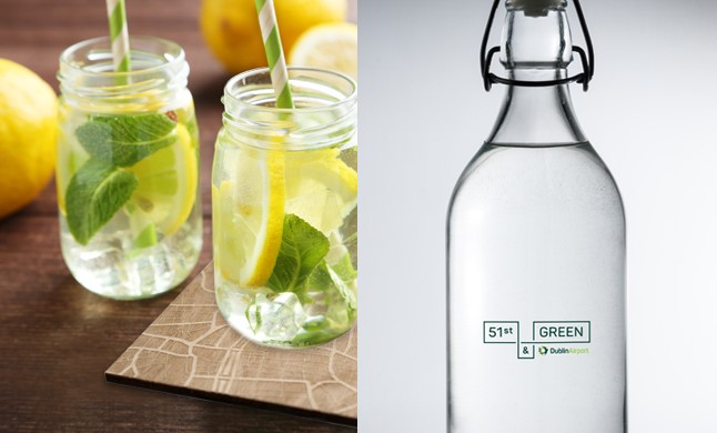
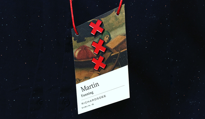
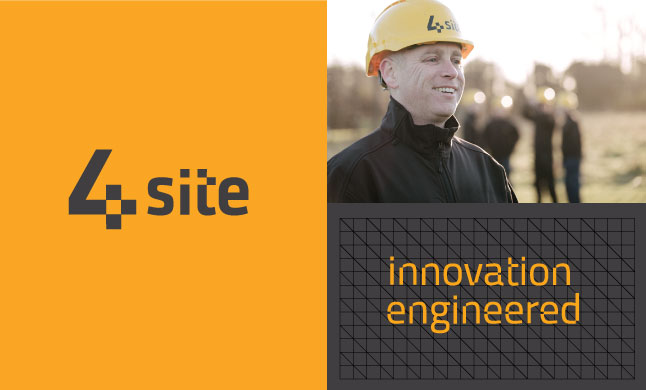
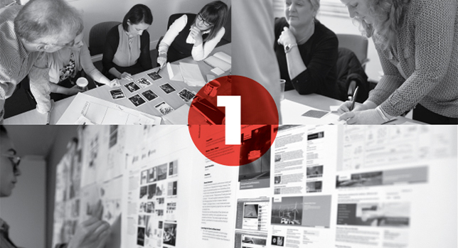
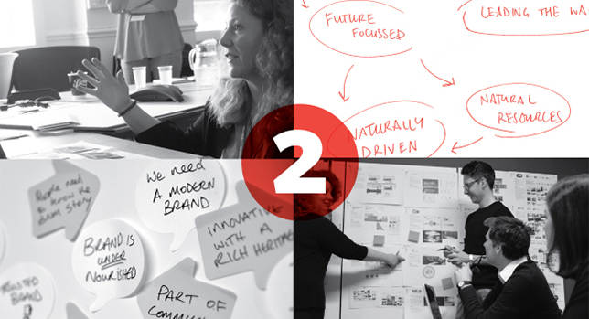
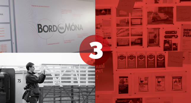
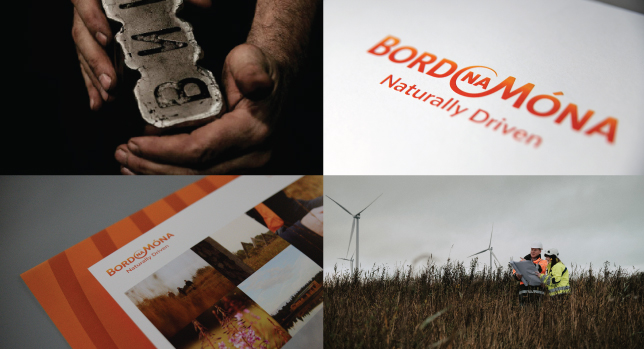