51st&Green – A Fusion of Ireland and America

It’s been over a year in the making, but our role in the creation of the new executive lounge at Dublin Airport is complete. Not only is this lounge the only US Preclearance lounge in Europe, it is the first lounge on “US soil,” outside of America.  Working across concept, creative direction, naming, brand identity and passenger experience, this week marks the launch of the lounge, where all of these elements can be experienced together for the first time.

From an initial brief to delivery, the challenge was to convey and position a new lounge experience that captured the crossing of time zones and countries. With a clear understanding of the audience, we considered spaces for play, work, relaxation and to explore the fusion of Irish and American produce. A key focal point was the idea of a barista, to reinforce the quality of experience and to create a talking point for the lounge. MCA Architects led the delivery of the built environment, bringing to life the concept through references to time and the brand colour palette.

2
Menu covers and delph.

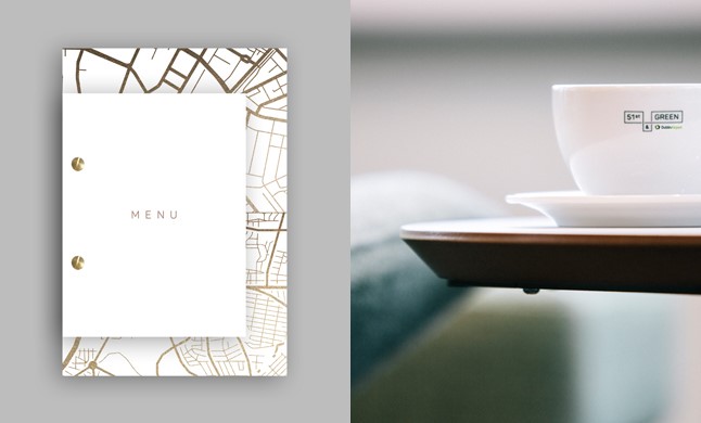
The name 51st&Green was inspired by the idea of an intersection; the fusion of the best of Ireland with the best of America. The 51st represents the creation of a new time zone – the 51st state of America and the Green is a proud reference towards Ireland and the new Dublin Airport brand. In addition, the construction of the name reflects a traditional American address, and this street sign concept is brought through in the style of the brand mark. This theme is continued across all key touch points to build the 51st&Green story.

This new lounge represents a place where Ireland and America connect; a place where people, time and cultures blend to create a truly unique lounge experience, and we are delighted to have played a leading role in bringing the vision to life.

#51standGreen

4

3

Branding For The Better

The power in your pocket to change the world.

In 1996, in partnership with the newly established Fairtrade Mark Ireland, Bewley’s were the first company to bring Fairtrade Certified coffee to Ireland. Now in 2016, Bewley’s are celebrating 20 Years of Fairtrade in Ireland and over 175 Years of great coffee and tea.

Inspired by Bewley’s 20 year relationship with Fairtrade we looked to the country that these first coffee beans originated from… Costa Rica.
Taking inspiration from Costa Rican and Central American traditional art and patterns we created a brand identity and look and feel that reflects this first pioneering move. The colour palette is rich yet natural and the system is flexible enough to work cross platform.

The campaign has been primarily activated across Bewley’s cafes, their HQ and social media channels.

Bew-FairTrade_5_Blog_646x390  Bew-Fairtrade_3__Blog_646x390

Bew-Fairtrade_2__Blog_646x390

A Nod to Bewley’s Unique History

As part of a wider programme focusing on tea, we were tasked with producing a set of ‘Special Edition’ teas to elevate Bewley’s tea credentials and to capitalise on the growth being experienced in loose-leaf tea. It was important that the pack design not only motivated consumers to buy the product but also helped share the Bewley’s story and deliver on their mission ‘To Delight the Senses’. Focusing on three of the best-selling variants, Darjeeling, Assam and Irish Breakfast Tea, the special edition teas needed to work both individually and as a set. The design also needed to take into account that the chests would be displayed in multiple locations – in cafes and restaurants to add theatre and interest as well as being able to hold their own and compete for attention on a retail shelf.

We recognised the opportunity to create a unique format for Bewley’s Special Edition teas that would build on the brand’s compelling history as the original independent tea importer to Ireland. In 1835, Samuel Bewley imported 2,099 chests of tea directly from China on the Hellas ship and in doing so, broke the East India Company’s monopoly. This story became the inspiration for the packaging. We used small wooden chests as a nod to the original format that the tea would have arrived in. The ship became the symbol of the Bewley’s spirit, taking pride of place at the top of the packs. The panel design uses elements such as the mosaic tiles from the Grafton Street cafe, creating a unique and ownable frame that is both attractive and functional. Colour was intentionally kept to a minimum in order to mimic the look and feel of the original stencilled chests; black being the predominant colour with a pop of brighter colour to differentiate between the variants.