After a short stopover in London for the prestigious 2024 Transform Awards, we were honoured to receive gold for our work with Debra Ireland.
The Transform Awards are one of the most celebrated accolades in branding, their focus on impact and performance over style and aesthetics setting them apart. This is incredibly important for us at RichardsDee as our primary purpose is to Design Meaningful Change for clients and their businesses.
That’s why when Debra won 3 of 3 nominations, we were delighted not only for the recognition of our partnership but for the amplification of the invaluable work they do for people affected by Epidermolysis Bullosa. This small but mighty organisation works tirelessly to transform the lives of people affected by this skin condition, raising essential funds and support for a cure. The visual shift towards positivity and empowerment now makes it an inspiring resource for families and people who live with all forms of EB.
As brand partners, we are thrilled by this acknowledgement and opportunity for the brand to continue bringing bold hope to everyone with skin as fragile as a butterfly wing.
We are delighted to win in the following categories:
🥇 Gold for Best Use of a Visual Property
🥈 Silver for Best Creative Strategy
🥈 Silver for Best Visual Identity by a Charity or NGO
What the judges had to say:
“In an increasingly alarming and alarmist world, charity communications often compete for the most emotive real estate. Debra, the charity supporting people suffering from epidermolysis bullosa, recognised that this wasn’t an effective strategy to serve all members of its community. Instead of focusing on suffering, they changed the narrative. It delivered a message documenting the fragility of the skin of those affected. The butterfly – beautiful, ephemeral – was the perfect visual representative.”
“I love, love, love this rebrand. It’s inclusive and beautifully crafted.”
We would also like to congratulate all involved and hope to be back next year.
We’ve been recognised as the Irish agency leading the way in design practices
Our drive to be a company recognised for our work, team and impact has been acknowledged by the esteemed Institute of Designers in Ireland. At their annual IDI Awards in November we were elated to win Design Practice Team of the Year 2023.
The judges noted:
“(RichardsDee) demonstrates how an Irish design agency can show up with heft as a trusted design partner for organisations across the private, public and civic sectors; as an employer that understands the need to develop and retain talent; and, as a fulcrum for community mobilisation.”
This award is testament to our dedication to our purpose – Designing Meaningful Change for our people, local community and our brilliant clients.
Meaningful Change centres around our foundational belief that our work makes an impact. That strategy, creativity and design combined can bring truly meaningful, positive and game-changing transformation. We’ve built our whole ethos, client mix, employee value proposition, outreach activities and ways of working around this vital purpose – and it’s evident in every endeavour we undertake.
In 2022 we celebrated 10 years in business, won four Transform Awards and began working towards becoming Ireland’s a B-Corp brand agency. This year we’ve partnered with exceptional mission-focused brands like DEBRA Ireland and Childline and are competing (and winning) against large global agencies for projects in Ireland and USA.
And, for our own team we’re making sure everyone feels inspired and supported to do their best work – including hybrid working, health insurance, finishing early on Fridays, birthday days off and paid leave for volunteering. We’re also dedicated to ongoing learning programmes to ensure people and careers progress.
There’s so much more to the above than one blog post can cover, but this gives a sense of how we’re achieving our ambitions as an agency and why we won this amazing award. The judges on the night commented:
“RichardsDee have a strong selection of projects that demonstrate strong originality and excellence… and have articulated a clear vision, for the organisation and for its people. A clearly evidenced commitment to learning, experimentation and innovation, with particular emphasis on providing space and financial support for the team to learn, develop, experiment, and thrive at work…”
We couldn’t of put it better. This Christmas and New Year we’ll be raising a glass to every one of our ambitious team members and clients who make us the agency we are…
FactoryXChange, a new European Digital Innovation Hub (EDIH) that is helping to accelerate digital transformation and make advanced technologies accessible to manufacturing startups and SMEs across Ireland. FactoryXChange is about adopting the latest technology, advancing industries, reshaping education, and propelling society forward through technology.
FactoryXChange recognised that to drive their digital transformation mission, they needed a brand strategy that would give direction and communicate the offer with clarity, and a distinctive visual identity that would stand out in a eco-system of many business support and funding organisations. To do this we were tasked with four key deliverables:
Customer first approach: Enabling a commitment to a customer centric approach that understands the needs and challenges that resonates with SME’s in the manufacturing sector.
Brand strategy: We developed a process that included a series of collaborative consortium workshops that explored the brand’s essence. and identified what set them apart. The collaborative workshops provided a chance to fully understand the needs of the target audience and how we could position FactoryXChange to connect with them.
Visual identity: Crafted with innovation, sustainability, and progress in mind, FactoryXChange’s visual identity incorporates design elements, a carefully chosen color palette, and a logo that stand out in the ecosystem of business support organizations. The design reflects their commitment to driving digital transformation.
Tone of voice: We established a tone and voice that permeates all communication channels consistently, effectively conveying the brand’s message. This ensures a unified brand experience for all stakeholders.
Driving Digital Transformation
With input from consortium workshops and stakeholder engagement we developed four key pillars to communicate how, FactoryXChange is committed to driving digital transformation across a range of sectors:
Community for Change: FactoryXChange brings together a community of businesses, innovators, and experts, all sharing a common goal – to advance digital transformation in manufacturing and beyond. This collaborative effort fosters innovation and progress.
One-Stop-Shop for Digital Needs: From artificial intelligence to robotics, cybersecurity to supply chain management, FactoryXChange offers a comprehensive range of services to meet the digital needs of the SME manufacturing sector.
Tech Translators: FactoryXChange goes beyond advocating for technology; they act as tech translators, bridging the gap between advanced technology and everyday people. This approach makes technology accessible, actionable, and impactful
Creating a Sustainable Future: Sustainability is a cornerstone of FactoryXChange’s mission. They not only adopt advanced technology but harness it to create a sustainable future for businesses, communities, and the environment. This commitment extends to every aspect of their operations..
Positioning FactoryXChange for Success
Built around the idea of ‘Manufacturing Digital Transformation,’ FactoryXChange’s brand identity places them at the forefront of digital transformation, with a specific focus on manufacturing 4.0
The new brand identity is built on the concept of their role as a connector and catalyst for change. This informed the design of a strong and confident new logo. To ensure FactoryXChange has an accessible and simple design narrative the overall system utilises and stripped back colour palette of black and white, with a yellow and green gradient that serves as a metaphor for change and forward momentum.
The challenge was to create distance from competitors and stand apart from each individual consortium member with no single member dominating.
Ideas Made Real is a school outreach programme designed to bridge the gap between curriculum and industry needs, championing the role of advanced manufacturing in our lives and opening young minds to the limitless potential of a career in STEM.
STEM education equips students with analytical, problem-solving, and critical thinking skills that are relevant to many careers. Furthermore, it fosters creativity and innovation, which are essential for addressing the most pressing challenges facing society and our world today
The Ideas Made Real program is a nationwide STEM and advanced manufacturing schools program from Irish Manufacturing Research (IMR) that empowers the next generation of makers with the tools for the future. We’ve been involved in helping with brand naming, brand identity, and the challenges of managing the many brands and organisations involved in this program. The objective was to inspire students of all ages to create, innovate, challenge stereotypes, pioneer new technologies and make their brilliant and bold ideas real.
Often, projects may seem straightforward at the outset, but as you unbox the complexities of branding programs and initiatives involving multiple stakeholders, branding projects can help create clarity regarding who should lead and who should endorse. In this case, we had to determine the correct branding relationship, whether the program should have its own name and brand or if it would add value and credibility by being closely associated with IMR.
Evaluating the correct branding relationships
Both options had merits, but when evaluating the outcomes, it became clear that this program needed its own name and brand assets while also maintaining a close connection to IMR. The rationale for this decision was that the delivery, content, and investment were made by IMR, so they should take credit for it. Additionally, IMR brought value and credibility, demonstrating that the program was run in association with a recognised and reputable body that could connect schools with leading manufacturers.
Brand naming and identity solution
Although the solution has a clear association with IMR in terms of colour, typefaces, and visibility of the IMR brand, the program required a shift in tone and language that could resonate with schools and students. It also needed a name that could quickly generate interest, be active, and serve as a signpost for the program. The name ‘Ideas Made Real’ was developed to work on multiple levels: it provides an understanding of the activities, emphasises creative opportunities in manufacturing, and is fun and straightforward. This naming structure allows ‘Ideas Made Real’ to lead communication with a close relationship to Irish Manufacturing Research and be used as an ingredient brand when courses are led by a third-party educational brand.
Upon launch, it became evident that the close association with IMR had two significant benefits. First, it lent the program credibility and expertise. Second, it added value to the IMR brand through the awareness, leadership and innovation-focused outreach program. While the final brand solution may appear simple in execution, the journey and process to reach this solution took time and involved input from various stakeholders. Success was evident in the adoption of the program by many schools.
We are delighted to announce the appointment of two new directors – Martin Fanning and David Dowling. Martin and David will join the founding directors Celine Dee and Simon Richards.
Martin has been with the RichardsDee team for 10 years and has led significant rebranding programmes for international brands such as Kerry, Alltech, Bewley’s and RDJ. Previously Martin worked with Radley Yelder, gaining a wealth of experience in corporate, B2B and state bodies – enabling him to lead a dynamic team and deliver compelling brand identity and expression programmes.
David has been with us since 2016 and has grown our brand experience offering across digital channels – as well as leading and designing national and international branding and comms programmes for brands such as Marketing Institute Ireland, Energia, Power NI, Indigo, Meili and more. David’s experience has led to a number of key client appointments and his forward-looking approach ensures our brands grow and flex to suit ever-evolving channels.
“The new appointments broadens our leadership team and helps us put in place a team that can help shape the future of the agency. We are incredibly lucky to see members of our team grow their careers within the business and become directors.”
Steve. Calm, considerate, thoughtful. With a desire to make everything around him better and the best that it can be. A friend, mentor, sounding board, co-creator, instigator and a touchstone for setting the standard in ideas and what they can become.
Twenty years ago, Steve joined Enterprise IG which became the Brand Union. It was here that he forged many relationships in Ireland and helped to inspire, mentor and guide clients and creatives, including myself. In these early years, every introduction with a new client was that he ‘was just off the boat’, establishing a sense of humour and fun in everything he did. However, just off the boat he wasn’t. He had an enviable back catalogue of brand identity programmes, awards and experiences that stood him far apart.
Steve had worked at Saatchi Design, followed by a role as Design Director at Newell & Sorrell. At the time, Newell & Sorrell was one of the places to work in London, creating ground-breaking brand identity projects, that Steve led for the likes of Selfridges, The National Lottery, Barclays and the infamous British Airways rebrand (Steve fondly talked of Margaret Thatcher’s handkerchief being placed over the tail fin and making the headlines). Following this, in 1988, he moved to Australia and joined the Organising Committee of the Sydney Olympic Games as Design Director, and subsequently FutureBrand.
As a younger designer to Steve, I was fascinated by these larger creative branding programmes. I had seen them in the D&AD Annuals, I read about them and while at Enterprise IG in 2002, his CV landed (however, it was pretty poorly designed – in Word no less, and with shocking indents and spacing). Steve came to meet Jim, Peter and myself, and with him was a tatty, felt black bag (something that seemed to be part of his identity ever since). It contained a treasure trove of brand guidelines, projects and experience. What a gift to be able to work with the person who had created these, to learn from him and ultimately enjoy a lasting friendship over these years.
One of the first projects we worked on together was the rebrand of Bank of Ireland. Enterprise IG had just won the account in Dublin and Steve was ready to lead the project. Little did we know that Bank of Ireland had just finished working with Interbrand in London, where Steve’s identical twin brother Andy worked – and, at the very first meeting, to the surprise (or horror) of the client they thought Andy had joined us! Apparently, Steve and Andy swapped roles quite easily – but those stories are for after the watershed.
Over the coming years, Steve would be the creative lead on some of the most significant rebrands in Ireland, including the GAA and National Lottery. As his role evolved, he eventually led Brand Union in Ireland to become more strategic and client-led. We drifted from each other while our careers and priorities changed. Unfortunately for Steve the coming years were to become unkind.
It was not until 2015 that our paths crossed again. Steve and his wife Tara came to ours for a summer house party and we talked and chatted into the early evening – great fun. Steve was starting to feel strong again and was keen to work, and for the next few years he came on board as creative consultant to RichardsDee. This suited Steve, Celine and myself well – Steve could find his feet again and focus on projects without the pressure of client responsibilities, giving him space to work with the team and to think more strategically on projects. One of these was a brand strategy project for Dublin Bus, who were evolving their brand following Transport for Ireland’s decision to roll out its own brand across Ireland. This was a perfect project for Steve, bringing his international knowledge, his warmth and fresh and bold thinking to the table – however, his idea to use an Irish animal on each mode of public transport did not see the light of day.
From 2017, Steve became a full-time member of the team. It was a delight to have him join Celine and myself and for him to be a sounding board for us, central in shaping our positioning and being able to be objective and reasonable when we were having to make tough business decisions. Steve saw the opportunity in everything, in every project and every person. He was able to set creative projects for the company that everyone could take part in, whether it was creating a mask or a record cover that inspired you – Steve always went out of his way to make sure that his own solutions to these projects were above and beyond. It was this vision, creativity and energy to do good that helped inspire our Creatives Against Covid-19 project, which had a profound impact on the design community and charities we fundraised for.
While his training may have been that of a designer, his wisdom, curiosity and ability to think big enabled him to play key strategic roles. Steve could bring a unique perspective, he was analytical but had that design and creative sense to always ask what if or why not? Steve and Celine developed a strong relationship quickly. Jim, Steve and I had a trusted kinship and together we went on to collaborate on projects for Kerry, National Broadband Ireland, House of HR, Irish Water, The Talent Club, Dublin Bus and BASF AG USA.
One of Steve’s biggest impacts was on the people around him, he was adored by our team. He had time for everyone and could help tap into the thinking of designers to uncover a deeper and stronger idea. Steve was a traditional designer at heart, in search of an idea, creative metaphor or play on words to bring to life a solution that had wit, style and interest. While his tool of choice (PowerPoint) may not have been the most effective, his thinking most definitely was.
He was constantly interested in design and the ways creativity is expressed – art, photography, writing, film etc… this always inspired me. Steve stayed enthusiastic about his craft – a genuine show of loving what you do and proving that your job can be your hobby. I think this was the case for him because he loved to work and to be set a problem to solve. Over the last year, and post his unfortunate stroke, Steve came back to the studio for a few days a month. He relished reconnecting with the team, and lit up being around creative projects that needed a solution. But in truth, Celine, the team and I benefited far more than Steve. When Steve was around there was a sense of calm, another leg to the stool and another kindred soul trying to make people, the work and our environment better.
There are very few people like Steve (apart from his brother) and he made his mark – on people, on clients, on brands and on many individuals who are all the better for crossing his path.
We will miss him dearly.
To fulfil Steve’s final wishes for his children – Grace and Charlie – we have set up a fundraising page, should you wish to donate.
We are delighted that our friends at Switcher.ie have been acquired by Mediahuis. Our work with Switcher.ie to reposition, rename, and rebrand from U-Switch highlighted the importance of creating an accessible identity that embodied the company’s mission and unique positioning. Much like our collaborations with Openet, 4Site, Dubray, and TDS to name a few, this acquisition demonstrates the long-lasting value of a strong brand persona. Switcher director Carl Gaywood notes in the Independent “the quality of the Switcher platform and brand is truly outstanding”. Well done Switcher.ie on this achievement.
Over the last year we have been working with the ambitious team at DublinBic to reposition, rename, and rebrand the organisation to become Furthr. One of its core brand expressions is the annual conference for start-ups, entrepreneurs, and investors, which features a new brand name and event branding – Furthr Festival.
Previously, this event was branded as ‘Futurescope’, with little reference to DublinBic. One of our recommendations was that this popular event should be a key expression of DublinBic and that they possess greater ownership and affinity to it. In doing this, the organisation achieves the awareness, takes command of this reputation-building event and obtains recognition for producing such a high-profile event.
In developing the brand for Furthr Festival and other events, our approach can be simplified to 5 key principles:
1: Invest in the master / parent brand Be proud of your own brand and the hard work put into making events happen. Take ownership and ensure your reputation, awareness and brand value grows rather than trying to build a new event brand that ultimately is creating its own destiny. It is ok to create standalone event brands if the parent brand wants little association with it, for reasons to do with risk, independence, or investment.
2: Know your audience Events have to reach many audiences, from academia to working professionals, specialists to a broad range of industry expertise. Ensure that you can create targeted communication to the audiences you want to reach and that these communications are interesting and motivating to them.
3: Invest key visuals Consistency of imagery is central to being remembered and getting cut-through. Develop a key visual as the foundation for the look and feel and a brand expression system can build form the key visuals to flex across many channels and communication touch points.
4: Focus on brand voice From headlines to emails, how you motivate audiences to engage and maintain a consistent communication trail without becoming monotonous is key to establishing a clear and identifiable personality for your brand. Your tone of voice is integral to your impact, so make sure you are communicating with your brand character in mind.
5: Make a plan and ensure you have the capabilities for ongoing marketing Develop a comms plan early on which deals with the many channels, and give thought to building awareness, consideration, purchasing, attending, and advocacy. Ensure you have the resources or a partner to assist in building and creating communications in an ongoing business.
2021 was an incredibly busy year in our studio. From new faces to new projects and group Teams calls to get-togethers, it’s fair to say there hasn’t been a dull moment. As the final few weeks of 2021 fade into a brand-new year with fresh surprises in store, we’re looking back on just some of the projects that we designed meaningful change for this year. And, if you have a strategy or branding project in mind for 2022, contact us at hello@richardsdee.com and you could find yourself on our list this time next year!
01 — Indigo
With Indigo Telecoms Group’s acquisition of our previous client 4site, we collaborated with the teams to define, design, and implement a strategic new brand built for the future of communication. By evolving the name to simply Indigo and the positioning to ‘Engineering a Digital Future’, as well as crafting an identity reflecting the new company’s three core offerings, a colour palette reflecting and complementing their name, a digital stream representing a future of limitless possibilities, and a brand voice and messaging deeply rooted in their core values, we helped set Indigo on their path to accelerating their growth strategy.
02 — Reitigh
2021 also saw us win new clients such as Reitigh, one of Ireland’s leading software companies solving the most complex processing challenges in financial services for banking, investment, and insurance enterprises. We worked closely with their leadership team to devise a unique set of values, a brand purpose, and a compelling promise as well as a strong design system and laser-focused messaging that brought their approach of ‘Always Simplifying’ to life. Plus, in the spirit of the festive season, we were even nominated for an ICAD Bell for our work! View more work here →
03 — Kerry
This year we helped Kerry look Beyond the Horizon with their stunning new pattern. Built in four layers to reflect Kerry’s From Food, For Food heritage, their strength in people, their unrivalled capacity for innovation, and their promise to reach over 2 billion people with sustainable nutrition solutions by 2030, the new hand-illustrated pattern brings their brand to life in miniature wherever it’s used. View more work here →
04 — MII
One of our biggest projects of 2021 was our rebrand of MII. Building on the brand strategy developed by Genesis, we delivered a revitalised visual and verbal identity system across the MII brand from the mark to a suite of impactful typefaces and the website to event naming. By amplifying MII’s role as the voice of authority for marketing in Ireland and an accelerator of marketing talent, we equipped the team with a brand that evokes their limitless ambition and radiates confidence. Read our full case study here →
05 — HOHR
2021 saw us appointed as Brand Partners to the Leadership team at the €1.6bn entrepreneurial powerhouse House of HR. Our challenge was to redevelop the Purpose, Vision, Mission and Values and crystalise these into a powerful creative strategy and identity system. Our solution was a rebellious and powerful system connected deeply to the brand we had defined previously, setting House of HR up for a bold and impactful future. Read our full case study here →.
06 — St. Vincent’s
For the third year running we produced St. Vincent’s Healthcare Group’s annual report. Designed around the theme of ‘Next Steps: Towards the Future of Healthcare’, we collaborated closely with the team at St. Vincent’s to deliver artwork and final layout for 2020’s report.
07 — Fáilte Ireland
2021 also saw us refresh the brand identity of Fáilte Ireland, Ireland’s national tourism authority. Building on the strength of the iconic shamrock, we imbued the revitalised logo with a sense of authority by reaching back to the classic identity born in the 1960s, as well as modernised the identity by refreshing the typeface, harmonising the colours with Fáilte Ireland’s regional brands, and reversing the mark from a negative shape (white) to a positive shape (green). Rich in storytelling, the new logo asserts Fáilte Ireland’s role as the trusted shaper of the tourism industry in Ireland. View more work here →
08 — Energia
2021 marked another busy year with one of our closest clients, Energia. As their longstanding brand partners, this year we collaborated on a range of exciting projects that unifies their brand experience across all channels and underpinning their mission. We have a number of interesting Energia projects on the go in our studio for 2022 in what will be a challenging start of the year for the energy sector.. View more work here →
09 — Irish Water
2021 also saw a stunning new photography project take off with our friends at Irish Water. Together, we embarked on a project to update Irish Water’s image bank to capture the scale and breadth of their investment in Ireland’s water infrastructure. In 11 days, across 28 locations around Ireland, we collaborated with photographer Keith Arkins to capture aerial and ground photography that visually evoked Irish Water’s national status from coast to coast.
10 — Childline
Just over a year ago, we won one of the most meaningful rebrands of 2021 – ISPCC Childline. Selected as brand partners to Ireland’s largest children’s charity, the past year saw us enter the worlds of children and ISPCC Childline teams across Ireland through workshops to discover how we could help ISPCC and their service Childline reclaim their roles as children’s advocates and allies. By crafting a visual and verbal identity deeply rooted in the vernacular of children while clarifying the relationship between the brands, ISPCC and Childline are established as the definitive destinations for resilience and support for generations of children to come.
11 — Studio Photoshoot
Earlier this year when we had the chance to safely – if briefly! – get back into the office, we took the opportunity to refresh our RichardsDee photography with the brilliant Josh Mulholland. Check out our sweet O’Connell Street space and the wonderful faces new and familiar that make it such a meaningful place to be. All it’s missing is a Christmas tree!
Every four years each nation presents itself in a competition for attention at the World Exposition. After a delay caused by COVID-19, Dubai hosts 2020 World Expo just outside the city, united under the theme of “Connecting Minds and Creating the Future.” The investment in infrastructure and services is typical of Dubai in scale, with expected crowds of 25 million over the duration of the event.
The World Expo is a great place to witness each nation’s branding and what they stand for, as well as providing a nation’s brand with the opportunity to get a sense of its reputation through environment, behaviours, narrative, and services. Stereotypes come alive, national pride can take over, and agendas become apparent. This year’s common themes centred on sustainability, mobility, and opportunity. Yet amidst this future-focus, Ireland was one of the few pavilions taking inspiration from the past, with a story of Ireland as the island of inspiration.
As each country tries to stand out, many build on the strengths of their visual identity assets. Germany and Switzerland were both rooted in colour and shape, while America built on the iconic star, and Belgium took cues from its cartoon heritage. Others looked past their current national identity with brave new ideas, including Austria’s multi-sensorial pavilion, the UK’s striking architecture inspired by Stephen Hawking, and Bahrain’s tightly-woven design visually presenting density as opportunity.
This visuality also helps to communicate the countries’ stories succinctly, even across languages. Visually compelling performances, such as Kazakhstan’s robot hand and dancer, can bring complex technology stories such as human and AI integration to life in a tangible
Inside each pavilion, the fun begins. Large format screens and projection are de rigueur amidst 2020’s offerings, and immersiveness is key. Each country distils and displays its culture alongside their superstar companies which elevate its status. From a bright and atmospheric whirlwind ride through Thailand, to a dreamlike night under the stars inspired by the First Nations peoples of Australia, and America and China competing through the lens of opportunity, seeking to outdo each other in the space race, each country seeks to exhibit progressive attitudes, never forgetting the softer side of power. Visually, it is an unbelievable overload. As a source of inspiration, ideas, and expression, being able to experience the diversity of executions on the same concept in one place is a treat.
The World Expo is a moment in time where a country should define their place in the world by telling the story as to why their nation is worthy of investment and tourism. A number of pavilions lose sight of this. It surprising how many narratives and stories get lost in the architecture and show stoppers. This is not about just turning up with the biggest and brightest. In contrast, the countries that truly stand out are those laser-focused on their themes. Norway’s pavilion centres on the ocean as a resource, while Estonia focuses on their digital lifestyle.
So, what is the purpose of a country at Expo? In practical terms, it’s a balance between business, investment, and tourism. But on a larger scale it’s also an opportunity to connect the stories, values, and visions of each country as a brand. Nations should use the event as a centrepiece to revisit and reinvigorate their brand as a global destination, and take advantage of the event as a launch pad to connect government services, present innovations, and display what makes them truly unique. Although World Expo itself is a bubble, the exhibits and the opportunities they present need to connect deeply to each country at home – this is a missed opportunity. For example, how many people in Ireland know what the Irish pavilion is communicating, has a connection to it or how Ireland is portrayed on a global stage? In this way, each pavilion would go further towards each nations’ branding objectives by acting as a compass to their identity and values.
In short, the World Expo is drama, scale, and theatre personified; a grand showcase of where each country has been and a statement into their future. The crackling energy of aspiration is evident, threaded from pavilion to pavilion and forging impressions of national brands visitors, governments and decision makers will take across the globe with them. It is, quite simply, one of the biggest shows on earth.
Discover Ireland is the consumer-facing brand of Fáilte Ireland, Ireland’s Tourism Development Authority. This familiar household name and brand identity had been in existence for many years, but it was time for Discover Ireland to be brought up to date and better represent Ireland’s tourism today.
Our task was to deliver meaningful change by re-establishing Discover Ireland as the only online destination for visitors seeking authentic experiences. For this well-known brand, we needed to ensure it was relevant to a domestic audience, impactful and distinct in a world of travel and tourism logos, and carried Discover Ireland’s personality and warmth into the digital domain. This was the definitive digital offering for holidaymakers looking to plan every aspect of a break, and the new brand needed to represent this in a contemporary, confident, and trustworthy manner in order to grow numbers and awareness. The brand also had to work as a B2B brand, working with established trade partners as a recognised brand that they respected.
Through our process of discovery, definition, and design we established creative territories exploring how a logotype can retain its sense of place through symbolism – in contrast to modern online brands which amplify simplicity over personality. Our solution was to draw inspiration from traditional Celtic letterforms and combine their authenticity and charm with a contemporary sans font to deliver on the objective of a forward-looking personality. This was partnered with a colour palette building on the familiar language of green for Ireland, with a brightness that encapsulates the fresh final identity of discoverireland.ie, perfectly adapting across the digital world.
“Just want to say thanks to you and the team for your work on Discover Ireland. I love the simplicity and craft in the final version”
Niall Tracey Director of Marketing, Fáilte Ireland
Looking for a new studio is a big ask; will it enhance the creative process? Is it easy for everyone to get to? Will clients get a sense of our ambitions? Will the area inspire and invigorate thinking? Does it reflect our culture and does it represent value? Looking for a new studio in a Dublin dominated by shared offices is a task, and after a year of looking, we found our new home.
Located on one of Europe’s great streets and in the very centre of Dublin, our new home is 32 O’Connell Street Lower. Reconstructed in 1919, and designed by Donnelly, Moore, Keefe & Robinson, the landmark building was the home of the Savoy Cocoa company – later bought by Rowntree. It seems very fitting that a confectionary company once renowned for launching great brands has its legacy living on in what we do.
Spread over 4 floors we now have a building dedicated to design teams, client areas and a reference library. But the real benefit of the new space is the following:
A dedicated 600 sq. ft workshop room where we can host or hire out the space for creative workshops, brainstorming sessions, presentations and meetings. A unique creative thinking space in the heart of the city.
An enviable rooftop terrace overlooking the GPO and O’Connell Street with unparalleled views, the perfect spot to host summer meetings or our Friday team show and tell.
On Saint Patrick’s Day the rooftop served as one of the best vantage points from which to view the parade. Agency friends and family enjoyed the views from the balcony which is almost within reaching distance of the spire on O’Connell Street.
The location means that we can promote the use of public transport, be near to retail influences and ensure that access is easy from all sides of town. While you might not be able to park outside the door (this was not the goal), we wanted a space where we can be inspired and energised, a space (forgive the cliche) that we are proud to call our home.
The Aer Lingus brand identity was in need of an update. Now twenty years later, Aer Lingus has embarked on a significant programme to overhaul its brand identity with a more “modern and fresh” image. In the past decade, the brand identity had transitioned from a dot.com sales logo to a well presented commercial brand. But it never recaptured the uniqueness, warmth and personality established in the rebrand completed 20 years ago – which was a benchmark in how an airline uses all experiences to reinforce a brands reputation.
Now the brand refresh has been launched how do we assess whether it is good or bad? At RichardsDee our viewpoint is that branding has to create meaningful change, helping brands adapt, motivate, grow and be the best that they can be. Great branding programmes start with real problems, real insights and a strong brand platform of vision, mission, purpose and personality, executed meaningfully across people, products, services and communications – a brand is what a brand does.
One problem that may have existed is getting to understand what Aer Lingus’s positioning was, the brand had been stuck between a value operator and a flagship carrier, trying to compete with Ryanair or position itself as a great flagship carrier like Swiss or Lufthansa. While the launch video explains the rationale, position and process, little has been written in the press about how the brand refresh will support the business case or assist in repositioning the airline, or how the brand experience will change in offering new products or services that will differentiate and motivate customer to chose them, rather than price. We do know that the new brand refresh is to reflect an international airline that connects, bring to life its value positioning and an airline that is in touch with modern Ireland.
In regard to the new brand refresh, there has been a lot of emphasis on the execution rather than how the brand is defining the future of how customers will experience Aer Lingus and how its reputation will be maintained. The shamrock takes centre stage, it retains its warmth and emphasises the hearts which is a good idea. The style elevates a consumer-centric carrier rather than a premium leader. The symbol features a 3D effect, but the shadow and depth of colour already looks dated, and when is a tilted shamrock not a shamrock falling over? Unfortunately, the brand refresh is lacking a bigger idea, the shamrock seems to be the idea and is placed everywhere and has become a shorthand to “an Irish welcome” even on the front of the door that is usually hidden? The font for the logotype brings a contemporary twist to the logotype, but the restyle ‘g’ does look awkward and unbalanced with the rest of the characters.
The new brand removes one of the brand most distinctive assets which is the heavy use of green on the livery. The new livery is lighter, modern, conventional and falls in line with fellow IAG stablemates Iberia, and maybe a potential design direction for Finnair and BA. Futurebrand’s rebrand of American Airlines created an ownable and dynamic retake on American symbolism without being overtly patriotic.
Overall it is and credible and consistent brand identity, it is true to its past but the refresh does little to communicate their values of strength and confidence, the refresh goes little further than addressing the cosmetic elements of the brand and helping the brand to look less like a national flag carrier and more accessible to a wider range of travellers. This was an opportunity to use the brand refresh as a principle to communicate clearly a focussed positioning, establish a leadership stance in introducing new innovative products and services and create a sense of purpose in the brand for the employees.
In contrast to this Alaskan Airlines went through a similar refresh by Hornall Anderson, but the launch established why, how and what the new brand will do for the business and customers. Alaskan Airlines grounded the refresh with research and in-depth conversations with flyers, they were clear in the goal the brand needed to make them look bigger, the brand became a lens to curate each travel touchpoint, they led with clarity in how the travel experience will become better including locally inspired food and craft beers. And, they went back to their roots, to the native artists in how their symbol of the Eskimo become modern, yet was respectful. The refresh wasn’t about revamping the identity is was making it relevant for “Today” – all supported by research to ensure that the refresh changed perceptions of the brand.
Maybe, the real brand story is not about the shamrock, nor the brand refresh, but that Aer Lingus is moving away from a national flagship brand to positioning itself as a value operator with great connecting choice. Aer Lingus should be more than a brand that uses the shamrock as a shorthand, it is a brand where the warm, friendly welcome of Ireland runs through its people, and that the airline is an international player with Ireland at the centre – helping to connect and bring people together. If this is the case, then the discussion around the new brand ident should focus less on a stylised tilted shamrock and more on the positioning, the personality of the people in the brand and the progressiveness in how the brand will define the future experiences.
We are are on the hunt for curious, thoughtful and talented designers, as well an organised, insightful and imaginative account director. At RichardsDee we believe design has the power to inspire positive change in businesses, brands and the world in which we live. Design that is purposeful and driven by insight inspires employees, changes perceptions and motivates customers. We call this Designing Meaningful Change. And we do it daily for local and global brands through designing brand strategy, brand identity and brand experiences.
Account Director
We are looking for an energetic Account Director who is experienced in brand positioning and generating insights and propositions that shape and influence the direction of our clients brands. You will have experience developing existing client relationships and growing new ones. Ideally you have worked for a number of years at leading national or international agencies and have a track record of leading, managing and inspiring clients to move their brand forward. We are looking for someone whose love of brands and strategy is evident, someone who wants to make an impact on businesses and be part of an energetic team to design meaningful change.
Senior Designer
We are looking for curious, thoughtful, experienced and passionate Senior Designers who can deliver understanding, ideas and creativity to the exciting projects and clients we are working with. Ideally you have worked for a number of years at leading national or international agencies and have a track record of award worthy, idea driven and strategically sound creative projects. We are looking for someone who loves working on branding projects and who is not afraid to challenge how brands can be expressed or should be experienced. You will get to make your mark on significant (and small) branding projects, be part of an energetic team and work closely with clients to design meaningful change.
Designer
We are on the hunt for designers who can bring creativity, energy and problem solving skills to the exciting branding and design projects we are working on. If you have had a couple of years experience at known agencies and are looking to work with a team on significant projects that will help you develop your career then we would love to hear from you. We are looking for someone who wants to do the best work possible, be part of a team and can bring a creative edge – attention to detail and excellent technology skills are a priority. You will get to grow your career, work with a passionate team and work on projects that will define your portfolio.
Looking for a meaningful change and to be part of a growing and ambitious company, then drop us a line at jobs@richardsdee.com
A recent article by Gillian Tett highlighted the concept of ‘normalisation of deviance’. This concept was identified by Nasa twenty years ago, and highlights that disasters cannot always be blamed on a single, catastrophic decision by a leader. Instead, they often occur because people inside institutions start to make numerous small decisions that stealthily change their concept of normality. Simply put, breaches that appeared so small, became the norm, until a significant event happened that demonstrated the complacency – in this case the Challenger disaster. While this tragic event cannot be compared with the management of a brand identity, the concept is very relevant to show how brands and brand experiences can weaken over time through actions, behaviours and communications that have not been considered through the brand lens.
Strong and meaningful brands are focused, cohesive and motivating, but when brand applications and brand experiences break the rules – however small – this becomes the new norm, and the accepted way of doing things. This is until a tipping point emerges and the brand appears fragmented and starts to lose its credibility and position, allowing competitors in, or it results in a brand that fails to inspire and motivate.
It’s very easy to focus on the exciting, big ticket marketing applications, but a badly worded or laser printed directional sign, a small shift in the reproduction of colour on a brochure, inconsistent typography in digital comms, an uncared for reception, deviation in tone of voice or a general lack of attention to detail – all amount to small changes to a brand that can contribute to the breakdown of a strong brand identity. In all cases, good intentions were at the root of the actions, but it is a consistent issue that we see with companies – not paying enough attention to the small items, all of which add up to ensure that the customer experience is seamless.
So, what can be done to minimise the impact of ‘the normalisation of deviance’ in branding?
Understanding – anyone who has the responsibility to implement a brand touchpoint – however small – needs to understand the personality, parameters and the rules of the brand. This can only be done through proactively sharing what the brand stands for, the brand assets and the expected brand standards.
Tools – To apply the brand consistently and with expedience, branding tools are required to produce communications to exacting standards. This may include digital guidelines that everyone can access easily; standards for all types of communication; or prototyping and visualisation to establish best practice and lead by example.
Management – Constant care and attention is required to manage the brand at ground level and from a strategic point of view. Attention to detail is key across all applications ensuring the customer experience is seamless. Any applications deemed “not on brand” need to be removed and made good.
Energy – Passion for the brand and continuous improvement requires energy and commitment – it requires getting people on board with the vision and instilling in them the drive to make it happen. There is no room for complacency or an ‘it will do’ attitude. Either will result in a weakness in your brand. Nor is it a 9 to 5 job. If you see an issue, and inconsistency or an application that does not make you feel proud, then fix it.
We are very excited to announce that our designers, Emma and Kyle, have won the top prize, representing Ireland in the Design category at the Cannes Young Lions Festival.
Their brief was to create a visual branding system which would “evolve and build on the UN Women Campaign” with the ability to grow and develop over time on a national and international level.
Following the 24-hour brief set by the United Nations, they took home the Gold Award, fending off competition from over 22 other countries. This is the first time a Gold Award has been won by an Irish team at the internationally renowned creative event.
IAPI announced today the winning teams who will represent Team Ireland at the annual international Cannes Lions Festival in June. We are delighted to confirm that our rising stars Emma Wilson and Kyle Schow have been selected to represent the country in the design category.
Emma and Kyle were briefed to rebrand The Wheel, a really exciting representative body connecting community and voluntary organisations and charities across Ireland. We are incredibly proud of their fantastic achievement, even more so knowing that over 200 creatives vied for a place on the team by entering the IAPI Young Irish Lions competition held throughout February & March.
This summer will see the largest number of Irish Young Lions since the festival’s inception 60 years ago and we wish our super stars the very best on their exciting journey.
“The standard of entries for the national heats was incredible. This is our 4th year taking a team from Ireland over to Cannes, it is a real opportunity to learn about the best marketing communications worldwide, future trends, to perform on a world stage and propel their career to the next level. ”
– Tania Banotti, CEO of IAPI.
For more information, contact: Simon Richards, Creative Director, RichardsDee.
The 2017 Airline Economics Conference is taking place in Dublin’s Shelbourne Hotel this week and is attended by airlines from across the globe with specific interest in finance and leasing. The theme of the conference is Growth Frontiers, a name perfectly suited to our client Goshawk who themselves have undergone significant growth since their inception only 18 months ago.
We were appointed as brand partners to Goshawk, an aircraft leasing company, with the focus of rebranding this young, but highly experienced team of aviation experts. In a short amount of time the company a committed portfolio of 89 aircraft with an attributable value of approximately US$4.4bn. Achieving these numbers in this short amount of time is reflective of the high level of ambition within the company.
Our creative solution for them had to be equally ambitious. Having reviewed their international peers, we identified a very conservative approach to brand and communications existed. Many employed the old trusted blue colour of financial institutions, however we wanted to reflect the passion and ambition within the company, therefore choosing a vibrant red to orange gradient as the primary colour palette.
This bold gradient brings energy and dynamism to communications when used in combination with the new photographic style. Black and white images of open skies and horizons reflect the Goshawk approach of looking at things differently than their competitors while the use of a handwritten font reflects the personality of the company.
Ireland’s Biggest Coffee Morning for Hospice together with Bewley’s, is 24 years old. In over two decades, Ireland’s longest running one day charity event has raised over €32 million for hospice care nationwide and served over 16 million cups of coffee.
However, the non profit landscape is changing. There are more charitable organisations in Ireland, with more fundraising initiatives to compete with, than ever before. Donations are down, consumers are skeptical and contributions to ensure the vital services of hospice groups to our communities, are being challenged. Hospice services remain in desperate need of funding and in many areas around Ireland, there is a real lack of available services.
We all know people who have been supported, comforted and cared for by hospice services. Staff work tirelessly to help patients to live life as fully as possible with dignity and comfort whilst making the most of precious time with their family and friends. Realising first hand the critical nature of these services, we were delighted to come on board to transform Ireland’s Biggest Coffee Morning for Hospice supported by Bewley’s.
We began with stakeholder workshops to get under the skin of what the event was all about. We conducted international benchmark reviews and positioning studies on all Irish same day charity events. As a team, we rewrote the campaign ambition, aligning everyone behind a huge, audacious goal.
e created a campaign identity that brims with personality, its loose typographic style feels personal and everyday, rather than institutional, reflecting the deep personal nature of the services delivered. Our key visual is a coffee cup with the sun rising in the background and our optimistic orange colour palette reflects the comfort and care provided by the staff.
We set about developing a messaging system elevating why this campaign is so important. A core message being that all money raised locally, stays locally. So by supporting the campaign, you are supporting a vital resource for your local community.
Our next requirement was passionate brand ambassadors, ambassadors that had experience with hospice, and that could speak fluently about the importance of supporting the campaign and the impact the monies raised made at local level. To date, Domhnall Gleeson, Brendan Gleeson, Imelda May, Gabriel Byrne, Mario Rosenstock and a host of other high profile advocates have readily come on board to support and promote the day.
The campaign launches this week and Ireland’s Biggest Coffee Morning for Hospice is on Thursday 15th September 2016. We’re hosting a big coffee morning in the studio and are asking all our agency friends and clients to register on hospicecoffeemorning.ie to host a coffee morning at your workplaces. If you can’t host one, please donate online at hospicecoffeemorning.ie where you can select the hospice you want to donate to. Remember, all money raised locally, stays locally and in this campaign, every cup counts.
It’s been over a year in the making, but our role in the creation of the new executive lounge at Dublin Airport is complete. Not only is this lounge the only US Preclearance lounge in Europe, it is the first lounge on “US soil,” outside of America. Working across concept, creative direction, naming, brand identity and passenger experience, this week marks the launch of the lounge, where all of these elements can be experienced together for the first time.
From an initial brief to delivery, the challenge was to convey and position a new lounge experience that captured the crossing of time zones and countries. With a clear understanding of the audience, we considered spaces for play, work, relaxation and to explore the fusion of Irish and American produce. A key focal point was the idea of a barista, to reinforce the quality of experience and to create a talking point for the lounge. MCA Architects led the delivery of the built environment, bringing to life the concept through references to time and the brand colour palette.
Menu covers and delph.
The name 51st&Green was inspired by the idea of an intersection; the fusion of the best of Ireland with the best of America. The 51st represents the creation of a new time zone – the 51st state of America and the Green is a proud reference towards Ireland and the new Dublin Airport brand. In addition, the construction of the name reflects a traditional American address, and this street sign concept is brought through in the style of the brand mark. This theme is continued across all key touch points to build the 51st&Green story.
This new lounge represents a place where Ireland and America connect; a place where people, time and cultures blend to create a truly unique lounge experience, and we are delighted to have played a leading role in bringing the vision to life.
A small team of us attended the Brand Neiuwe Conference in Amsterdam – a symposium on the latest thinking and direction of brand and brand identity. The two day event gathered together over 300 global leaders of branding to hear from the creators of case studies that have generated interest such as The Premier League, Spotify, Mozilla and Helsinki Philharmonic Orchestra.
From seasoned professionals, who presented with confidence and gusto, to smaller agencies sharing projects for the first time. The subjects covered were varied and included topics such as, new processes for large and small-scale branding programmes and insights into managing the fallout when a brand is launched and subsequently blasted on social media.
Particular attention was given to the branding process. The importance of digging deeper to discover distinctive brand pillars and focusing on who you are doing this for – the audience. Consideration was also given to leading clients through creative work. Every case study was exemplary in standard, and the passion and insight from seasoned practitioners confirmed the reasons why we got into the industry in the first place – to be creative, to challenge, to have a point of view and to have fun.
Highlights included:
– “The Simplification of the Process” by Michael Johnson and his insight into connecting strategy with creativity
– Sagi Haviv and his sharing of a number of case studies and the pitfalls of these projects in a humorous and down to earth manner
– Brian Collins and his passion for design, his team and their projects
– DixonBaxi on being restless and always pushing forward
– Essen International for being the nicest guy presenting
– DesignStudio for the insight of the process and the championing of what we do
Thanks must be given to Armit and Bryony, of UnderConsideration, for putting the energy and time into the event and for creating a compelling conference that focuses on the process, projects and people.
Bord Na Móna has ambitious plans to become number one in each of their chosen segments, employ 3,000 people, turnover in excess of €1billion by 2030 and reposition the business as global leaders of the future.
We were invigorated by Bord Na Mona’s ambition. But we knew their current brand experience was not up to their new vision. We worked with the team over the past year in a three step process to realise their vision.
We created a programme of work that included a comprehensive brand audit, benchmark and competitive studies, consultative interviews, cross functional team workshops, consumer research and designed a creative process that would successfully reposition the business and bring all stakeholders along the journey.
Through the discovery and insight stages, we unearthed a “brand truth’’, that Bord na Móna is Naturally Driven. Naturally Driven not only speaks to the expertise and the innate ability of Bord na Móna employees to take something ordinary and make it useful, but to their drive to make the most of our natural resources to provide sustainable solutions to the diverse challenges being faced.
With the new brand truth established and a robust master brand strategy in place, we set about developing the brand identity system.
We identified much of the brand fragmentation had arisen from acquisitions that were diluting the master brand and encouraging the divisions to operate autonomously. Our initial objective was to design a fluid system where all existing and future companies would align behind one brand, and embrace one culture to deliver one vision.
By working in an agile and collaborative way, the outcome is a confident and energetic brand system that both reflects and galvanises the ongoing evolution of the business and their ambitious commitment to making a difference to people’s lives, the economy and the planet we live on.
To ensure the successful integration of the visual identity system, we have developed brand guidelines, toolkits, and continue to host workshops both for internal stakeholders and partner agencies.
In 1996, in partnership with the newly established Fairtrade Mark Ireland, Bewley’s were the first company to bring Fairtrade Certified coffee to Ireland. Now in 2016, Bewley’s are celebrating 20 Years of Fairtrade in Ireland and over 175 Years of great coffee and tea.
Inspired by Bewley’s 20 year relationship with Fairtrade we looked to the country that these first coffee beans originated from… Costa Rica.
Taking inspiration from Costa Rican and Central American traditional art and patterns we created a brand identity and look and feel that reflects this first pioneering move. The colour palette is rich yet natural and the system is flexible enough to work cross platform.
The campaign has been primarily activated across Bewley’s cafes, their HQ and social media channels.
RichardsDee is Ireland’s leading brand and design agency and we are looking for senior and mid-weight creative and conceptual brand designers to join our growing team. The ideal candidates will be self-starters, ambitious, articulate, upbeat and have a strong understanding of brand and corporate identity. The candidates will work in teams that are fun, hardworking and love what they do. You will work alongside the Creative Director and Client teams in developing and building brands that are changing categories and evolving industries.
Senior Designer- Brand Identity Experience- 6 years +
Responsibilities:
•Create impactful and memorable visual experiences for a range of ambitious clients
•Generate and produce great ideas and design executions that are underpinned by brand and business strategy
•Execute and produce design communications for diverse media
•Collaborate and coordinate with all internal agency disciplines from strategy, creative, project management and implementation
•Work passionately with our external partners, from photographers to illustrators and typographers, ensuring we deliver world class responses to briefs
•Continuously develop and participate in external activities on an ongoing basis for personal development and as a source of inspiration
Skills and Experience:
•Exceptional creative talent
•Strong written and verbal communication skills
•Strong organisational and time management skills
•Strong presentation skills and leadership qualities
•Experienced in all current design software
•BA degree in graphic design plus 6+ years of related experience
•Experience with motion graphics and a working knowledge of digital design
Mid-weight Designer- Brand & Packaging Experience- 3 years +
Responsibilities:
•Be confident in brand and packaging and in presenting your work, both internally and to clients
•Be able to excite and inspire people around you – both colleagues and clients – while earning their respect and confidence
•Be able to make bold, clever design decisions and bring others with you
•Be great at organising and prioritising your workload
•Bring a strong creative point of view to the agency
Skills and Experience:
•A brilliant creative thinker, with the ability to challenge and push comfort
•Obsessed with both craft and detail
•Comfortable engaging with the strategic dimension of our work, able to get under the skin of clients’ issues
•Articulate, confident and assertive in presenting work
•Highly collaborative, able to build strong relationships within design and across the business
•Excellent typography and brief taking skills
•A good awareness and keen interest of packaging in the market today.
•Print and new media exposure and good knowledge of print and various print processes.
•Experienced in all current design software
Please submit CV and a low-res PDF of work to simon@richardsdee.com before March 10th.
As part of a wider programme focusing on tea, we were tasked with producing a set of ‘Special Edition’ teas to elevate Bewley’s tea credentials and to capitalise on the growth being experienced in loose-leaf tea. It was important that the pack design not only motivated consumers to buy the product but also helped share the Bewley’s story and deliver on their mission ‘To Delight the Senses’. Focusing on three of the best-selling variants, Darjeeling, Assam and Irish Breakfast Tea, the special edition teas needed to work both individually and as a set. The design also needed to take into account that the chests would be displayed in multiple locations – in cafes and restaurants to add theatre and interest as well as being able to hold their own and compete for attention on a retail shelf.
We recognised the opportunity to create a unique format for Bewley’s Special Edition teas that would build on the brand’s compelling history as the original independent tea importer to Ireland. In 1835, Samuel Bewley imported 2,099 chests of tea directly from China on the Hellas ship and in doing so, broke the East India Company’s monopoly. This story became the inspiration for the packaging. We used small wooden chests as a nod to the original format that the tea would have arrived in. The ship became the symbol of the Bewley’s spirit, taking pride of place at the top of the packs. The panel design uses elements such as the mosaic tiles from the Grafton Street cafe, creating a unique and ownable frame that is both attractive and functional. Colour was intentionally kept to a minimum in order to mimic the look and feel of the original stencilled chests; black being the predominant colour with a pop of brighter colour to differentiate between the variants.
Following a pitch process, we were delighted to be appointed to work on the naming, brand strategy and creative development of Intuity, a newly formed entity in Galway.
Intuity is home to tec support, an IT support and maintenance business and ice cube, a company that has been providing software solutions to Credit Unions and marts for decades. It was important to develop an overarching creative strategy that aligned the brands and built on the new group positioning – Straight Talking Experts.
With plans for a 100-strong expansion to its workforce, Intuity is ambitious and we are delighted to have played a part in their inception.
We are delighted to welcome Mariana to the design team, where she was recently was spotted on the recent ICAD Upstarts initiative. Mariana, originally from Brazil, recently graduated from BCFE. The one thing you need to know about Mariana is she thinks that Blade Runner is the best film ever made and chips were made to be eaten with vanilla ice cream or not to be eaten at all.
Last week I attended The Design Thinkers conference in Toronto; a unique conference bringing together designers, strategists and creative thinkers from across the globe. After spending a few days in the company of the RGD (Association of Registered Graphic Designers), I noticed a number of consistent themes emerging, notably the importance of:
– Creating the magic for our clients; as creative designers, we have an obligation to our clients to help them to see and realise the potential in ideas and what they can achieve – to take the every day and make it wonderful
– Embracing technology and using it to our advantage; by simplifying the working day and creating clarity in the way information is shared, providing inspiration to customers
– Being more in-sync with our clients ‘everyday’; from coffee-break research and working with clients in their space, to commercially partnering with clients on flagship projects
– Revisiting what we do and why we do it; addressing the purpose of an agency, creating a defined company culture and a better work-life balance
– Being innovative and embracing new working methods; working quicker and wider, focusing on what is important on a project before developing the detail
– Adapting to the rise of the in-house design teams and helping them become the champions of design within their organisations
– Understanding the extent to which the design world is changing; we should not be afraid of crowdsourcing but of algorithms
The overriding impression is one of a conference that celebrates the future of the industry and not just design as a craft. These are important lessons, which I believe can be learnt by other conferences: to be more open to the commercial needs of the business and the needs of the clients, both today and with an eye on where the industry may be heading in the future. All in all, a great few days (and nights) were had in Toronto – I was extremely impressed by the work of the RGD in Canada, the community they have created and the conference as a whole.
Last night we hosted the designers participating in the 2015 ICAD Upstarts course. ICAD is a great initiative where up and coming designers work with a mentor and design studios to develop their work, challenge their thinking and improve their portfolio. We set a brief last week and their work was presented last night. Considering the short time scale, the work presented was excellent and an enjoyable evening was had discussing the work. Once again we were delighted be involved with this great initiative.
Coffee is a daily ritual at RichardsDee, and when Bewley’s invited us to spend an afternoon at their roastery in Malahide, we were there like a shot (pun intended!). The afternoon started with an insight into the coffee production process followed by an introduction to coffee cupping, which reveals the different taste cues depending on region, roasting techniques and the beans used – all very enlightening, but as soon as we stepped into the test kitchen, the atmosphere changed. We knew we were about to see how baristas create amazing designs out of steamed milk, but what we didn’t know, was that our skills were about to be tested, and of course we were all dying to have a go!
Our mentor, world champion latte artist, Elvis took us through a step-by-step demonstration of how to create the perfect latte art. Then, one by one we battled each other to compete for the RichardsDee Latte Champion of the Year. After some very dodgy pouring and purposeful banging of steamed milk jugs, the contest was down to two: Tomas and Martin, but there could be only one winner. With two attempts each to impress the resident judge Elvis, Martin just inched Tomas out to take the grand title.
So next time you’re passing by the studio, remember to ask for a flat white made with care and attention by Martin, or should we say the resident Portobello Champion Latte Artist.
As we continue to grow our services and the scale of projects, we have opportunities for the following roles:
Account Manager We are looking for a motivated account executive looking to take a step up, with first class skills in project management, communication, organisation and a passion for creativity and branding. Working alongside the Account Directors you will either manage or assist with a range of projects from brand strategy, brand identity and brand experiences. You will be involved from concept to completion including involvement with creative thinking, copywriting, budgets, proposals, delivery schedules and support documentation. You’ll be confident, personable and enthusiastic with initiative, you must have a keen eye for detail and real motivation to succeed and develop your career. You must demonstrate the potential of being an account manager of the future and want to work with a creative branding agency who wants to make a name for itself.
Design Internships We have opportunities for design graduates looking for design internships – with the possibility of the internship developing into a full time role. You must demonstrate an excellent portfolio, thought process and desire to work across brand identity and brand experiences. Also you must demonstrate excellent software skills across that standard Creative Cloud apps. If interested drop us an email at martin@richardsdee.com
It’s that time again! As we tick off the talks to see at this year’s Offset, we thought we’d make our own wish list of speakers who haven’t yet graced the stage. From a long list of inspiring individuals and studios, here are some of the names that made the cut. (Soz Pentagram, you’ve had your turn ;P):
1 THE THINKER
Writer for The New Yorker, author and TED speaker, Malcolm Gladwell provokes us to think and challenge typical understanding or assumptions. One of his notions, that spontaneous decisions can be as relevant as – or better than – considered ones is in line with what we know as designers. He teaches us to pay attention to intuition. Strategy and thinking is as creatively rich and inspiring as image making and listening to some of the questions dissected by some of the great minds on the circuit can be profoundly educational.
2 THE MOTION MEN
Man Vs Machine were unanimously elected as a must-see, given their position as a constant source of awe inspiring motion graphics. Interestingly, their work is possibly the most likely to have featured in the average household – on More 4, Syfy, TV3, MTV to name just a few of their clients and exquisite executions. We’d like to hear what makes them tick and just how they did that.
3 THE SPACE DESIGNER
Challenging how we approach a given space saw architects like Thomas Heatherwick, artists such as Olafur Eliasson and designer of installation and super graphics master, Morag Myerscough feature on our list of desirables. Morag aims to turn every space into a story – with thrilling and eclectic narratives of colour, big type and geometric patterns. She creates drama on a large scale and her work questions the typical limitations of the graphic designer role, breaking out and inventing experiences and stories, something bigger. Morag has worked with The Tate, Design Museum, Barbican, Design Council, British Council, Wedgwood, V&A, Vintage at Goodwood and many more.
4 THE IMAGE MAKER
Nick Knight OBE (Oooh, get you Nick!) is a legendary fashion & documentary photographer and web publisher best known for his hugely influential and visionary work with designers including Alexander McQueen, Calvin Klein, Christian Dior and music artists like Bjork, Lady Gaga and Kanye West. Knight’s iconic work consistently challenges conventional notions of beauty and his often surreal photographic style is instantly recognisable, always inspirational. His work has been published in British Vogue, Paris Vogue, i-D and Dazed & Confused and has exhibited in international art institutions such as the V&A, Saatchi Gallery and the Hayward Gallery but to name a few. We assume he’d have some entertaining stories as well as knowledge to impart.
5 THE STUDIO
In collecting inspiration from artists and studios around the globe, you may find your mind wonder how those in a similar vein really do it. For us, one of those yet to grace the stage at Offset is Scandinavia’s BVD. Their aesthetic is best described by their own mantra, “Simplify to Clarify”. Strong thinking, simplified, across solutions for Coca-Cola, H&M, 7 Eleven and a horde of Scandinavian clients. For pared back packaging, slick retail solutions, impactful branding and the Scandinavian touch, we nominate a talk by BVD.
And just a few more from our long list who we’d love to see:
Chris Ware, Geoff McFetridge, Jim Sutherland, Michael Jager, Sean Perkins, Mike Dempsey, Vince Frost, Made Thought, Stockholm Design Lab, John Ellery, Stranger and Stranger, The Guerilla Girls, Tyler Brule, Build, Thonik, Raymond Pettibon, Simon Synek, Ken Robinson, Barbara Kruger, Tim Brown, Signalnoise, Anagrama, Bompas & Parr, Digital Kitchen, Róisín Heneghan, Irma Boom, Rose Design, Purpose Studio, Richard Baneham, John Crowley….
LastThursday evening, we were delighted to be joined by over fifty clients and colleagues at our studio, where Cathy Winston inspired and educated us in the process of Innovation. Black hats, yellow hats, start-up monopoly and cafe conversations, it was a night of creativity, ideas and new thinking – helping us improve our businesses and brands through embracing innovation.
This was our third Insights evenings, where we invite leaders, creatives and like minded individuals to share their passions and insights in an informal and sociable setting. The aim of the evenings are to encourage a shared learning environment where we can be inspired and empowered.
We were delighted with the amount of interest with our latest talk and would like to thank everyone for attending, we are now considering speakers for our next Insights evening which will be soon, and if you are interested in being invited to the next Insights evening then please drop us a note.
If you hadn’t already realised 2015 is the Year of Design in Ireland. The aim is to foster dialogue and collaboration, encouraging investment in design as a key component of competitiveness and innovation, grow employment opportunities and sales, as well as highlighting the export potential for the Irish design sector. This is an ambitious task and one that is highly commendable.
Design is an unsung hero in Ireland even though it has been intrinsic to much of the country’s success; from the design of pharmaceutical buildings (locally and globally), the design of technology hardware (Intel proudly displays “Designed in Ireland” on its Galileo Board) to design being a successful discipline within the many and varied creative industries across Ireland.
As I look through the programme of events for ID2015 it becomes apparent that engagement with business (our clients), promotion of the design industry as a whole, as well as demonstrating the value of the industry to the economy is missing.
Browsing through the list of activities on offer, the emphasis has been placed on style, craft, making and production. Even the intro video reinforces this; with no references to the value design brings to communities, society, experience or the bottom line.
Already the potential exciting year of design is turning into a focus on craft and aesthetics, positioning us as a cottage industry rather than flexing our muscles across all aspects of design, establishing us as a true business sector connecting with opinion formers, intrinsic to business success and showcasing our talent and potential to an international stage.
As a country, we’ve already established ourselves as a tech hub. Is it too much to have the same ambition for the creative industries? Surely we should be embracing that and taking this opportunity to think big and put our best foot forward as a collective – industrial, architecture, branding, advertising, digital design?
10 ideas that will help the creative industries become celebrated and connected at a national and international level:
1: Promotion of the industry and its many disciplines and the benefit design brings to business. A simple task would be to raise awareness of how designers influence not only commerce but also the day to day and our everyday surroundings. Think how AIB have created Backing Brave to celebrate entrepreneurs and small businesses, and how Ireland could own a “Backing Design” campaign.
2: Nationwide research into the state of the design industry, to promote understanding of the value of industry and provide a robust database and clear categorisation of disciplines.
3: Initiate a dialogue to build a case for the Creative Industries in Ireland and to provide support and economic benefits for companies commissioning design / creative services in Ireland.
4: Dialogue between industry and education. It is widely acknowledged that graduates are ill prepared for the commercial realities of today’s business, and this is just as true for design graduates being ill prepared for the modern studio. ID2015 has an opportunity to influence a change in design education and create a dialogue between the creative industries and educational bodies for the benefit of business and graduates alike.
5: Exhibition of design services at every Irish embassy, rather than just locally, to promote and showcase design talent in all its formats.
6: Bespoke conference targeting marketing directors and design buyers on the role of design and how to utilise design for business benefit.
7: A Design Showcase that demonstrates and celebrates all design services in a democratic and “non awards” situation, removing the divide between disciplines and positioning the industry as a creative force.
8: Establish dialogue with the government on the importance and value that the industry brings to the economy and how the design sector can bring significant employment.
9: Initiate a conference for state agencies and semi-state organisations to educate them on design and the procurement of design, creating design-buying heroes within Government
10: Establish dialogue, framework and a road map for creating a truly powerful business sector, understood and valued by government and business alike.
The Year of Design is a fantastic step forward but we need to start to talk more as an industry in how we help society, businesses and the economy and less around the making, the product and ourselves.
Since its inception, Irish Water has been dominating headlines for all the wrong reasons.
To ensure a successful long-term future, Irish Water needs to engage people’s heads and hearts. But how?
By focusing on the 3 Ps:
Purpose, Principles and Participation.
By refocusing on their brand and using it as a platform through which all communications, actions, behaviours etc. are funneled, it will take time, but Irish Water can drive its brand back on course.
No one expects brands to be perfect. Acknowledge and admit mistakes and you will be judged far more favourably. The way a brand deals with its issues is far more important than the issues themselves.
Start behaving like a consumer brand and not like a government body. A purpose is more compelling than a product. Start to communicate what purpose they have in a consumer friendly way, demonstrating the need to repair and conserve.
Build awareness around the serious issue of water and the importance of planning for the future. We may feel we have too much of it coming from the heavens above, but we are lucky to have water.
Stop being invisible and start being valuable. Your purpose should be about maximisng value for the customer.
Engage in a two-way dialogue with customers. Co-create a system that everyone buys in to and believes in, and therefore feels a sense of stewardship over.
Demonstrate positive actions on the impact a state-of-the-art water system will have on the country both now and into the future, across all touch points.
Make the most of each and every opportunity to connect and share their purpose. Currently 3rd parties, driving white vans that are apologetically branded working with Irish Water, are carrying out the installation of water meters. These are great platforms to communicate the positive role of what they do and why they exist.
Initiate ‘random acts of kindness’ throughout the estates where they have caused issues.
Too many brands prioritise claims over actions. Irish Water need to engage and involve people, not interrupt them.
Consider the Irish people as part of the brand, not as ‘consumers’.
In summary, Irish Water needs to be genuine, people-centric and showcase actionable cause. Only then can it start to regain trust and move forward.
Following on from our post about female speakers at the web summit this week, our designer Emma Connolly has been busy networking and snapping things of interest. Feel free to share!
Note: If you’re using in a blog post please be sure to reference and link to beta.richardsdee.digital
The past number of years has seen an unprecedented wave of creativity applied to not for profit digital campaigns and social channels.
As marketers in the online world increasingly recognise that digital and the role of social channels is much more about the company ethos, adding value and working on the peer-level to ‘give back’; it is perhaps easy to understand why not for profit Digital Communications are resonating with audiences and winning awards.
But let’s take a closer look at why (good) digital not for profit communications and strategies often seem more ‘organically effective’ than many of their commercial counterparts targeting the same types of audience:
1. By the very nature of being a not for profit organisation, the ‘societal goal’ is absolutely central
Less need for supplementary and supporting ‘Corporate Social Responsibility’ or ‘Mutual Social Responsibility’ efforts
Not for profit organisations are formed around a social cause – providing power to resonate with audiences on a level beyond capitalism and profit
2. Merely surviving year-on-year highlights the ability of the organisation to connect and engage audiences
It’s a crazy competitive space, not helped by economic downturns and negative attention often tarring entire charitable sectors
Organisations focused on a cause that has little or no societal appeal simply don’t survive. Those that survive, have a ‘social truth’
Similarly, those who don’t have the understanding required to motivate and put people into action will also fail. In many ways, the not for profit sector embodies commercial ‘survival of the fittest’
3. So, with a socially appealing mission, a loyal following willing to involve themselves without physical reward, and understanding what motivates their patrons. Digital. Just. Fits
Digital mediums are being employed to cost-effectively identify audiences and broadcast extremely creative, engaging messages to the masses
Digital channels are being expertly utilised to broaden the reach of not for profit communications, often with viral consequences that are the envy of other sectors
Social media is enabling us to tell more of the brand story, to personalise the experience for individuals (after all – social giving is at least to some degree about the ‘feel good factor’) and create a longer-lasting impact
It is becoming clear that those having the most online success have really begun to master ‘storytelling’ in the not for profit digital communications space
4. All the while working better to reach and involve ‘youth’ audiences – the future of any not for profit organisation
The 2013 Millennial Impact Report highlights just how active a new breed of patrons can be in driving not for profit digital communications:
65% of receive email or newsletters from ONE TO FIVE nonprofits
Donation sums are smaller, but we’re more likely to get active for a good cause (77% have)
Interestingly, 65% of learn about your cause via your website, vs. 55% through social media (18% print
But 75% won’t hang around for a poor website experience, and you must be mobile optimised with penetration high at 77%
Our action on your website looks like this: 51% use it as a platform to connect via social media, 46% to donate and 46% to read a blog post.
Get your website structure right and remember that Content is KING.
70% of Millennials prefer to give online, but it might be surprising to learn that we aren’t that in to text-giving (only 15% have done so). Yet we do like to act immediately – these points combined highlight a preference for ‘giving recognition’. Perhaps text-giving doesn’t adequately promote my good deed?
So, moving on from and otherwise accompanying the TV commercial, the flyer door-drop and the high street coin/direct-debit collection; here is how some forward thinking not for profit organisations are leveraging the data, the reach and all the creativity associated with digital channels:
UNICEF
Last year, UNICEF re-invigorated the hugely successful ‘Tap Project’ whereby restaurants would ask patrons for a $1 donation to help provide clean drinking water in Africa. Now, while the updated campaign does not have the beautiful and direct correlation regards ‘my water, for your water’, it does talk to social behaviours and asks us to question what we’re focusing our time on by challenging us to give up access to something far less vital than water–your cell phone.
https://www.youtube.com/watch?v=Wetbh84MGOc
RNLI
To our point about the necessity to engage younger audiences, how about empowering them instead? Really empowering them. After all, it is the younger ‘digital native’ audiences who understand best how this all works. The UK’s RNLI demonstrates how you hit a home run with content marketing, blogger outreach and leveraging online mediums – and it’s a far cry from collecting pennies in boat-shaped boxes at the dry cleaners.
Cancer Research UK
If you don’t already know this, it might give you pause to consider that No Makeup Selfies raised £8m for Cancer Research UK in six days. Despite the fact that Cancer Research UK did not create the #NoMakeupSelfie movement. Here’s how that happened:
First up, the hashtag #nomakeupselfie started to trend on twitter. Why? Because it spoke an organic truth to the demographic.
Ground had already been broken by movements in anti-airbrushing and brand campaigns such as Dove’s ‘Campaign for Real Beauty’, so a level of empowerment and duty was already in place and it’s no surprise that all such examples have powerful imagery and tones of ‘anti-establishment’ or ‘anti-societal-norm’. That’s empowering stuff.
Nobody could identify the source of the hashtag. However, the empowered twitter folk were now already so engaged and so motivated that they themselves began asking ‘how to donate’.
Step up Cancer Research UK to put themselves forward.
Following a barrage of retweets, PR coverage and consumer donations, the organisation expertly followed up with celebrity stories and local activations all documented online via the existing hashtag and the new conduit: #NoMakeupSelfieForCancer – whether initiated or not, the pace at which the organisation joined in is to be admired and respected, as too are their sincere (now viral) ‘thank you’ messages.
Girls not Brides
I came across the movement a while ago and recently, it has been getting more and more attention and started to pick up awards. Aside from the primary point that this is of course a mission worthy of everyone’s attention, I’m raising the point that a really well-honed content strategy. The simple, informative information that often gets missed.
At www.girlsnotbrides.org, the mission is clear and the stories are real. Add to this tools for visitors, students and teachers to get involved and you’re well on the way to a long-lasting platform that can truly be the daily catalyst to changing something that needs changing.
In Summary…
We’re all aware of the reach and engagement uniquely presented by digital and online channels. The challenge now is to:
Be creative, draw on the social truth at the core of your organisation
Allow room for audience personalisation, but be careful not to demand too much or add unnecessary complexities (‘Keep It Simple Silly’)
Uncover who are most likely your key influencers online
Identify how you’ll engage these and future campaign participants
Be prepared to keep fuelling and to follow-up in an agile manner
Leverage EVERY touch point (and that includes offline and PR)
Following on from our branding and development work for tds, RichardsDee recently completed a responsive website design and development for tdsstudent.com.
Created over a simple parallax format, the responsive website design is focused on bringing the visitor through the benefits and feature of the college campus management solution, designed to inform and engage the audience and generate interest in the product over its competitors.
This is the second website we have created for this client, based on an ongoing strategy of promoting products within the wider tds portfolio online, as discussed in our recent blog post on product websites. The responsive website design renders the structure and specific content within the website based on desktop, tablet and mobile phone devices.
To learn more about creating responsive website design and/or heavier data-driven solutions, contact Adam Clarke on +353 (0)1 662 4472 or adam@richardsdee.com
A new brand identity will not resolve issues with local government taxes or quarrels between landlords and what their tenants are doing by sub-renting their properties, but the new Airbnb logo and identity is a confident step in the maturing of the brand.
One of the powerful elements of the new brand execution is the symbol, or should I say “Belo”. This symbol has a strong idea at the heart of it and works on many levels:
An “A” for Airbnb
Features the pin icon used on maps and part of its previous visual language
An inverted heart comes across strongly, reinforcing passion
(Habitat may have got there first though)
A simple execution that lends itself to many creative expressions
A warm, personal attitude that will establish quick recall
The approach to the new Airbnb logo and identity is a refreshing change from the previous word mark, and the brand now has a new tool in its brand armory to build awareness, differentiate and communicate the brand’s passion.
Looking at other brands in the digital realm – eBay, Yahoo, Facebook, Vimeo, Flickr, Skype, these all feature word marks and lack any real strong idea, personality or warmth to their brand identity (apart form Yahoo with an exclamation mark – says it all!).
The launch of the brand has also been widely accepted, due to the fact that the brand is moving forward in a positive manner, and they have not tried to use the brand evolution as the only story. Brands reviewing their identities need tangible reasons for change and enhanced brand experiences must be visible and paramount. Airbnb has also achieved this, with additional and improved services on its site.
Unlike other recent controversial brand re-launches (Gap or Yahoo), Airbnb realised what they had (and what they didn’t have) and have built upon this.
The approach in brand identity by Airbnb may be old school, but it is a welcome return to brand identity and logo design that has depth and meaning. If you think the logo can be improved then Airbnb have created a nice tool where you can create your own:
“Sketch it. Paint it. Put a penguin on it.
Make a symbol that reflects your Airbnb experience, and add it to your Airbnb profile”
The role of product a website has long been the debate of commercial directors, advertising agencies and SEO professionals alike. From the commercial focus on (or isolation of) a hero product, through to issues of duplicate content and competing for search results – we’ve seen it all over the years. As a commercial design and branding agency, we’re going to attempt to cut through some of the clutter and technicalities surrounding the overriding question:
Do we need a product website?
If you have more than one product in your suite, you should consider it. If one of your products has ‘hero’ status, you should really consider it. If your range of products is varied and a specific product or product range focuses on the needs of a particular ‘type’ of end-user or user-requirement; you’re product website should already be in planning. And here are 3 good reasons why the world is heading this way:
1. People have specific agendas, and limited attention spans
We’re easily distracted by too many options. For any given unique proposition, we’re going to need to cover off: Why this product is awesome, and what does it say aboutme. What it will really mean to me (the benefits). What it will actually do for me (the features). What it costs me (including any pricing options). How to buy it (and what happens next).
That’s a lot of information, comprehension and persuasion. The point is that it’s not always wise to blur the lines with “oh… and we also have another set of products you just might be interested in”, and hence the consideration of a product website. From a communications point of view; simple, singular propositions result in more effective customer engagement and acquisition.
2. More than ever, we really do understand our audience
So there’s no reason not to focus on the customer first and foremost. Let’s take a look at a leading car brand: Volkswagen. If you’re looking for a job, have a gripe about their environmental responsibility, need to find a dealer who might help you decide which model to purchase, or otherwise want the general company overview, you’re best bet is www.volkswagen.com, or if you own a small business, www.volkswagen-vans.co.uk.
Volkswagen & The Beetle
And then, Volkswagen build this little number called ‘The Beetle’. Most importantly regards this discussion is that the car is designed for a very specific type of consumer. We know who they are. Volkswagen know who they are, there’s science in there from the shape of the bodywork through to the way its personality is communicated.
Enter the need for a product website that understands the buying motivations of the target consumer, tells the product story in a way that resonates with them, and keeps them engaged with all that lifestyle ideology: www.beetle.com.
3. Everybody’s doing it
We’re not talking about building mobile apps on a whim or hours spent spluttering on social media with no clear objectives in mind here. There are a wealth of credible examples of product websites having strategic, creative and commercial objectives.
Sony Playstation
An example of when a product in a company’s set is specifically designed for a type of user is the product website for Sony Playstation. No cross-selling at all, the ‘SONY’ name is there for branding purposes only. Even the brand logo does not link to their core website. This is somewhat different to…
iPhone
The iPhone section on apple.com looks like a product website. Acts like one too. However, if you’re in the market for an iPhone, you’re likely somewhat religious and on some level willing to buy into a MacBook Air and and an iPad to boot. In essence, Apple has created micro-sites within their core site that focus our attention on the product (together with all associated options and accessories) while allowing easy access to other products. This mirrors the universal appeal of their product set. There’s a clear distinction between the way Sony and Apple present their products to us online.
Verizon Wireless
The USA communications giant Verizon has separated its mobile business from the core website housing residential and commercial TV and fixed-broadband services. Regards the mobile offering, it needs to appeal to a youth and NetGen audience who will be ‘mobile first’ brand entrants. More importantly, perhaps, is the vast array of options available to a consumer as a mobile customer; think prepay vs. postpay, devices (phones/tablets et al), services such as mobile broadband, accessories, customer support, account log-in and payment/top-up. Suddenly, attempting to contain this within a core website with other products fighting for attention throws up comprehension issues.
From a branding perspective, little changes on what is in essence a product website; with the exception of the URL itself. In fact, the website is integrated (as per Apple) into the wider experience, again suggesting that Verizon fixed broadband customers are likely to be open to mobile products too. However, all ‘support’ channels, for example, are focused on the mobile offering. Better user experience, better brand control.
Skype & Microsoft
For a likely number of reasons, Microsoft-owned Skype is actually a product website. OK, so it started off as a totally separate entity, but interesting to view how it now sits within the wider Microsoft offering. In fact, you might consider that Skype acts to give credibility to other Microsoft products in it’s footer; for those who care to scroll that far. The point is that the Microsoft logo isn’t up there in flashing lights for a reason, and that again comes down to understanding the audience.
WorldPay Zinc
And then there’s the strategic use of product websites in a B2B context. WorldPay is a leading provider of electronic and online payment facilities. Their product range covers all sizes of customer from SME through to leading multinational organisations, including airlines.
Big business. Too big for me and my company? Probably. And that is why there is a ‘separate’ product. WorldPay Zinc allows anyone from the local plumber to a 3-chain restaurant to take mobile payments easily with simple set-up. It’s a proposition for a unique type of smaller business user so the product website has none of the scary stuff associated with large-scale industry ecommerce, and with the main (very corporate) website removed from all mention.
tdsvisitor
We developed a product website for ‘tdsvisitor’, a visitor management solution that now has a global reach, with companies such as Google using the platform in 52 countries. Other multinational organisations are now showing interest. Our role as their design and branding agency was give ‘tdsvisitor’ it’s own hero brand that would better represent the tdsvisitor solution as a stand-alone product.
Accordingly, our strategy involved developing a focused product website (tdsvisitor.com) that presents only the absolute information required for facilities to understand and consider the product without the distraction of other products in the tds armoury.
Like with Sony and WorldPay, we only reference the tds core brand because, regards the end-user’s agenda, understanding the company’s rich foundation and heritage in the facilities security industry is actually secondary to “what is this specific product and what will it do for me”. That’s the hook. The rest is a process of due diligence through which the history of tds may or may not be an influential factor for the purchaser.
So what about technical issues related to product websites?
Frankly, all issues surrounding the number of web properties any one organisation should have is a matter of strategy from both branding and commercial perspectives.
There is no denying that things changed and end-users now demand relevancy and far more engaging experiences online. In a world where competing for customer attention and time are arguably the key barriers, gone are the days when a ‘microsite’ would confuse the wider brand proposition in the digital space. For many organisations with diversifying portfolios, product websites are now a prerequisite.
Once carefully considered and constructed with the end-user in mind, it’s actually relatively straight forward to understand how multiple website properties are positioned in the wider digital footprint, how they communicate with target consumer groups, and what relationship they have with one another – and that includes technical aspects such as search engine optimisation and multiple marketing/data touch-points.
There is currently an Abram Games exhibition on at the Jewish Museum in London. While I may not get to go the exhibition, his work has left a lasting impression on myself and many designers. His manifesto – Maximum Meaning, Minimal Means, has depth and substance and is the essence of what we strive for – creating solutions for clients that embody visual ideas; ideas that motivate audiences – executed with brand ownership in a simple and crafted manner. Games’ manifesto leverages not only the aesthetics but the messaging – addressing the fact that messaging needs to be relevant, understandable and have purpose.
Too many designers create work that focuses on the minimal rather than the messaging. This minimal Swiss approach has a role and a purpose in many communications, but generally adopts a ‘less is more’ approach rather than maximum meaning with minimal means. Games broke new ground by creating striking propaganda posters through iconic images of modernism and optimism. Looking at designers from the past (recent and distant) a common theme is their ability to interpret messages into striking communications that created a sense of time, culture and craft; they had their client in mind, an audience to engage and a responsibility to themselves in creating work that they were proud of.
Games’ innovative approach, often looking at negative subjects in a positive manner is an inspiring take on how we should approach our work.
Hopefully I will get to go the exhibition before January 4th.
Devenish Nutrition are a market leading agri-technology company, that specialise in developing and providing nutritional solutions to challenges faced by livestock producers across the globe.
As part of a larger branding project, we were asked to specifically look at their packaging and provide a design solution which would elevate their market leading status and bring the range together with a consistent look and feel.
A key part of the new packaging design is the introduction of a graphic agricultural landscape, which provides a dynamic element to the pack whilst grounding it in a familiar environment.
Colour-coding through the landscape and colour blocking on the sides of the bags allows for the different products to be easily recognised in a warehouse whilst giving each product brand a degree of personality in its own right. The design is completed with a visual of the animal range in question to allow for quick reference in product store.
Finally a quality seal device was developed to represent the IP that is present across certain products under the ‘DeviCare’ offer.
UPDATE: MAKING WAVES: 2014 ICAD Upstarts Exhibition 7th to 9th November 2014…
Post from September 2nd, 2014:
Last night we hosted the annual ICAD Upstarts – a fantastic programme by ICAD to mentor and challenge those looking to get into the industry or improve their skills.
We set a brief last week on the creation of a Third Wave Coffee brand, and last night was the show and tell (and critique).
Considering that the team has full time jobs and just seven days to complete (four of you went to EP), the effort, quality of thinking and execution by everyone involved in ICAD Upstarts was excellent.
The ICAD Upstarts presented us with interesting illustrations, strong brand names, well thought out design ideas and a genuine enthusiasm for what they were doing – inspiring stuff!
We were delighted to be invited to participate and host ICAD Upstarts 2014. We are also pleased that we can give our time back to the industry – something that we believe is extremely important.
The RichardsDee team are back, safe and fresh-faced following our Friday hike in the Garden of Ireland. Goodbye mountains of Wicklow. Hello mountains of email.
The Irish Fundraising Awards notes that this award will recognise the best supplier to a non-profit organisation who has delivered exceptional service by assisting fundraisers to meet and exceed their income targets through a range of innovative and competitively priced activities.
We’re really looking forward to the ceremony and to meet other people passionate about their role in the Irish Fundraising sector. The key note speaker on the night is award wining journalist Orla Tinsley who began campaigning for the rights of Cystic Fibrosis in 2005 and was awarded the Rehab Young Person of the Year in 2008. The following year, Orla was named Overall Woman of the Year by Irish Tatler.
After a few days exploring the coffee scene in London, it is apparent that third wave coffee is influencing drinking habits, mainstream coffee offerings and where to hang.
From the industrial design inspired coffee houses Ozone, Allpress and Shoreditch Grind, to the design cues of Workshop, Tonic and Rapha, it is apparent coffee takes centre stage. The minimal image references to the product and its source demonstrates a confidence in their coffee expertise. Where Starbucks and Costa saturate their environments with scene setting coffee graphics, trying to reassure customers that they know coffee, the third wave spaces let the baristas and product tools do the talking.
A visit to chain Harris + Hoole in London Bridge demonstrates the influence of the variation of coffee making styles, with Aeropress’s , V60’s and information on the make up of their blend clearly on display. What Harris + Hoole offers is clearly mainstream, satisfying the office workers, but the merchandising and sharing of coffee information confirms that interest and a quality experience is high on the agenda.
From Look Mum No Hands to Timber Yard, professionals looking for a third space or free wifi encourage spaces that have little buzz. The sound of keyboards or the hissing of headphones have made these spaces an extension of the office. Spaces that did have buzz included Workshop and Ozone and what set these apart was the hum, smell and theatre of the roasting machines confirming their passion for coffee.
At Benugo Espresso Bar in Kings Cross it was a chance to taste a cold brew coffee, a passing fad or drink to catch on? The coffee was refreshing and sweeter, served in glasses. The bar had a continental style that would not look out of place in the grand arcades of Milan. An interesting design feature within the environment was the espresso machine on the customer side of the floor rather than on the counter. This gave a great sense of pride and sharing to the making of coffee, enabling all customers to get up close and personal with the barista.
Kaffiene, Flat White, Speakeasy, The Borough Barista are refreshingly simple spaces. Where most food retailers look to the great markets of Europe for inspiration in design, these coffee shops have created spaces where the barista is king and the counter is center stage, no need for hessian sacks or crates here.
Where a coffee shop roasts their own blends, these are sold in brown bags with applied labels or minimally styled pre packed bags elevating a sense of craft, freshness and passion for the product.
A number of these coffee shops are boutique in their purpose but the ability to now get a good cappuccino without chocolate on top or to pop down to your local for a bag of beans will influence the big three, putting gentle pressure on them to enhance their product, environment and service.
We recently completed the communications for an event by Dublinia – Blood, Battles + Burials. Our work helped them own the event and ensure their presence is maintained over the day long seminar.
We are delighted that Ulster Bank won the Best Cause Sponsorship Award last week for the ‘Enabling Social Impact Campaign’, a campaign we developed the strategy, creative, copy and communications for.
We were approached by the team at Ulster Bank to develop a campaign to support the brand’s sponsorship of The Wheel Conference. The Wheel is an annual event that brings the Not For Profit community together delivering the latest thinking about the community’s work to deliver positive social change.
Ulster Bank commissioned research to better understand how to meet the needs of the sector. We distilled the research into a key insight; that all NFP’s irrespective of lifestage or age are bonded by a common goal, that of making a difference, or creating social impact. Ulster Bank have long been committed to Not For Profits in Ireland and continue to offer support, information and products specifically suited to the sector to help facilitate real change. Ulster Bank’s committment to the sector allowed us to create the campaign platform ‘Enabling Social Impact’. The over riding campaign look and feel and messaging was executed across all communications for the event including digital display ads, social media, event brochures, press ads, environmental graphics, a 5 minute video that was played on the day.
Onaware is a global leader in delivering specialist identity management services that translate insights into risk reduction strategies for their clients. Our challenge was to create a new brand identity development including: name, identity, look and feel and brand communications for a company who’s vision is to be the most trusted identity management company in the world.
To deliver on the brand identity development, we started with an initial strategic phase establishing the vision, values and personality of the brand, feeding these into the naming stage, brand identity and communications creation.
Through our robust and tested naming process we recommended the name: “Onaware”, meaning always being “On” and always being “aware”.
The new brand identity, based around security, responsiveness and adaptability reflected the positioning and strategy.
The value delivered included:
A process that quickly delivered a new brand in a tight time frame
A brand platform that enables “Onaware” to act, create and deliver in a consistent manner
A new .com name that is meaningful and easy to say
A new brand identity that positions “Onaware” as a responsive, trusted and innovative leader within the market place
A brand graphic style which is own able and supports the business positioning
The business tools for launching a new brand with an impending deadline
Naming and brand identity development for a global leader in identity management services
Having recently created packaging for a new range of ready meals that burst with flavor and goodness, we had lots of fun with our barcode design.
While we can’t unveil our packaging yet (it launches in September), we can do a sneak peak of how we translated our idea across the easily forgotten barcode. UPDATE: See our full project case study here
What’s in a bar code design?
Barcodes feature on every single piece of packaging so why not extend the packaging concept into the mostly functional and almost entirely neglected barcodes?
One of our favourite Irish Illustrators Steve Simpson is a real champion of injecting life into barcode design and has done some super work breathing life into these unsung little heroes. So come on, let’s show barcodes some love!
Having received over 100 CV’s for a recent design role that we were recruiting for, I was surprised by the lack of preparation, basic communication skills and consideration of presentation by so called “graphic designers”.
As a graphic designer you need to demonstrate that you take responsibility for how you communicate, how your present yourself and your work – it is directly related to your own personal brand image. That includes how and when you go about seeking a design job.
While it maybe disheartening that there seems to be a lack of design jobs, jobs exist yet it doesn’t take much to make the first move so write to agencies on spec, your letter may arrive on the right desk at the right time. But also pay attention to the following guides:
Always address the email to the person, not Dear Sir or To Whom, and also get the name right – my name is not Julie
Never use a default word template, remember you are a designer interested in graphic design. Word is perfectly acceptable to format a CV, but consider the layout, language and fonts – you need to demonstrate a genuine care in typography, creativity and attention to detail.
Always attach your work as a Low Resolution PDF – a 30mb PDF is not acceptable, nor is anything over 8mb come to think of it.
Design your PDF portfolio (remember you are a graphic designer) – present your work in the best possible way and ensure the highest professional standards.
Do not use links to online portfolios – we are time pressured and I think it looks lazy.
Demonstrate work that focuses on the role concerned, i.e. branding designer – show branding work. Refrain from showing a bit of print, a bit of illustration with a bit of photography and a few wedding invites for good measure, it shows lack of quality and focus – unless all of it is brilliant.
Do something different (remember we are in the creative industry), I remember a story of someone being employed because they did a magic trick in their interview – however if you are going to do something different do it really well (the magic trick worked).
Make sure your email works – I try to answer all emails but don’t blame me if you don’t get a reply because you’ve misspelt your email.
SoSellit.com is a new site for anyone looking to Sell, Offer or Swap items that they might have. Launching in late 2013 our role was to create a new meaningful .com name, brand identity and associated brand graphic style.


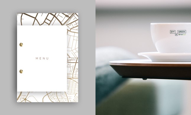
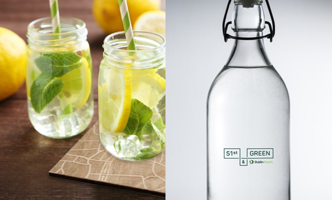
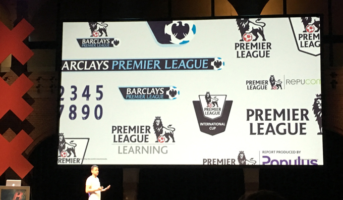
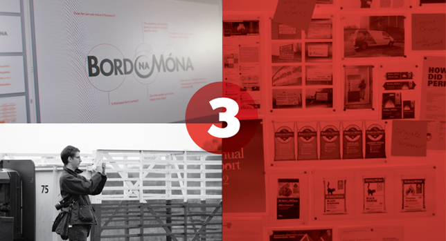
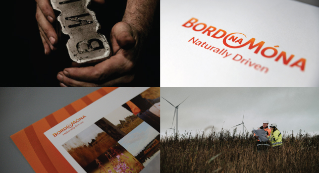
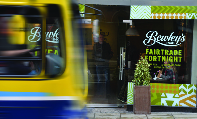
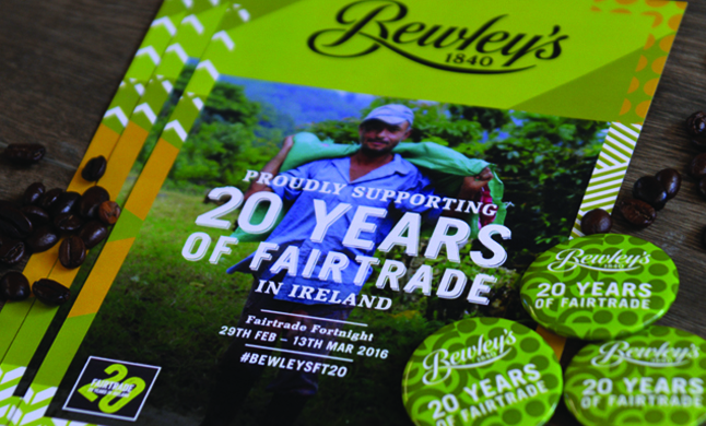
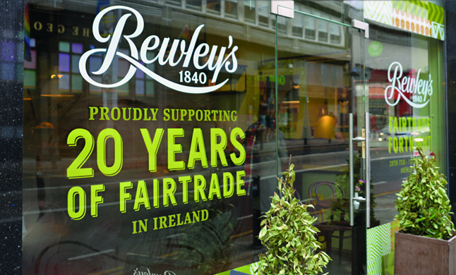
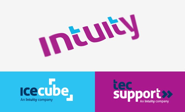
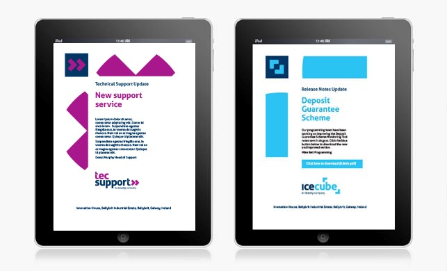
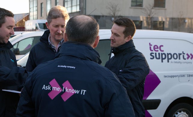
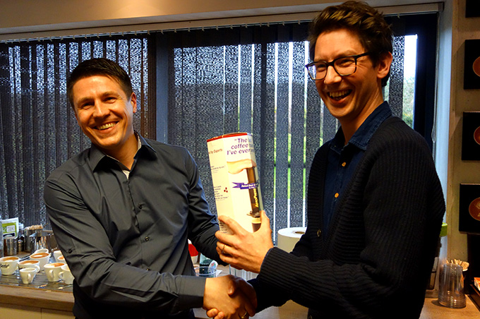
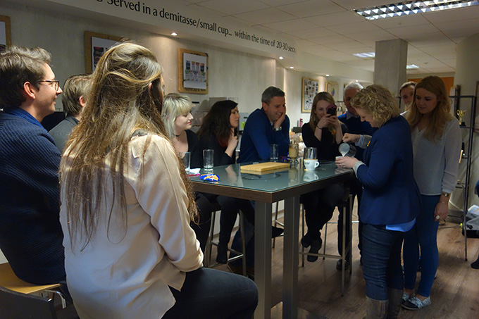
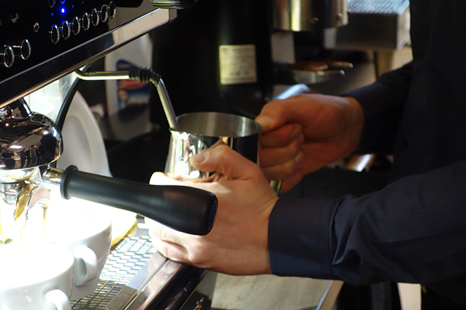
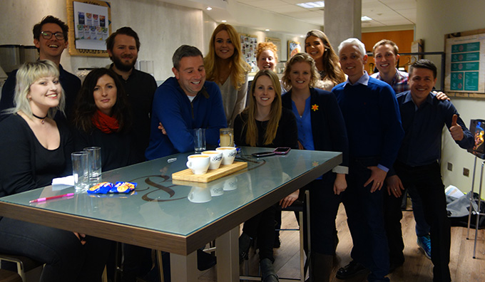

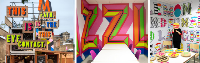
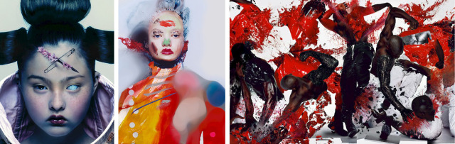
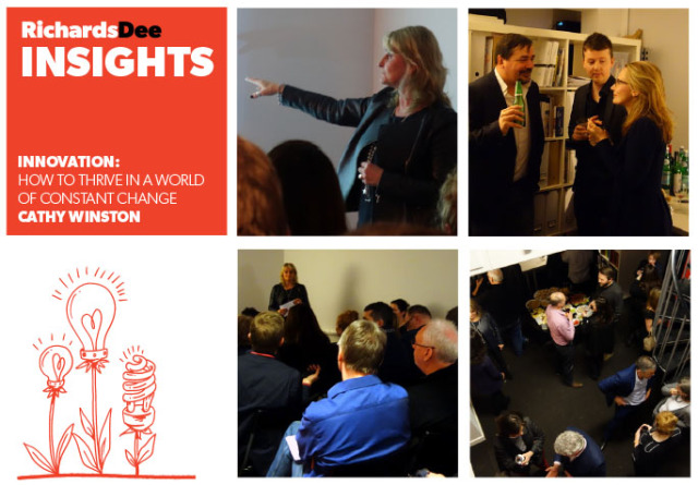
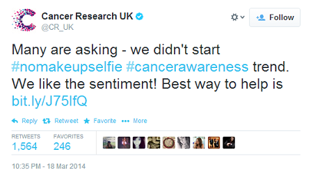
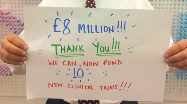

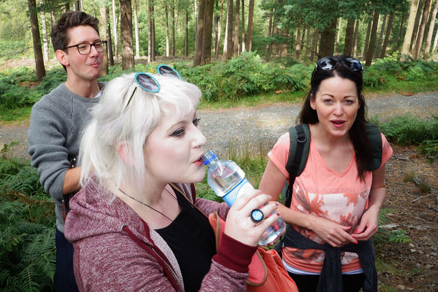
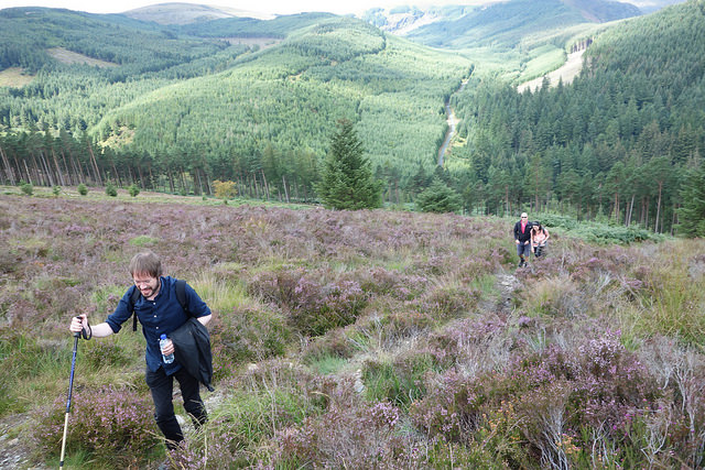
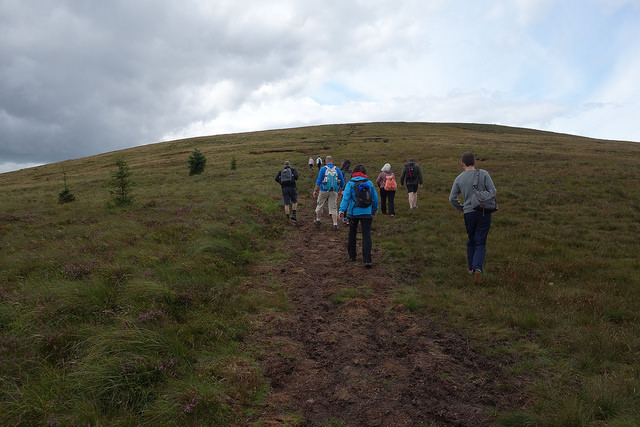
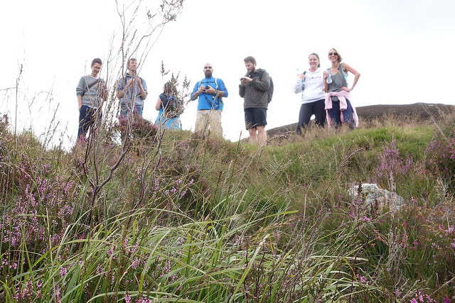
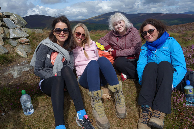
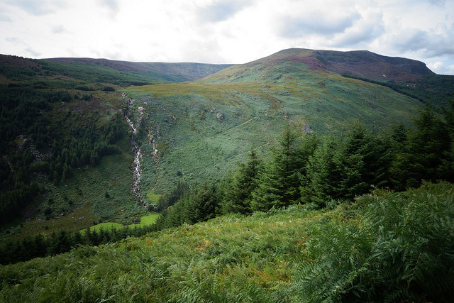
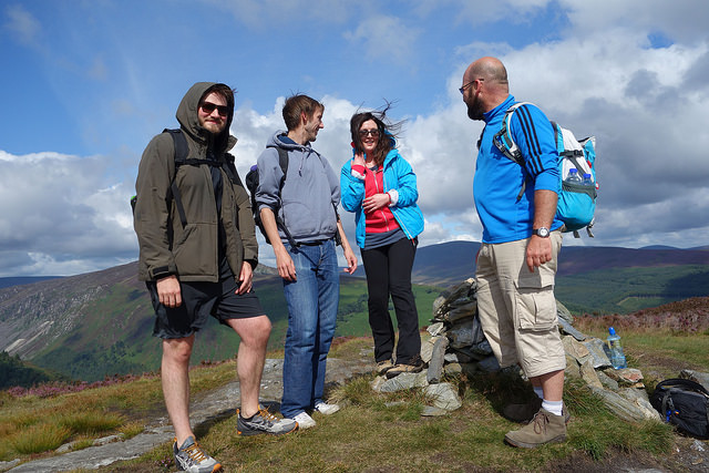
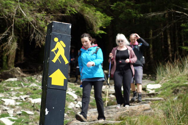
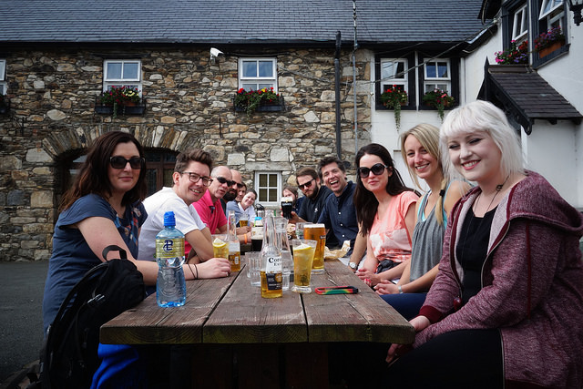